Recommended Sites


Posts Tagged ‘Alien’
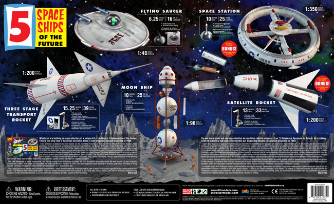
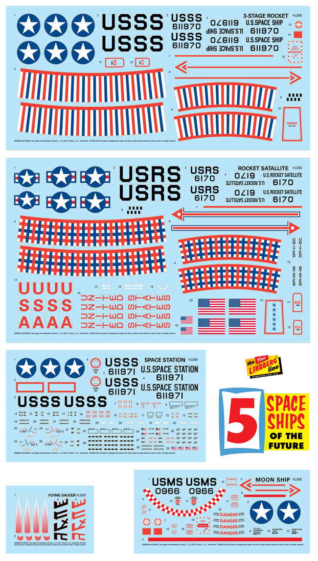
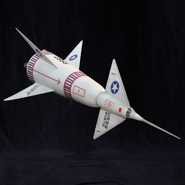
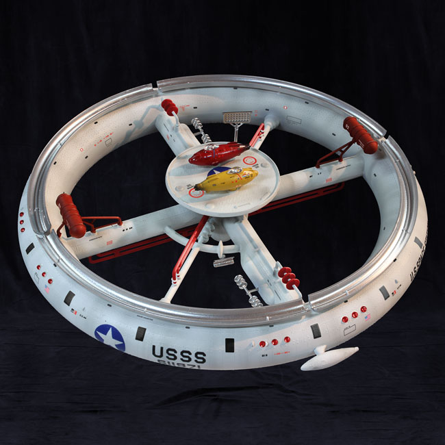
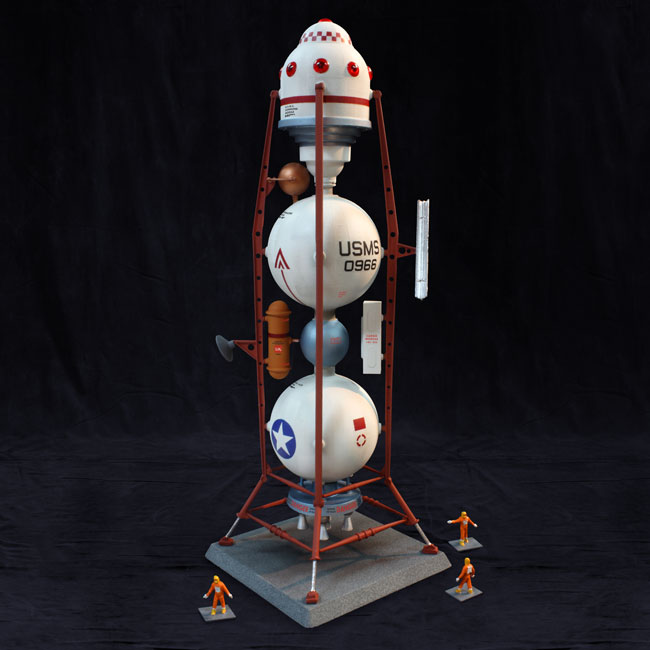
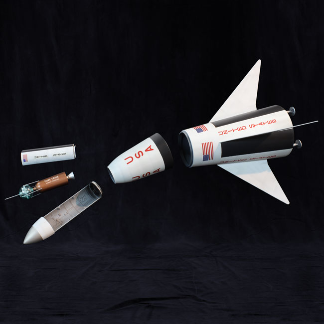
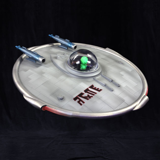
Lindberg Model kits: 5 Space Ship of The Future! Back from the Past
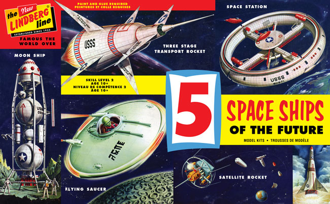
Blasting from the past is Lindberg’s 5 Space Ships of the Future. Considered to be Lindberg’s most iconic and sought after kit, the futuristic 5-pack will finally be available for the first time since its originally release way back in 1958. Along with 5 complete model kits, the release will features vintage boxart, retro-inspired decals, and a few new twists. The 5 decal sheets are remastered from the 1958 versions but with a better fit and details, and include all new decal options inspired by the kits rich histories. Also for the first time ever parts are injected in a spaceship grey.
The all new full color tray features amazing models painted, assembled and photographed by E. James Small. Check out more of his work at smallartworks.ca.
Polar Lights Model Kits: 4 weeks of Christmas Part 4
Before you lay your head down Christmas Eve and visions of new model kits start dancing through your heads, let’s finish up our rundown of projects in the hopper here at Polar Lights models. I hope you have enjoyed the looks the progress on Kane, the U.S.S. Reliant and King Kong kits.
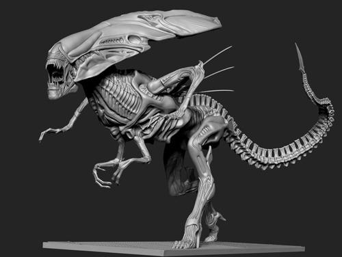
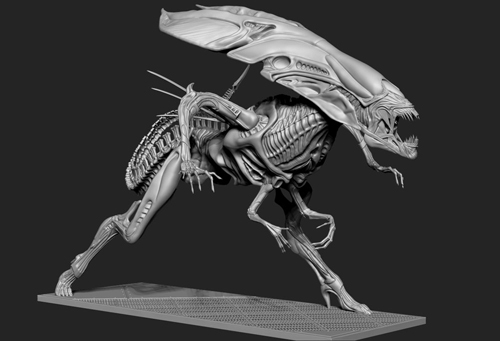
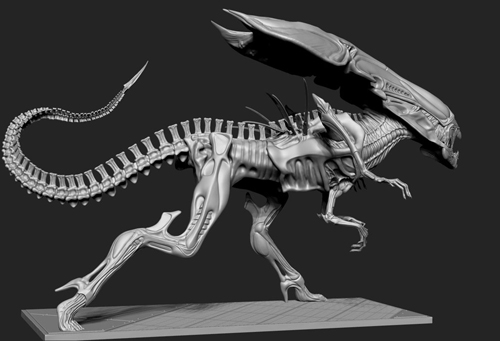
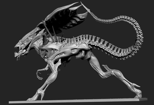
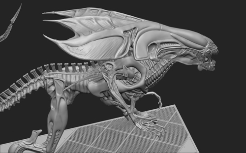
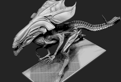
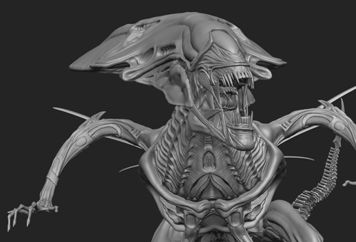
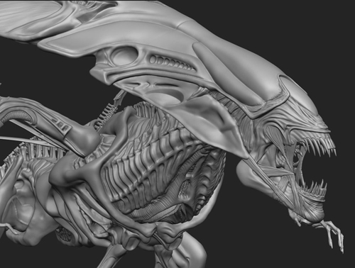
We announced acquiring the Alien/Aliens license at Wonderfest. Here is a look at something we have talked much about yet, the Alien Queen! This is the digital sculpt as rendered by Bill Wieger, the same sculptor we used on the Kane kit. The model offers a dynamic look at the creature. We are still nailing down the details on the final scale and release date. We’ll announce more when we know more.
Well, that wraps up a great 2013! Please have happy and safe holidays. We’ll see you next year!
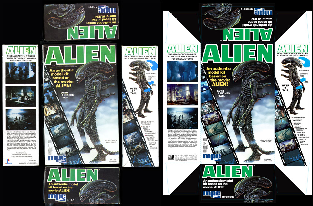
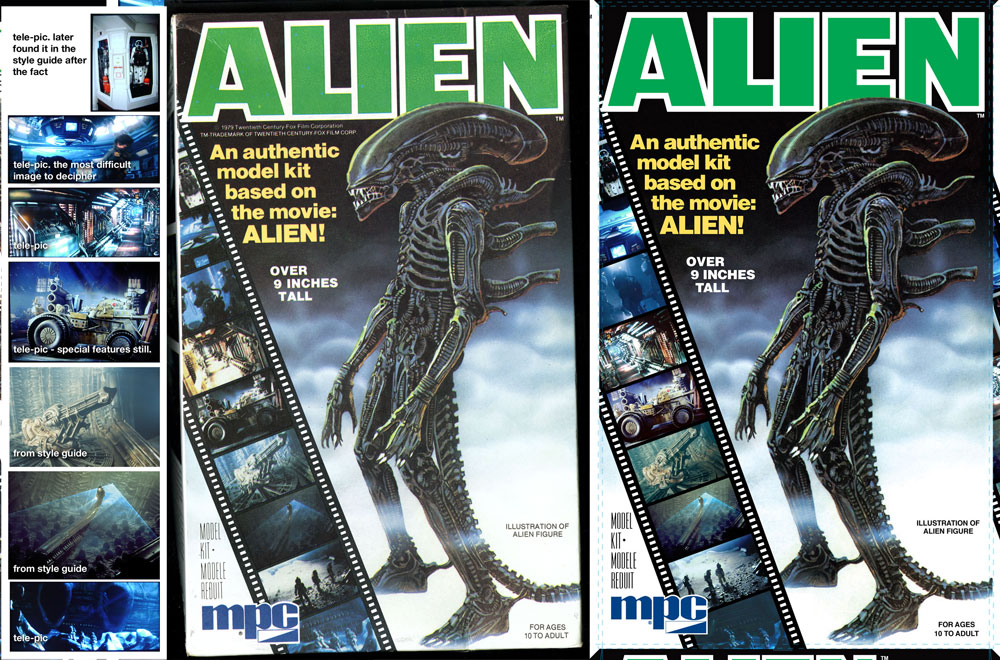
Round 2 Model kits: Recreating the MPC Alien Box Art
In the process or recreating the original MPC Alien box art, I had quite a time finding all of the images that were used originally. Modeler and historian, Mat Irvine, recently inquired about what the differences were. It was a fascinating hunt, so I figured I would reorganize my explanation and share it with you guys.
First, I’m showing the before and after images. The left side shows the original raw package scans of our vintage kit. The right shows our final production art. Whenever we reproduce a package we take a little bit of liberty to punch up the color slightly to account for fading. We replace any solid color with our best guess of the original CMYK values. In this case, the green in the word “ALIEN” was 100% cyan and %100 yellow. The scanner always captures values of magenta and black that was never on the original piece. Otherwise, we force black to become black, white to become white, etc. and generally touch up the image as needed to remove printing flaws or dirt.
The challenge of this particular piece was the small inset images in the filmstrip on the front and side of the box. I knew that many of the images were familiar and figured I could find them either in the licensor’s style guide assets or could be found online. Since they were relatively small, even medium-res images would work well enough. I decided to hunt them all down rather than spend time doctoring up the small shots that when looked at closely really broke up due to the larger dot size that was used during printing back in the day. Upon close review, the images were rather muddy.
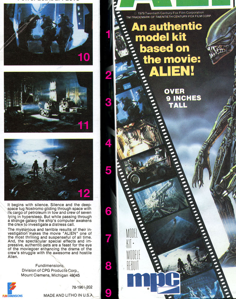
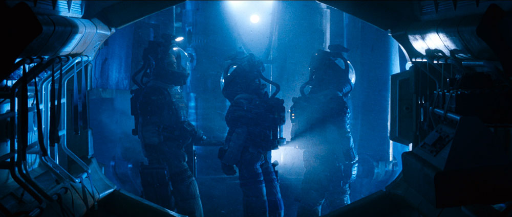
We’ve all seen the image of Kane walking the transom in the egg room and the shot of the Space Jockey. Images of the Nostromo corridor and pics of the trio in their EVA suits seemed familiar enough and seemingly didn’t pose a problem. I knew some shots were more obscure like those of the tractor on the front and the Nostromo storage bay on the side. I figured the rest would be discovered along the way with some deep digging. Little did I know what I was getting into. I’ll cover each one shot by shot starting with the easy ones…
#6 & 7 were the most straight forward as I found nice hi res pics in the style guide. And that’s where the “ease’ of the project would end.
#8 & 9 and maybe #10 seemed pretty familiar. I had to have seen them somewhere or another. As it turns out, “close” images could be found of #8 in the style guide. The positions of the figures weren’t quite a match, but upon reviewing the film, we never saw them in the film in that exact position either, because I watched it again… to find that shot and all of the others I was lacking. I defaulted to an HD screen grab found online to supply pic #10. I settled on using the style guide image for #8. I found myself resorting to more drastic measures for #9 and several others.
#5 & 11 I had never noticed in the film before. After watching again, I found them, but at different angles than what we see on the box.
#2 reminded me of the emergency helmets on the bridge of the Nostromo, but I’ll be darned if I could tell you where those suits show up on screen.
#4 was kind of tricky but #2 took the cake. The pic of the corridor is mirrored form what we see on screen. I eventually realized this and found a scene that was pretty darn close, but what the heck do we see in pic #2? Eventually, I realized the only way to figure that one out was to keep an eye out for anything resembling a perspective shot of something resembling a wagon wheel. I eventually figured it out. The image is a rotated shot of the ceiling in the bridge. I tracked down that shot eventually.
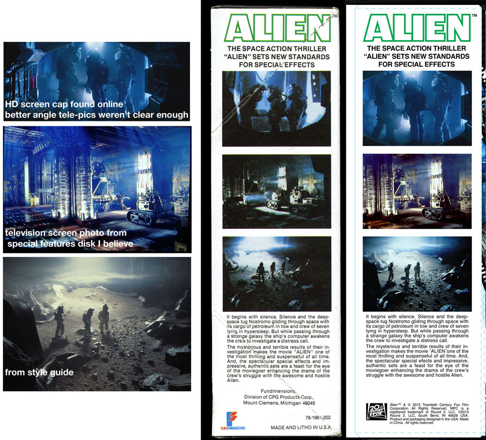
So how did I get the images I was missing? For DVDs we have an app for that, but the images are really small. Bluray is the way to go, HD with nice brilliant color, but we didn’t have a Bluray drive and pulling screengrabs from a Bluray is a complicated process. (which we eventually figured out after the fact) So, I basically paused the Bluray on my HD TV at home and took a photo of the screen. I had the lights out and camera on a tripod for stability. After some experimenting, I found decent enough results that they tightened up well enough for the packaging. In some cases, I tweaked the color balance a bit to more closely match the box. In the case of the tractor in pic #5, I found that buried in the image gallery (that I otherwise never would have gone through) on the special features disk. I found the suit in #1 there as well. I had a bit of egg on my face though when I later also found the suit pic in the style guide assets.
In some cases, there was no exact match and I settled for the best I could get. My theory is that since still photography from a handheld camera would have required a flash that we would have seen on screen. Therefore, my final hypothesis is that the shots on the box that don’t quite match were from cut footage of some kind. In the case of image #10, the characters are riding the elevator down, but in the film Kane is facing the opposite direction before the scene is cut. He never faces right with the elevator that low.
So there you go a great adventure in packaging design. Only the crazy few would dare go down this path. But, what the heck it was fun. In what other business do you have an excuse to watch a great sci-fi movie like ALIEN to make your paycheck?