Recommended Sites


Archive for April, 2017
Lindberg Model Kits: Mini Lindy’s: An Illustrated History 1970s
This is part 2 of an illustrated history of the Lindberg’s Mini Lindy line based on found images, catalogs and info from some modeling sites.
In 1970 the existing kits from the 60s were rereleased with new packaging and item numbers; 8 under the name 1971 Hot Shot and 8 under the name Mod Rod which included psychedelic flower decals. Other Mod Rod versions of previous cars were made available though a mail-in promotion; they came in plain boxes but included Mod Rod decals and instructions. These included the Porsche Carrera, the “1971” Corvette, the Ford Mustang, the Jaguar XKE and probably more.
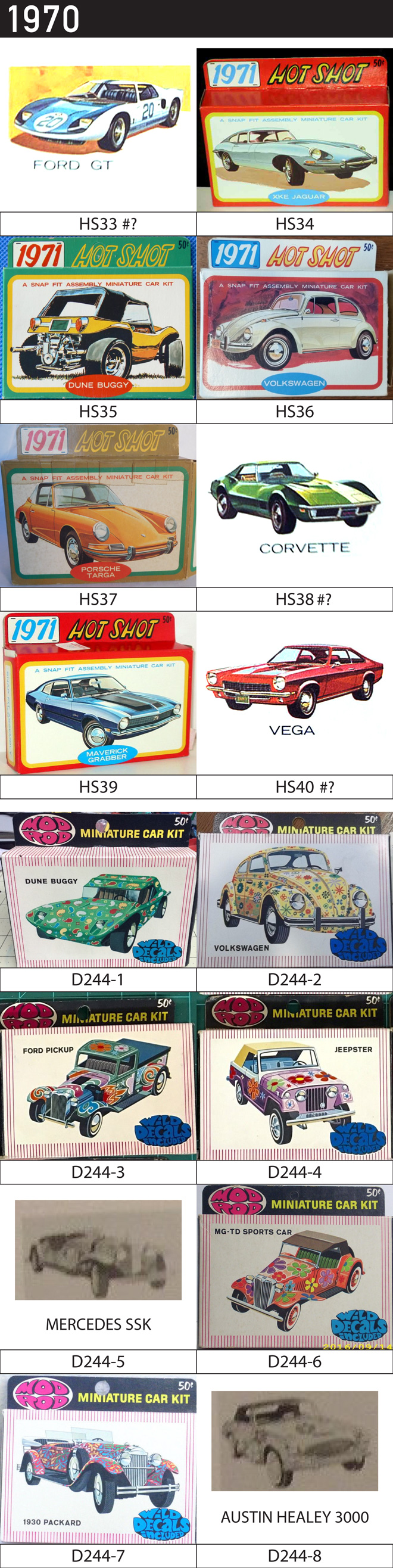
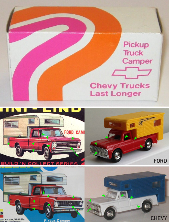
In 1971 8 of the original trucks were rereleased under the name Big Wheels. That same year seven new cars were released under the name 1972 Super Sport. The ’68 corvette was included to round off the 8. New cars included the Cadillac Eldorado, Lincoln Continental Mark III, Chevrolet Vega, Buick Riviera, Gremlin, Monte Carlo and Pontiac Grand Prix (in catalog as Grand Ville). The Super Stock series are some of the more difficult to find Mini Lindy kits. One interesting thing to note is that the Pickup Camper was a Ford now it is a Chevy. The box art is the same as the 1960s but has been altered slightly. I believed the pickup was altered for a dealer promotion, because the Camper can be found in pink & orange striped Chevy promo boxes. The chrome grilles look different but the bodies are similar enough that the tool may have just been altered. It still has the number 22 on the underside of the body.
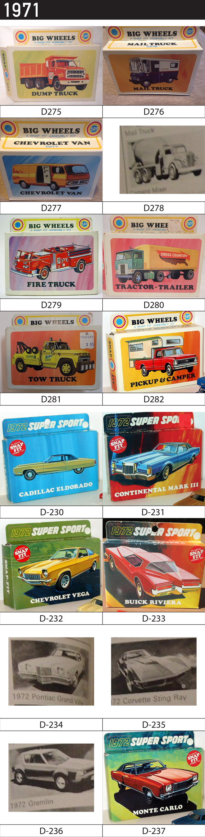
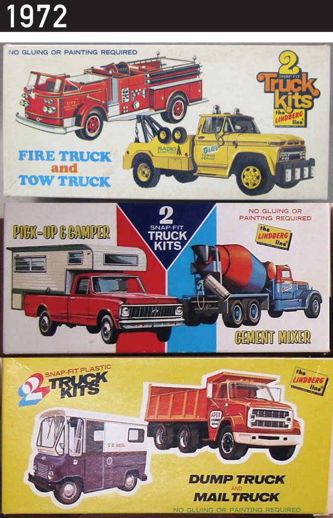
In 1972 some of the trucks were released in 2-packs.
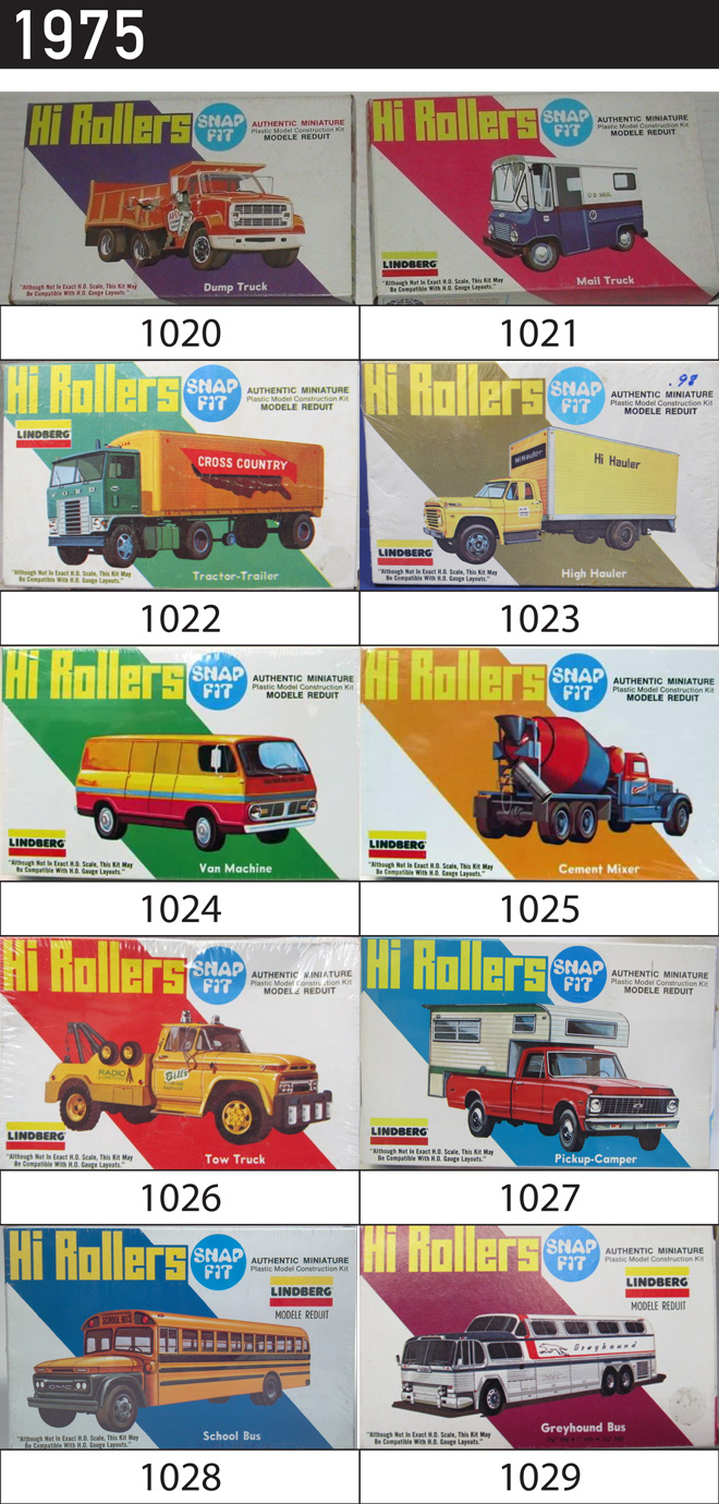
In 1975 10 trucks, vans and bus were released under the Hi Rollers series. The back of the packaging showed all the releases except for the 2 buses.
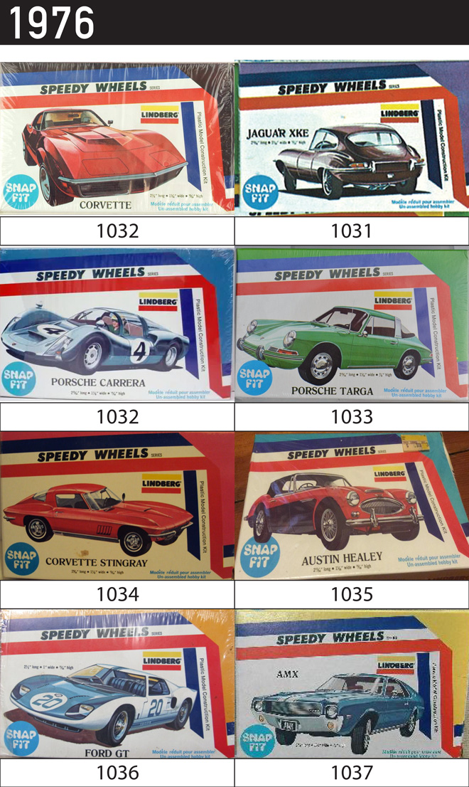
In 1976 8 cars were rereleased in the Speedy Wheels series.
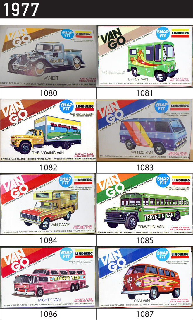
In 1977 the Van Go series added a new twist to 8 previous cars with bold graphics and glitter in the injection plastic.
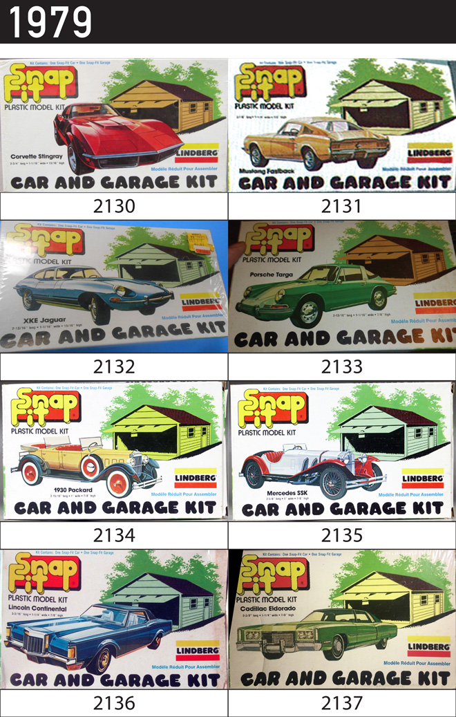
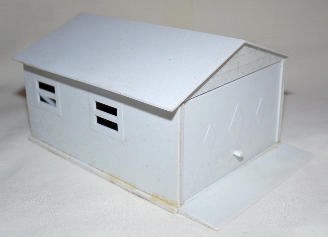
In 1979 the Car and Garage Kit series include a plastic garage with windows and an opening garage door. The Cadillac Eldorado and Lincoln Continental Mark III returned for the first and last time.
Look for my next post for part 3 – the 80s & 90s.
Some of the dates and images were found on these fantastic sites….
Lindberg Model Kits: Mini Lindy’s: An Illustrated History 1960s
This is an illustrated history of the Lindberg’s Mini Lindy line based on found images, catalogs and info from some modeling sites.
Part 1 – 1960s
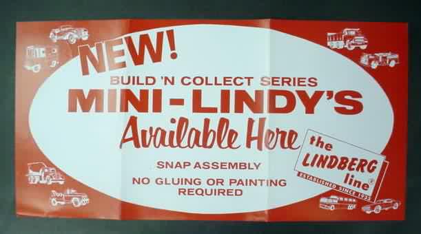
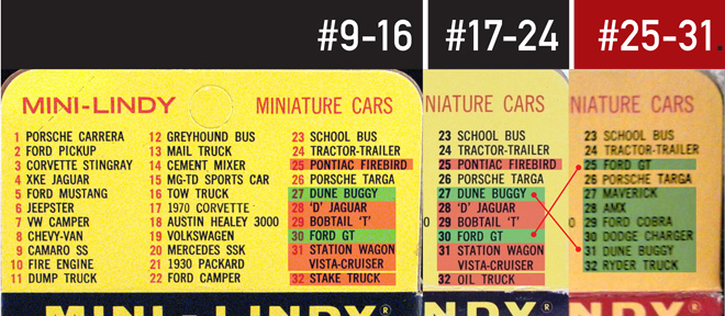
The first 24 Mini Lindy cars were produced between 1967 and 1968 with the first 16 appearing in the 1968 catalog. The vehicles were HO scale plastic kits that included clear parts, chrome parts, metal axles, rubber tires and a decal sheet. They came in black boxes with the model illustration appearing in a white oval. On the reverse side appeared a rear view of the vehicle. Three variations on the packaging appeared: a basic box, box with a flap for hanging and a cellophane version that was just the basic box with the back illo cut out. On the back of the flapped version was a list of kits numbered 1 to 32, though at that time only 24 had produced. The list also changed a bit on kits 17-24.
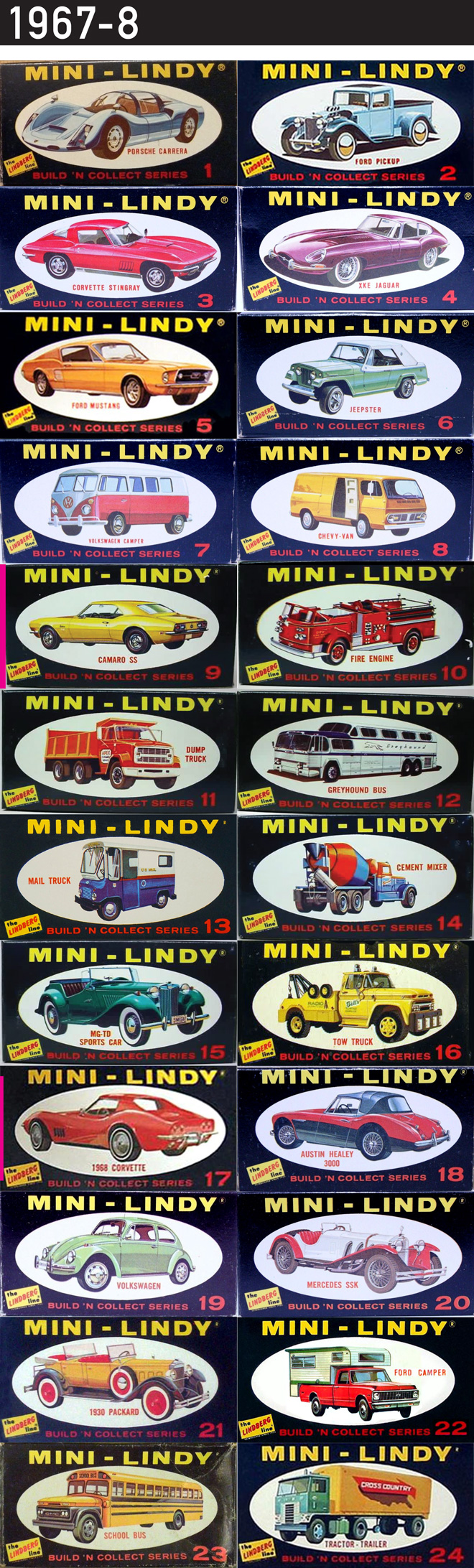
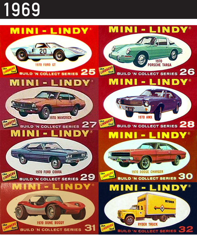
In 1969 7 “red box” kits were released; kits were numbered 25 to 31. An oddity… #32 Ryder Moving Truck appeared in a black box. Not sure of the release date but given that the kits were released in groups of 8 generally I would think this would have been released with #25-31, but I don’t know. The list on the flaps changed again to reflect the final 32 kits. Seems as though #25 Pontiac Firebird, #28 Jaguar D, #29 Bobtail T, #31 Station Wagon Vista-Cruiser, #32 Stake Truck, and #32 Oil Truck were unproduced. The 1969-70 catalog still only showed the first 16 kits.
Look for my next post for part 2…….
Some of the dates and images were found on these fantastic sites….
Coming off the Shelf – Honoring 75 Years…
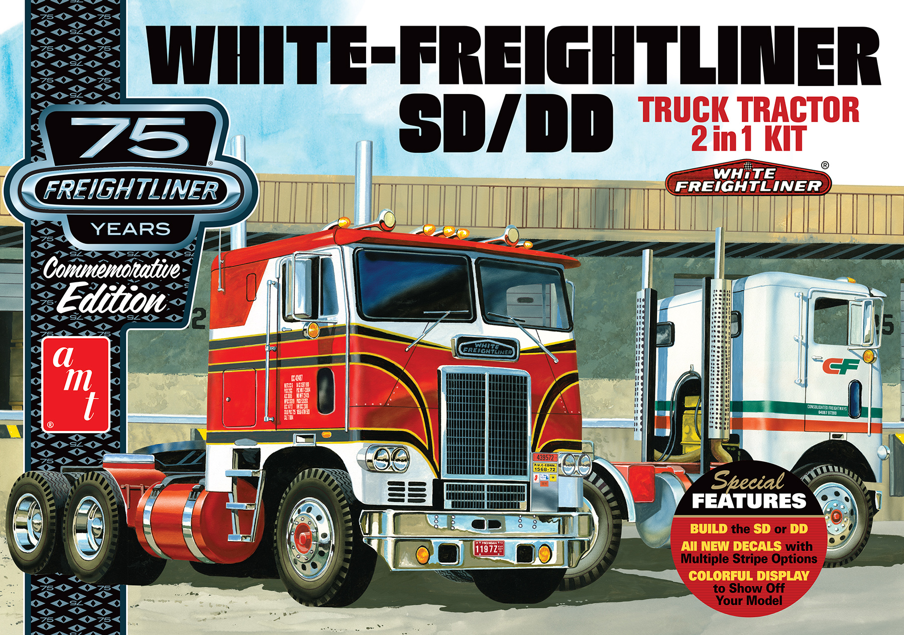
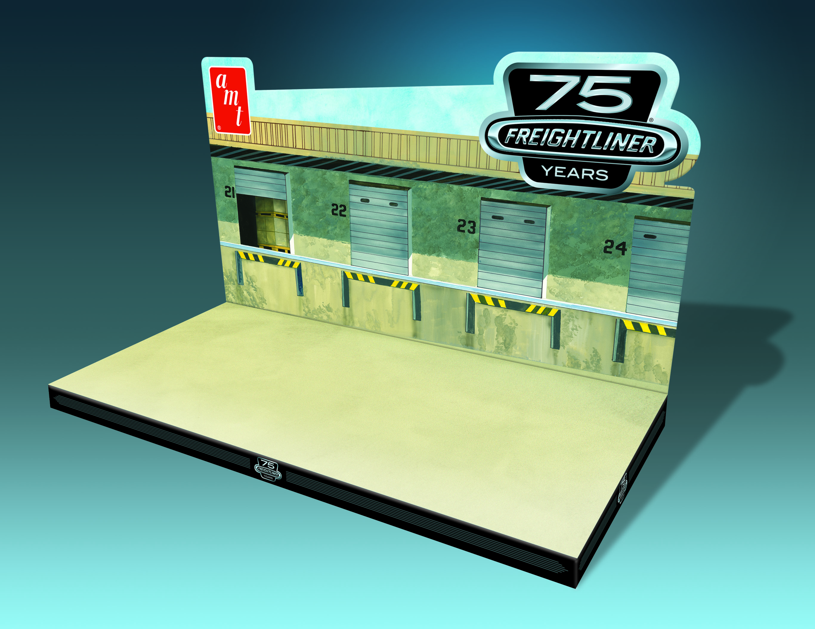
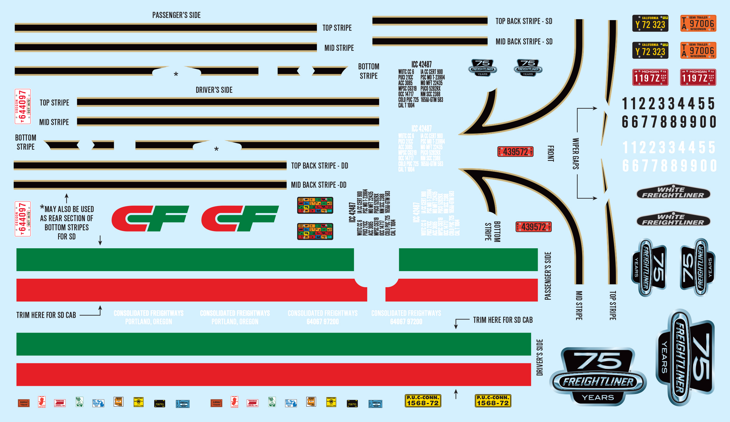
With Freightliner celebrating 75 years, the kats at AMT decided to offer a “commemorative edition” kit in honor of such a special occasion. With the option to build either the SD or DD, this 2-in-1 kit has more to offer than simply a familiar build. For starters, the box features new artwork by AMT’s legendary artist, Don Greer. Next up, is a brand new colorful decal sheet featuring multiple striping options which can both be used for either your SD or DD build—plus, custom Freightliner 75th Anniversary logos, plates, numbers and more. Finally, when your build is complete, show it off on the bonus super-sized display base. The first ever, included in our current line of big rig kits! And as an added bonus, the extra parts you have left over can be stored away—then used for future “custom builds” that you may have in mind!
So put the hammer down, and keep an eye on the horizon for this “commemorative edition” kit. Coming soon to a local hobby store near you.
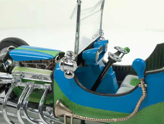
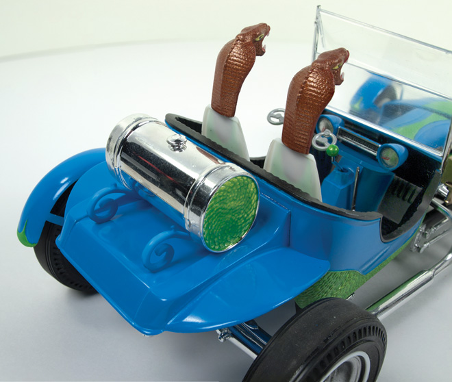
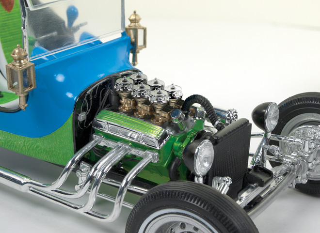
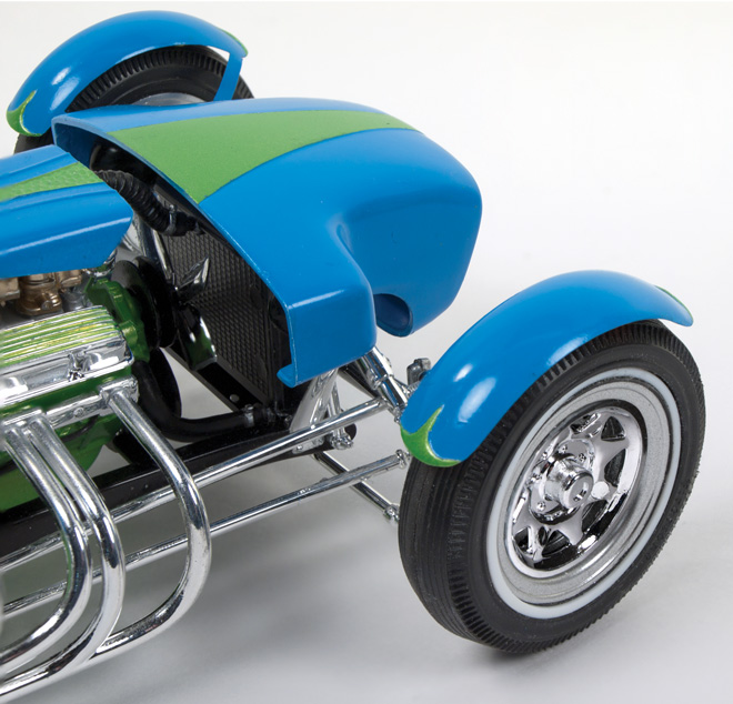
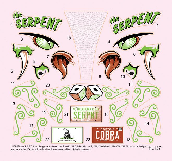
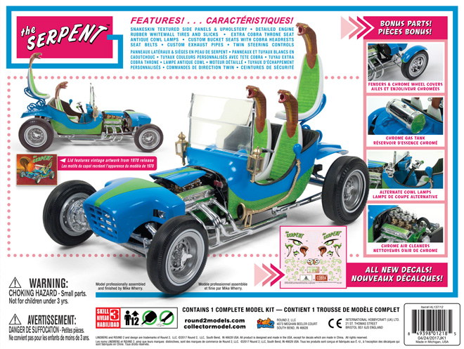
Lindberg Model kits: Big 1/16 Scale Serpent Sho-Go Rod!
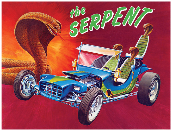
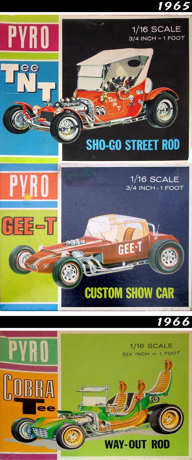
After 47 years and some tooling work the Serpent Sho-Go Rod is ready to roll again! The kit has had quite a few variations over its long history. The first appearance was in Pyro’s 1965 catalog as the TeeNT Sho-Go Street Rod and the Gee-T Custom Show Car. The Serpent variation first appeared in 1966 as the Cobra Tee Way-Out Rod.
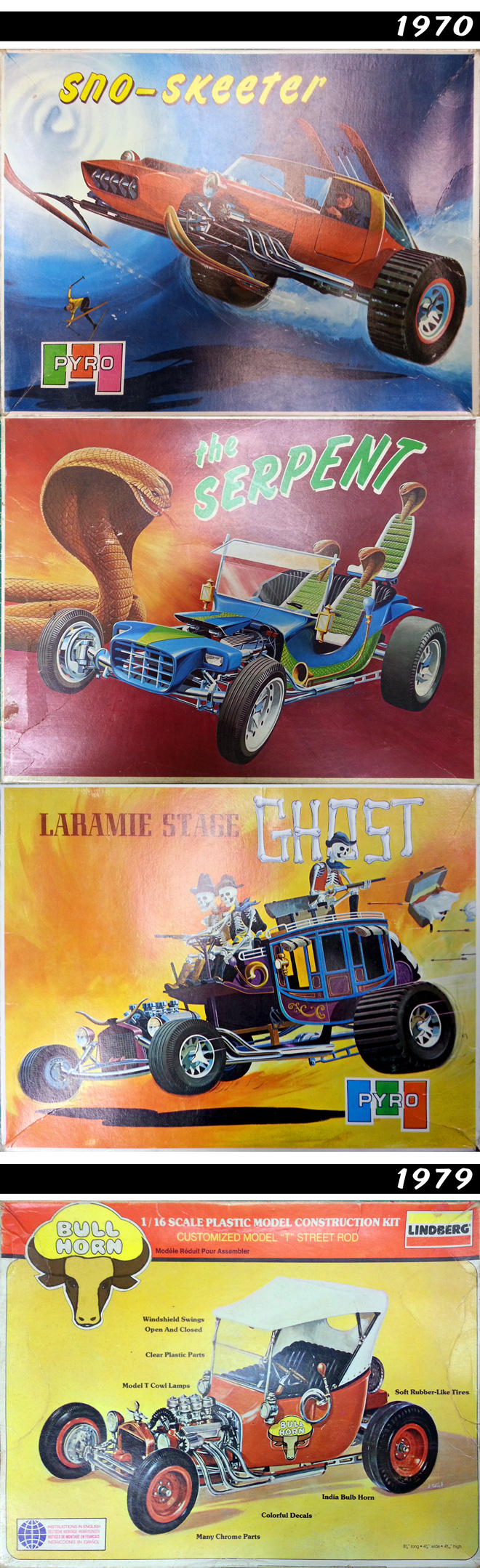
In 1970 skis where added to the Gee-T and it was re-christened as the Sno-Skeeter, the Cobra Tee became the Serpent, and new parts were tooled for the 4th version – the Laramie Stage Ghost. In 1979 Lindberg released the TeeNT as the Bull Horn Street Rod. Supposedly, it was renamed as such because, when loonies at Lindberg obtained the tooling, they thought that the horns from the Laramie were meant to go with the TeeNT.
The Serpent is a big, fantastic rod at 1/16 scale. It sits at over 8 inches long and 5 1/2 inches tall. The kit features snakeskin textured side panels & upholstery, detailed engine, rubber whitewall tires and slicks, an extra cobra throne seat, antique cowl lamps, custom bucket seats with cobra headrests, seat belts, custom exhaust pipes and twin steering controls. Parts will come injected in blue, black and clear. Alterations to the kit include improving the way the bucket sits on the frame and adjusting the stance of the 3rd seat to better match the box art.
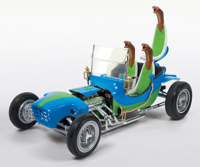
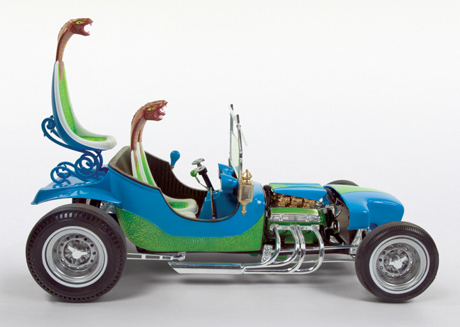
For those wanting a more custom look the Serpent comes with a slew of bonus parts including front & Rear fenders, chrome wheel covers, chrome gas tank, alternate cowl lamps, and chrome air cleaners. An all new feature for the Serpent is a large, snake-themed decal sheet. Slithering your way this May!
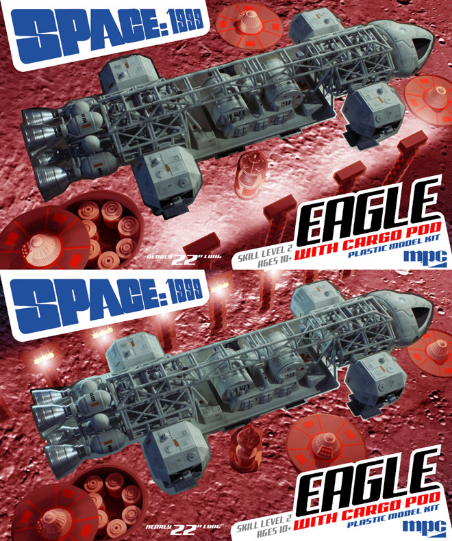
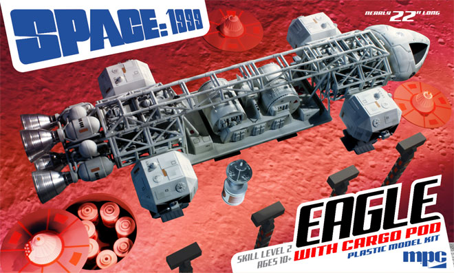
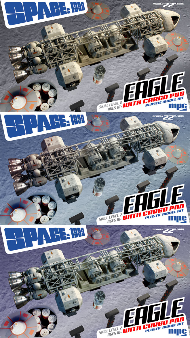
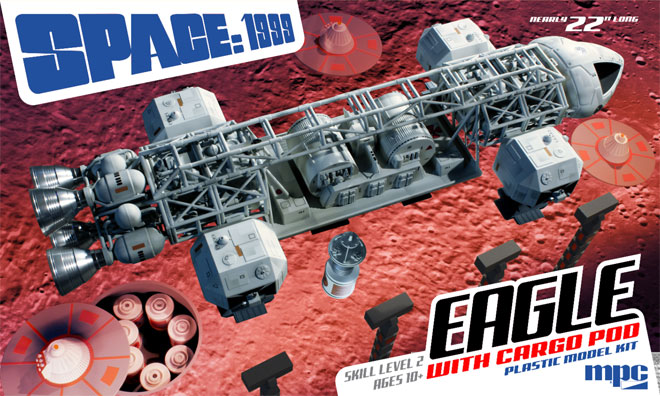
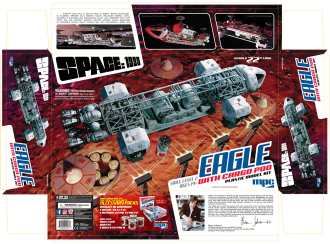
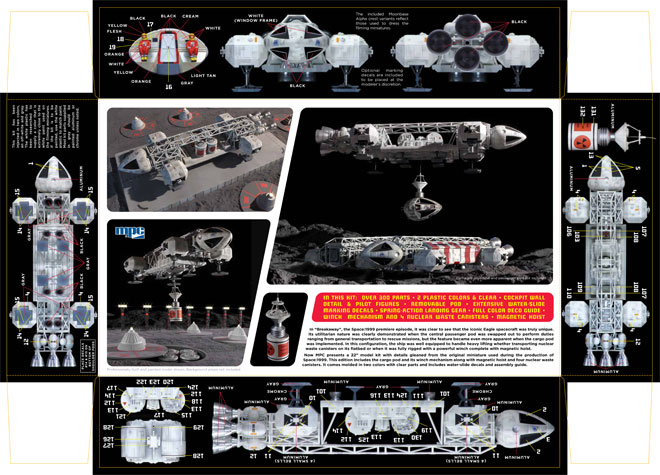
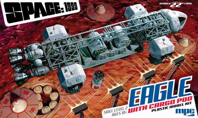
Space 1999 Model kits: MPC Eagle with Cargo Pod packaging part 3
As described in previous posts, I enlisted Jim Small to assist with the new Space:1999 Eagle with Cargo Pod box illustration by having him build some environmental props shown in the nuclear waste storage fields in Space:1999. So with all that work done, it was time to start photographing everything in context which could then be used as reference for the illustration.
Our method of working through this is kind of like a director working with his director of photography in a film, but we work long distance and transfer images and direction via chat messaging. Jim has everything set up in his workspace and sends over a photo. I usually plug that into my box layout that already holds all of the other design elements. Then I send direction back to him. Is the angle alright? Is the lighting correct? Etc. is worked through. In this instance, Jim sent me one quick photo just to generally set stuff up and see how the angle works, and this was the initial shot.
The angle was fine, but I had him play around a little bit with the location of the storage silo, but ultimately landed on the decision to position it below the rear of the Eagle. Once that was settled, we moved on to the other elements. I had him adjust the lighting and position the nuke cone platforms to the space I had built into my design.
My initial vision was to have a row of lamp stands in the foreground, but I thought we would be missing out on seeing the signature light flares coming off of them in that position. So I had him re-position them to the far side of the scene to judge later.
With all of the elements now available to me, I dropped them roughly into photoshop and tweaked positioning where needed and added a photo of the moon surface. This gave me the opportunity to play around with color and to judge where to position the lamps.
I ultimately decided to go with my first instinct (because they always tell you to when you can’t decide) and leave the lamps in the foreground. I wanted to use red to pop the box off the shelf, but I am not a “red guy”, and I wasn’t sure to what degree I wanted to push the “red alert” theme I mentioned in my previous post.
I continued to play around with color and asked for Jim’s input again. As a purist, he thought it might be better to make the moon surface gray and leave the ship white. The only way to separate them in a painting then would be to make one element “warm” and the other “cool”. I went through the exercise of proving one or the other of us wrong.
This is the image I used to base my painting on.
The painting itself was painted at 100% print size because the total box area is pretty big to begin with. I learned a lot when doing the first Eagle painting. If you recall, I actually did two paintings the first time around, the large main image and then I painted the smaller background Eagle separately and actually did that one first to get back into practice. I and many other people liked that smaller painting better than the larger main one. I liked it because I thought the end result was a better interpretation of the ship. (I think others liked it more because it was a longer-distance shot with less distortion in the ship) I think the fact that it was smaller made the paint on the board look more satisfying so I didn’t want the ship to get really big again on the new painting. Besides, working larger (which most illustrators do to allow details to sharpen when printed) would have required a large unruly board to paint on. So it was essentially one half a piece of illustration board measuring in the neighborhood of 20” x 30”.
I used acrylic paint again and ended up limiting the number of paint colors with maybe 10 different tubes in the mix. I used cooler reds for the shadow areas of the moon surface and warmed them up under the light of the lamp stands. I started by masking off the ship to preserve it’s pure whites. I then started roughing in the lunar surface before tightening up a few details like the craters, etc. I then moved on to the lamp stands and nuke cone platforms. I tend to paint secondary objects first in order to “keep my juice up” to paint the really exciting stuff like the ship at the end. I only transfer lines for what I intend to paint next. So that means details don’t get drawn in until the overall forms are painted.
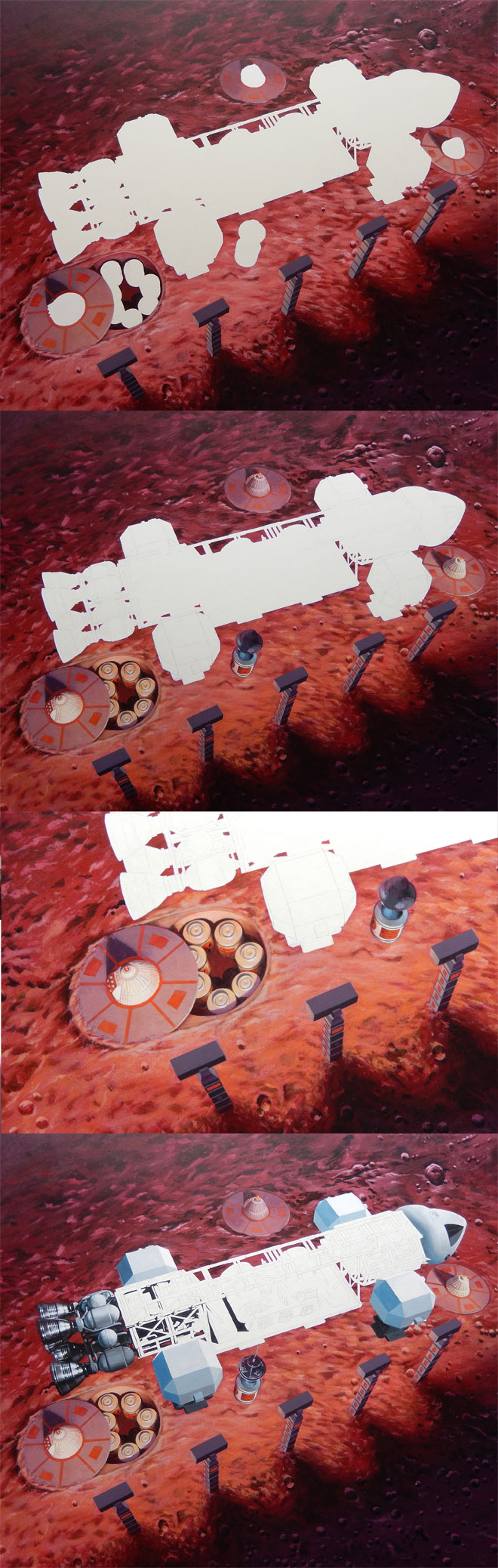
One of the things I got hung up on with the first big painting was mixing the colors for the facets of the shoulder pods, and ended up painting over them several times. So I started there on this one, and only ended up painting over them a couple times before being satisfied. That helped set the value key for the rest of the ship. I laid in pure blacks just to get me rolling in detail areas. I tinted the whites a little bit where I wanted subtle color tones. In my digital color study, I purposely put a touch of purple in the outlying areas and shifted to a slightly greenish tone in the central area of the cargo pod. This was in hopes of attracting the eye to that area with it clashing against its complimentary background. For no other reason than not knowing where else to go, I started in on painting the details of the ship at the rear and moved my way forward, leaving the spine for last.
I was pinched for time by the time I got the painting finished, but it didn’t require the stress of staying up through the night and bringing in a slightly unfinished piece in the end. I had to touch up a few details and add logos and weathering patches digitally to the first painting. This time around I was able to paint everything in, and realize the fortuitous angle negated the need to paint Moonbase Alpha crests.
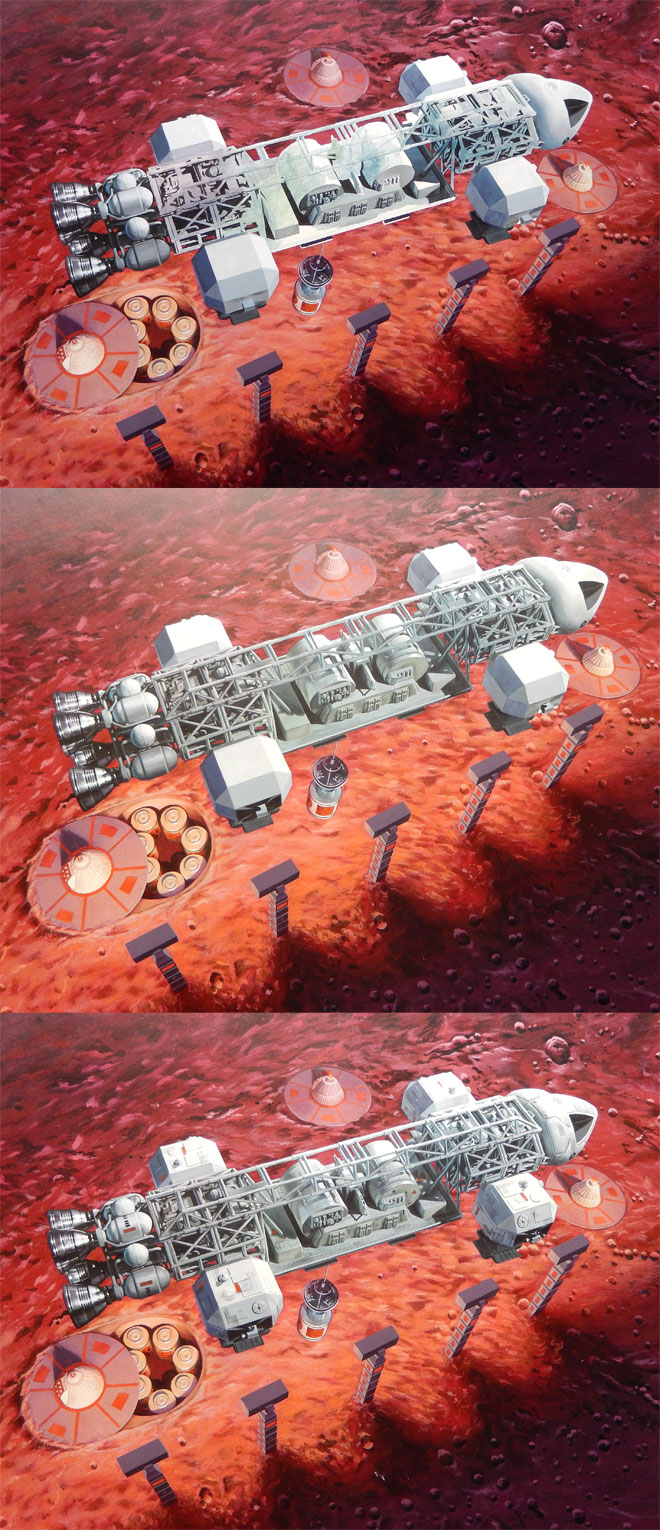
Scanning and digitally “stitching” a large painting like this is a tedious process even with a ledger-sized scanner. It took a total of 12 scans to capture the entire piece. One set of scans was taken from one direction then, turned and rescanned. This step helped eliminate the texture of the board and paint that is inherent in the scans. I tweaked the values to nicely match the original painting. We’ll see how it looks when printed.
A cause for concern arose when I showed the painting to Tom Lowe. His first question was “what, is it landed?” Um… Not in my head, and the colors should be tipping off everyone that knows the show that the Eagle is taking away one of the nuke canisters, right? Well, I couldn’t get the comment out of my head, and I had always wondered if I shouldn’t “cheat” and show the lamp light flares even though we never see such flares from behind a light source in reality. I thought adding them was worth giving closer consideration, and this IS an illustration. It should show the ideal, not necessarily reality. the light flares were created in photoshop and I think they really do help to show what is happening as well as stressing that the warm red under the ship is coming from a light source.
So, with all that ado out of the way, here is a sneak preview of the entire package layout with the painting and Jim’s buildup photos in place.
I didn’t want to spoil this post by putting this at the top. We had announced at every opportunity that the winch boom included in the Cargo Eagle kit would be magnetic, meaning that we would include the magnets in the kit needed to make one of the nuke waste canisters cling to the boom without requiring glue. Well, it would have been nice… We have been advised that in order to prevent the possibility of child endangerment, we should not include the magnets in the kit under any circumstances. The kit is engineered with locators for the magnets in case anyone wants to procure their own. In lieu of the magnets, we added a peg to the boom that can be easily removed for the sake of accuracy. Was this an over reaction? Probably, but we couldn’t risk the liability.
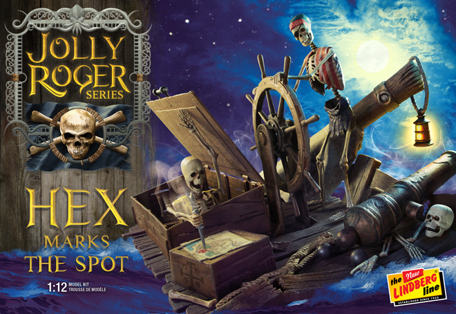
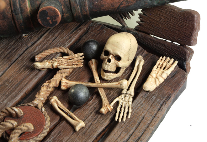
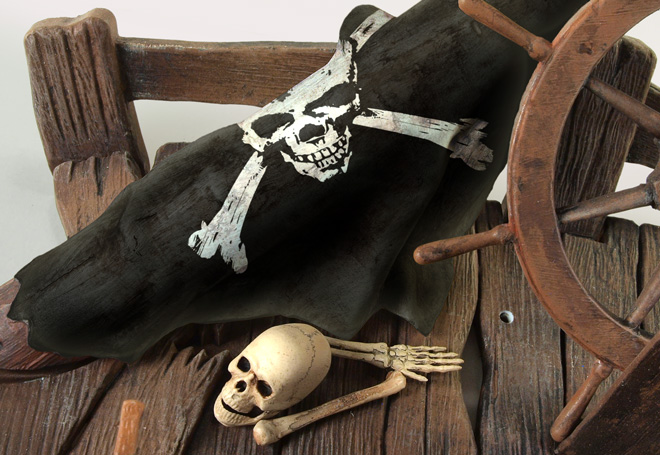
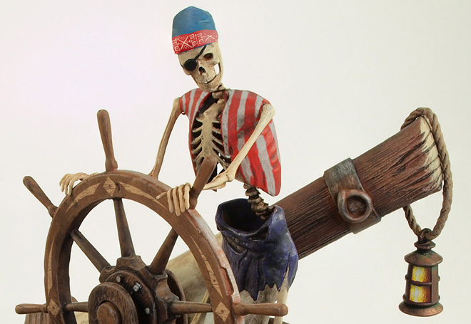
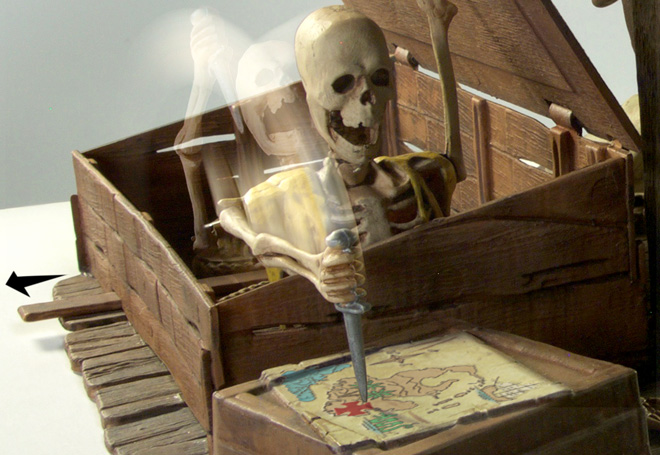
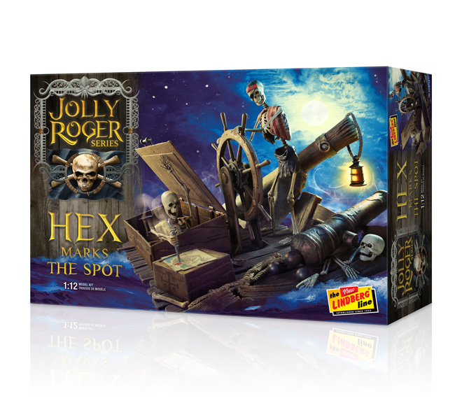
Lindberg Model kits: Jolly Roger Series: Hex Marks the Spot!
“Set adrift and drudges weak
Pursuit of yer gold and sapphire lot
What ye find is not what ye seek
When a HEX marks the spot.”
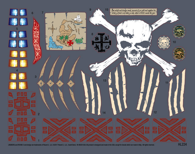
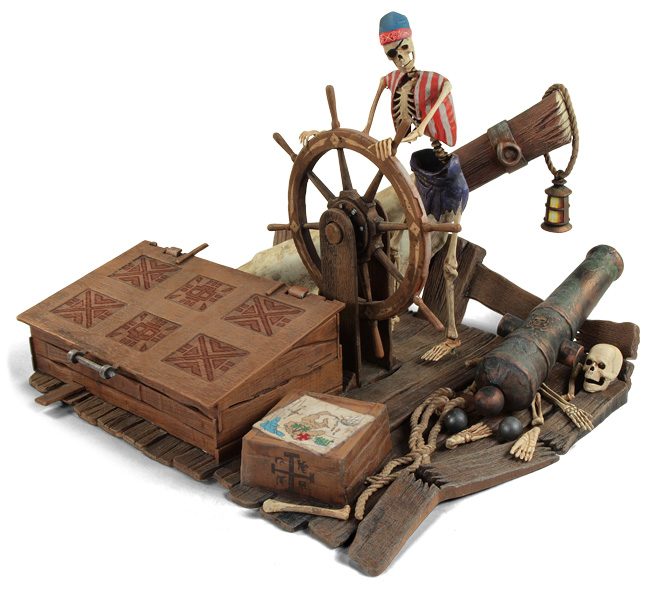
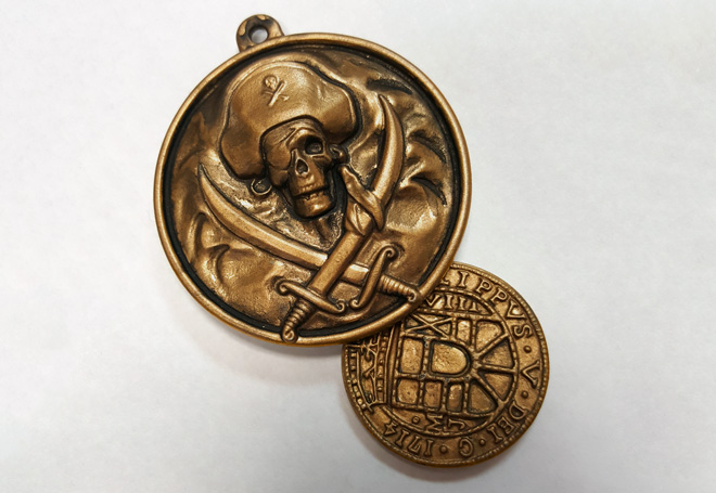
Emerging from the depths of the Round 2 tooling bank comes a new addition to Lindberg’s Jolly Roger Series. Hex Marks the Spot begins a haunting lineup of 1:12 scale figural kits. This memorable kit from 1972 stands 6 inches tall and 8 inches wide. It portrays a cursed pirate captain steering his “skeleton” crew in search of a deadly treasure. The all plastic assembly glue-together kit nearly snaps-together. The model is highly detailed and well sculpted, featuring realistic wood-grain and weathering on the deck and crates. The cannon features corrosion after spending years on the dicey sea. Additional details like cannon balls, a skull and bones are included to flesh out the scene. The model jumps to life when a second skeleton lunges from a crate with dagger in hand to pinpoint the location of the lost booty on the treasure map. A BONUS pirate medallion and coin are also included.
Decals include a massive skull and cross bones, treasure map, blue or yellow lantern glass, stripe detail for captain’s vest, decorative band for skull cap, royal crest for stolen crate, chest designs, multiple crests for the cannon and decorations for the ship’s wheel. The decal sheet even includes the poem above. Be sure to tell your usual retailer to reserve your copy!
Space 1999 Model kits: MPC Eagle with Cargo Pod packaging part 2
As part 2 of our look into the packaging for the new MPC Eagle with Cargo Pod model kit, we have a special article written by Jim Small. Jim is our go-to guy for all of our sci-fi model kit buildup work. He also supplies endless consulting on all of our sci-fi kits and especially everything Space:1999 related. In our last blog post, I mentioned that I had him on the hook to do a little scratch-building/heavily altering a set of Eagle nose cone parts to show a wrecked nose cone for the box bottom and a few stand-in mockup parts that could be used for reference for the box illustration. You’ll find, as you read, that Jim really went above and beyond what I asked for. My kudos and many thanks to him for that!
Special Box Art Effects, One Shot at a Time.
James Small, www.smallartworks.ca
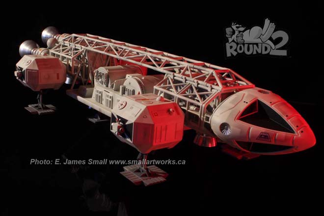
The newest release in Round 2/MPC’s fantastic Space: 1999 lineup is the Cargo Eagle with Winch Pod. As with every great kit, there needs to be great packaging. The work prepared for the box cover needs to be engaging and authentic to satisfy discerning fans today. Jamie Hood, Round 2’s senior designer, product development expert and resident Sci Fi artist is, as usual, right on top of his game with the soon to be revealed new boxtop design showing the iconic Moonbase Alpha workhorse in the fantasy situation as seen in the opening episode, “Breakaway”!
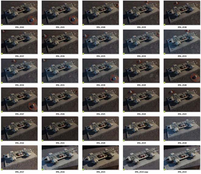
Although another one of Jamie’s gorgeous hand painted illustrations will grace the main box cover, he needed some model photography to flesh out the box bottom and sides to show off how great this kit is, and he asked me to help produce some of that work. I had been supplied test shots of the new Cargo Pod and accessories which I built, finished and used in conjunction with an existing Eagle model I had previously built.
Jamie knows how much I love to photograph models in a dramatic fashion, so he asked me to try and recreate some original scenes from the show using the actual built and painted kit. Jamie started by showing me some screen grabs of the scenes he wanted to recreate. Because of the predetermined photographic layout Jamie had provided, I knew that some of the pictures had to be choreographed somewhat differently than the screen grabs to accommodate the spread.
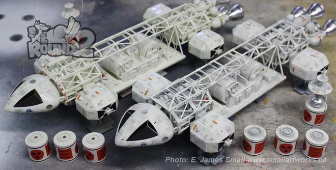
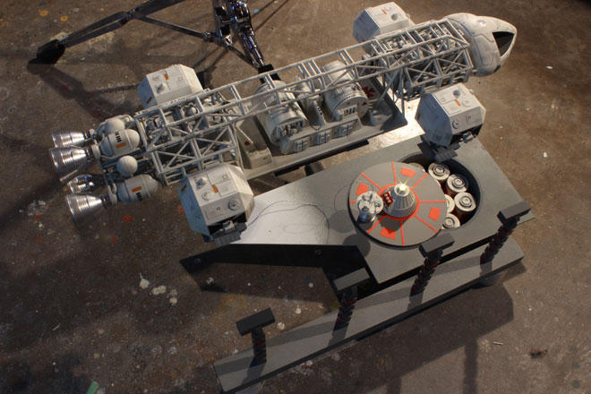
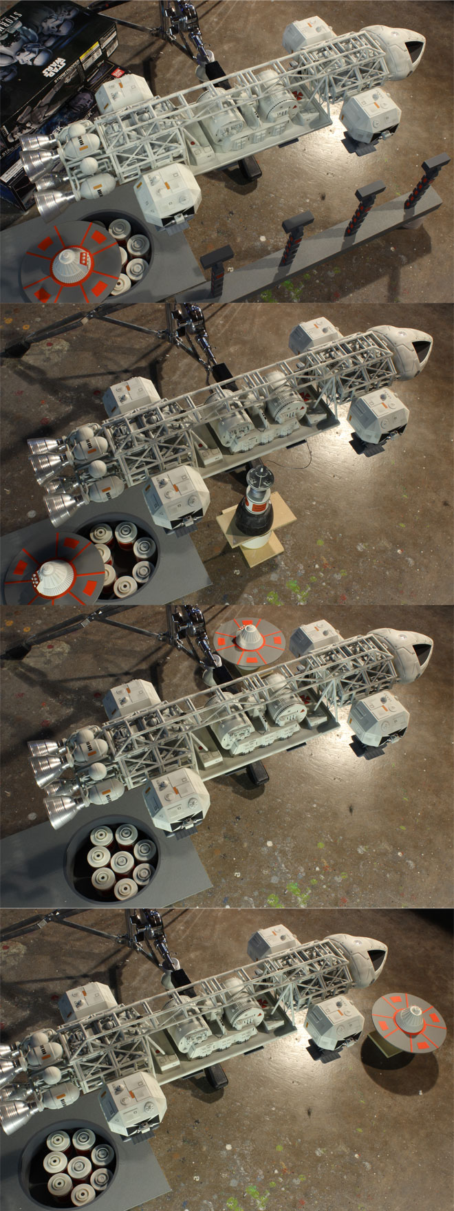
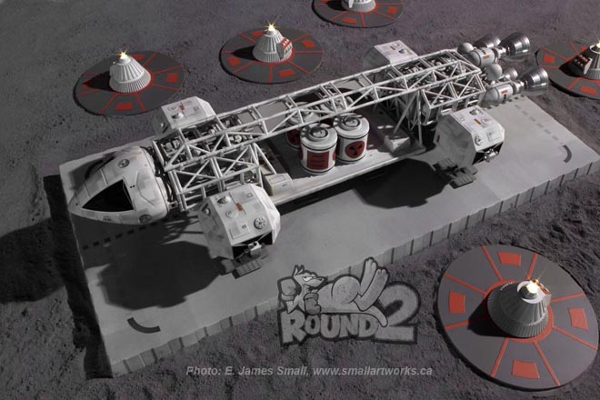
Two models made using test shots of the new Cargo pod and accessories, one painted, the other left unpainted but decaled to show how great the kit can look even without any painting at all! The special machined aluminum accessory sets are also attached to the models.
Normally I like to do all my photography completely “in camera” with no digital effects, but in this case because of the limited space in my shop and the expanse of the scenes needed I had to cheat and use Photoshop to assemble the various elements that had to be shot to create the visuals. Also, one of the shots needed to have three Eagles in the picture, but I only had one finished model at my disposal at the time so I had to do some digital manipulation. The picture would also show the red striped Rescue Eagle, but I had only a finished plain white passenger pod available which was earmarked for a customer so I couldn’t paint it. Jamie would later add the red stripes in digitally.
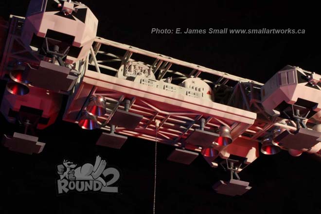
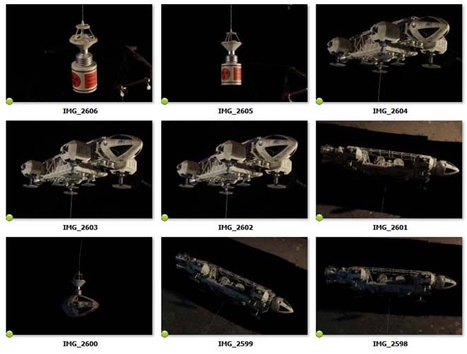
I also needed to scratch build some props not included in the kit to make the scenes required for the box art so I built some quick-and-dirty replicas to scale with the 22” model to provide the necessary backdrop. I made correctly scaled light stands, a simple rectangular landing pad matching the original, a nuclear waste disposal area cone and a “pit” that contained the canisters which matched what was seen in “Breakaway”. Jamie also liked the idea of showing the Eagle carrying away the damaged nosecone as seen in the episode “Missing Link”, so he sent me a spare nosecone from his parts bin which I re-worked to simulate the banged-up cockpit section.
Making the props was a LOT of fun for me as I do love to scratch build and modify stuff. It gives me some real creative license as well as the challenge of reproducing the original models used in the show from scratch. Time was limited so in true traditional VFX style I built everything with just the photography in mind. The waste area cone, for example, was made from a disposable plastic martini style cup and detailed to suit.
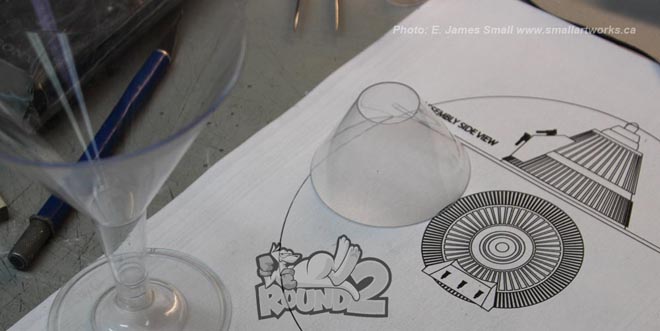
The “nuke dome” being started, the cone cut from a plastic martini glass of the type seen at left which coincidentally has the close-enough-to-work angled sides.
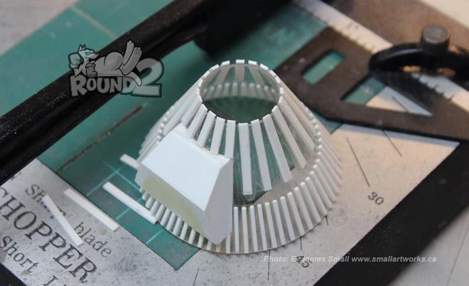
Details added to the cone using sheet and strip styrene.
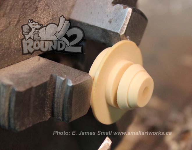
The top of the cone is turned on a lathe from a piece of leftover resin from another project.
The “damaged” nosecone was detailed only on the side that the camera would see. I cut out panels, detailed the voids with kit bashing and made dents on the surface, simulating the damage incurred during a crash landing, using heat from a small blow torch (very gingerly used!) and a Dremel tool. The opposite side, left mostly unfinished, had a plug-in mount installed where the left sensor dish would be so it could be propped up with the supporting rod (simply a wooden dowel) positioned away from the camera.
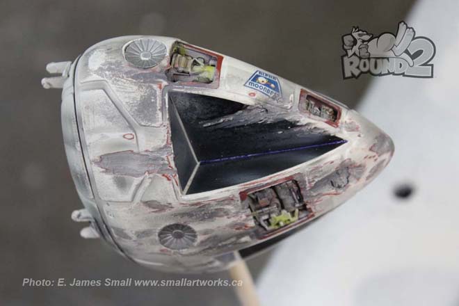
The Eagle nosecone modified with kitbashed parts put into into holes cut out of the kit and painted to resemble crash damage.
I also put functioning LEDs into the light stands and the cone beacon to add authenticity.
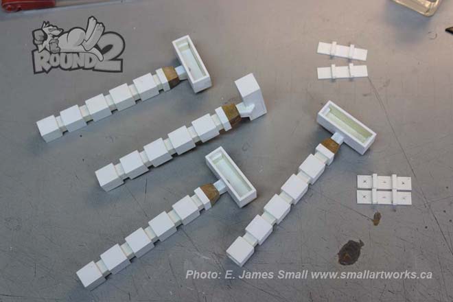
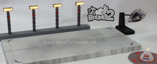
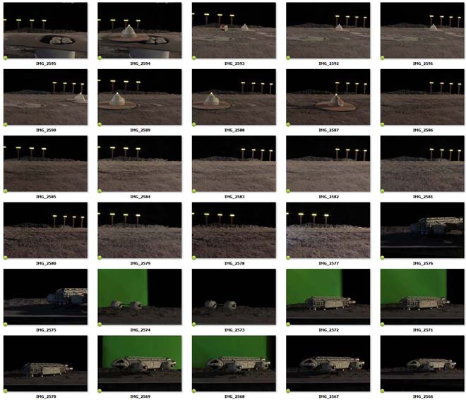
Four light stands were fabricated using sheet styrene and square tubing. These would later be mounted to a base which supplied the power using a 3 volt battery box underneath.
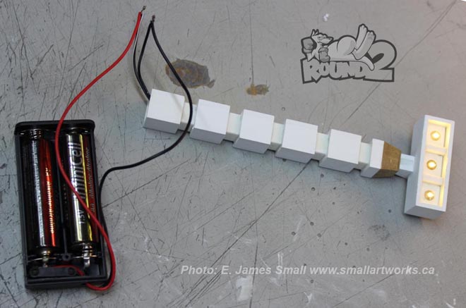
Testing the lights on the stands. Three 5mm “Straw Hat” style LED’s were used in each stand.
The red areas on the trunk of the light stands were also to appear lit up, but this was a VFX cheat, borrowed from Brian Johnson and his crew when they lit up the main model of Moonbase Alpha’s windows, by using red reflective “Scotchlite” tape applied that would bounce the light back to the camera when it was shone from the camera’s point of view, just the same way road signs are lit with car headlights.
All the finished props built for the box art photo shoot.
Some of the shots I did were the relatively simple ones, those shot against a black velvet background for the outer space beauty shots of the model shown on the sides of the box cover. Because I knew that the motif of colour that Jamie had designed for dramatic impact was to have a significant red tint, I used a red fill light to enhance the shots. I also shot a couple using green and blue fill light to impart a more colourful tapestry in case he had some other ideas in mind, but Jamie wisely rejected them.
The finished Cargo Eagle model shot against black velvet and fill-lit with a red spotlight for dramatic effect.
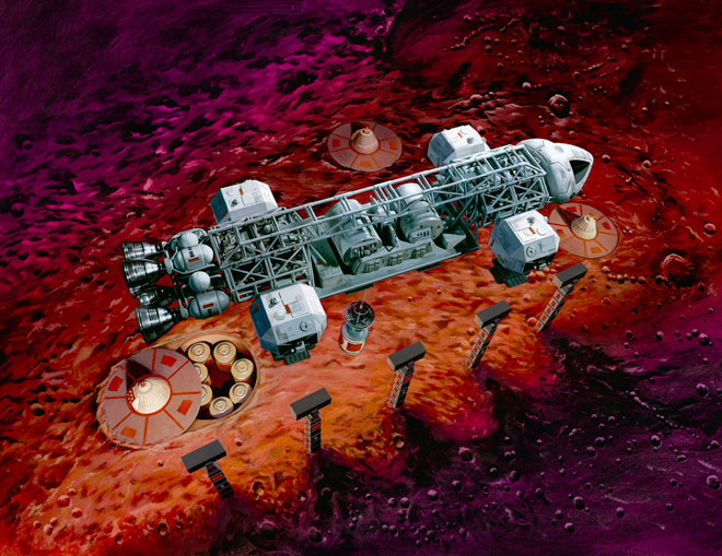
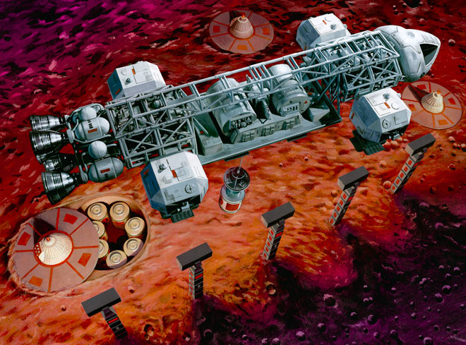
The rectangular landing pad the Eagle is shown sitting on with its flatbed loaded with nuclear waste canisters was made quickly from sheet styrene using screen grabs as a guide for proportion and detailing to scale with the 22” kit. Coincidentally, the actual VFX shot for the episode used the like-scaled studio model 22” Eagle!
Jamie H. butting in here. Just for the record. I discussed making prop “stand-in’s” with Jim, all I asked for were rough placeholders. I told him to take some photos of the Eagle matching the angles shown in the unloading scene because it was a nice angle of the ship. Much to my surprise he sent me some photos one morning of the platform itself! Textbook example of “over-delivering.”
Lunar regolith was simply made from sprinkled concrete powder on the 3 foot square work surface. The waste cone was repositioned for different exposures and assembled in Photoshop to make it look as if there were several of them in the scene. Since a true “multiple exposure” is impossible with a digital camera (I currently use a Canon Rebel T3i), this compositing technique was necessary. The same thing was done with the four light stands to make it appear that there were more of them in the scene.
All the shots taken for the Eagle sitting on the pad with the waste cones surrounding it. Several shots were done identical except for lighting effects and the waste cone prop repositioned for each shot so that when composited, it will look like many cones surround the model using the single prop. Not all the pictures were used in the final comp, of course, but I took a lot of extra shots to provide different options.
The models were all photographed with the camera mounted to a tripod and suitably lit. Time exposures had to be used to achieve maximum depth of field. The hanging “damaged” nosecone and waste canisters were solid mounted and shot separately to be matted in later, as just the slightest movement during exposure with them hanging off the Eagle would have blurred them in the picture.
In some of the examples of the raw pictures shown you can that see some of the elements were shot against a green screen thinking this would be helpful in isolating them for compositing, but in reality this caused more problems than it solved due to fringing and “green spill”, so that idea was abandoned and I just used the ones shot against black velvet instead.
Some of the elements shot separately which would later be combined into the finished VFX pictures. Not all shown were used, some were used that are not seen here. Some colour correction and sweetening would also be employed to maximize the look of the finished composites.
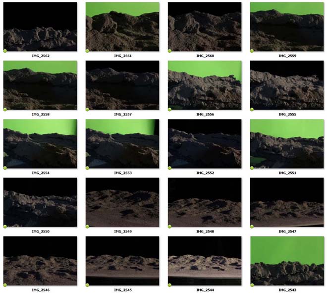
Two of the scenes also required mountains for the background and foreground hills. Because of the limited space on the table I actually made the distant mountains from small pieces of carved foam, sprayed with gray primer which further textured them and sprinkled with concrete dust. These mountains in reality were just about 6 inches wide or so, but shot in extreme closeup and lit harshly. They were simply matted in behind the models. A similar technique was also used by Johnson’s VFX crew for distant mountain ranges, but without the aid of digital compositing! Instead, they had the miniature mountain photographs blown up and mounted to large wooden flats, propped up behind their model sets. I had considered doing the same thing, but it was far less expensive for me to plop them in using Photoshop.
In addition to these VFX shots I also took a series of photographs that were designed to help Jamie compose his painting, but he will cover those in his own article shortly, and are therefore not presented here. I also shot several “orthographic” pictures of the finished model for the box tray sides to show decal placement and paint schemes for the consumer to use as reference. The miniature was propped up in front of a black velvet backdrop, suitably lit and shot with a 300mm telephoto lens from about 25 feet away to help eliminate perspective distortion, making the picture plane look as close to a blueprint-like image as possible.
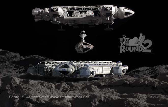
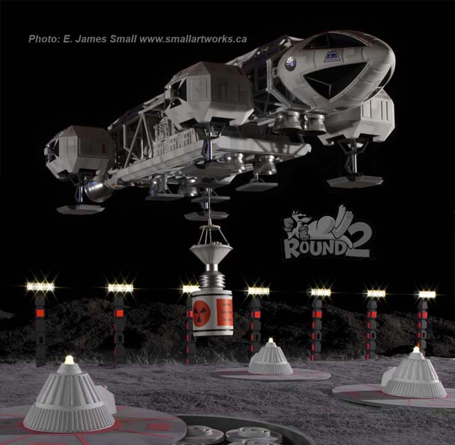
The three finished composites using the previously photographed elements. You will find these images gracing the box tray. Compare to the inspirational screen caps from the show.
I always have a lot of fun building models, but just as fun is when I have the opportunity to recreate the spectacular scenes that remind us why we loved a TV show like Space: 1999 in the first place.
Special thanks to Jamie Hood and all the wonderful people at Round 2 for finding a place for my work to be included as a part of the box art that will soon be on hobby store shelves for everyone to enjoy, containing yet another fantastic kit. Dreams are continuing to come true, thanks to Round 2!
You are welcome, Jim.
If you want to learn more about model photography, be sure to check out the article Jim wrote on the Central Nova Scotia Modelers web page here.
Next time, we will reveal the box illustration…