Recommended Sites


Archive for the ‘Round2 Models’ Category
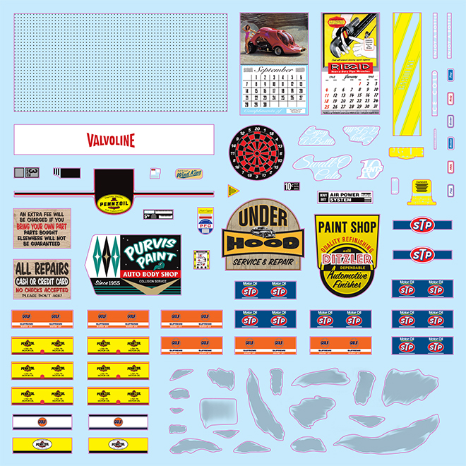
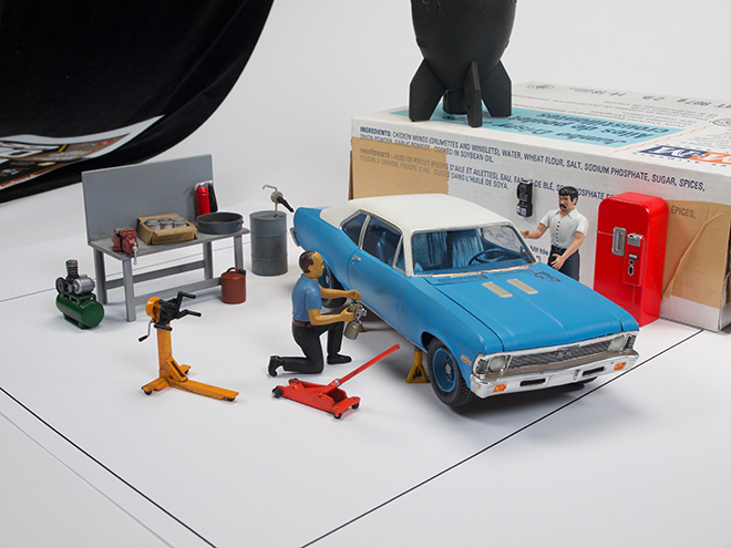
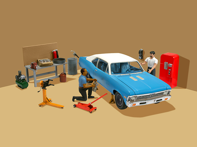
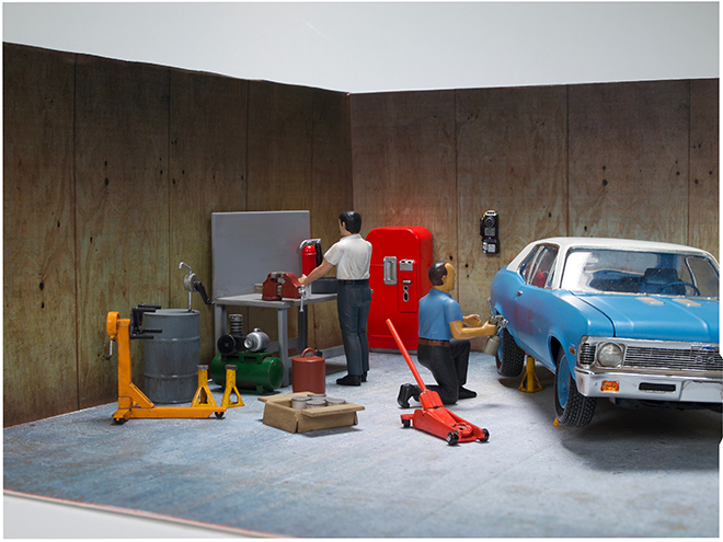
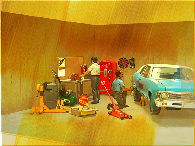
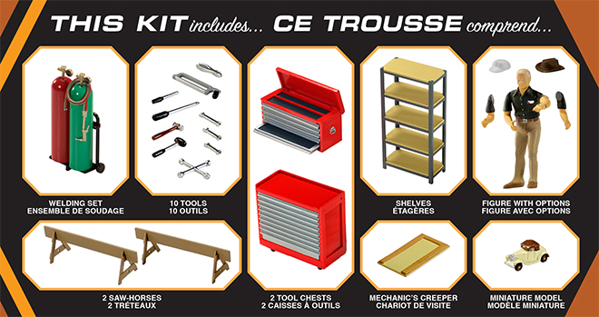
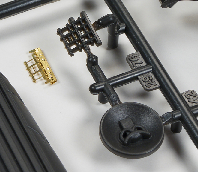
AMT Model Kits: Garage Accessory Series Set #2
Here is the first look at our second upcoming 1/25 scale garage accessories set, Tip Top Shop! The set features two figures, workbench, compressor, jacks, and soda machine along with a plethora of other handy equipment.


The decal sheet includes peg holes for the workbench, equipment labels oil brand labels, calendars, shop signs and more.
Some folks like to see “behind the scenes” processes that go into creating our packaging. Here is a look at before and after photographs compared to the illustrated look you find on the packaging.
Look for the kit in December!
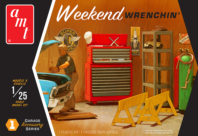
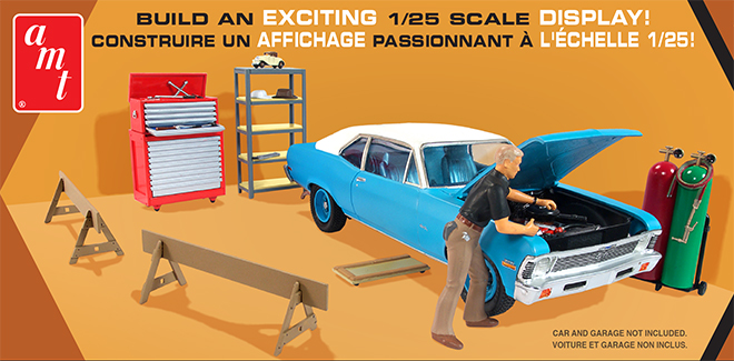
AMT Model Kits: Garage Accessory Series Set #1
We have been working on a special new series of kits that we have not yet taken the time to reveal. And it is almost time to deliver! (egg on our face!) So check out the next few blog entries to see what we have coming.
Here is the first look at some upcoming sets of 1/25 scale garage accessories.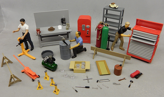
We are starting with two sets. The first comes in November and the second comes in December.
Weekend Wrenchin’ comes first featuring a hard-working mechanic, tool chests, creeper, shelf unit, acetylene welding tanks and hand tools.
This gives a detailed look at everything in the kit.
And here is a look at the great decal sheet that comes with it. All equipment labels are included along with decals for garage signs, oil stains and even logos for the figure’s baseball cap!
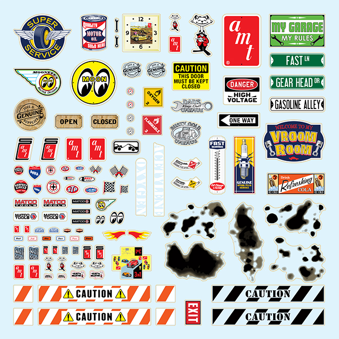
Look for this kit in just a few weeks!
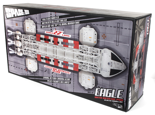
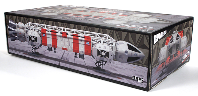
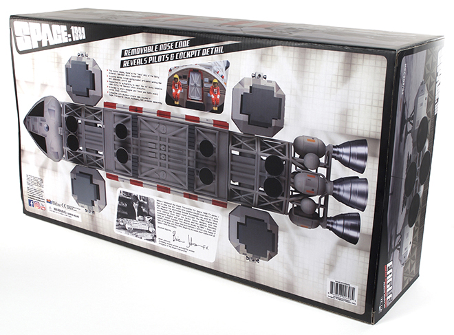
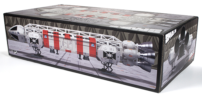
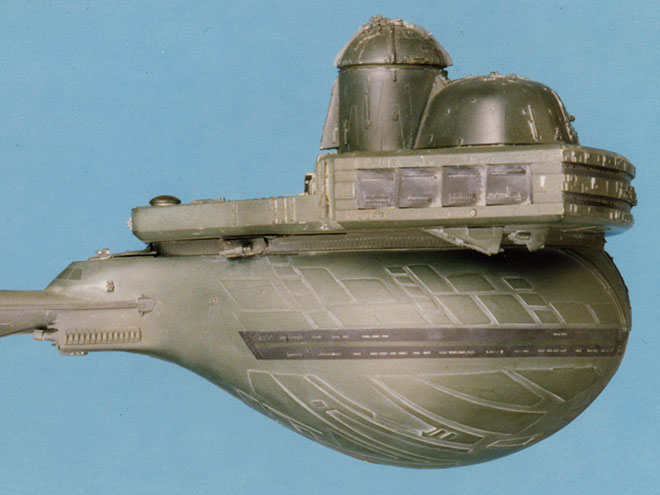
MPC Model Kits: Prebuilt Rescue Eagle Packaging
Last year’s release of our 22″ Prebuilt Space:1999 Eagle Display Model was an instant sell out. It was limited to just 500 pieces as we tired to judge the market for a fully painted and (mostly) assembled model. The response to it has been great, and as you’ve probably heard by now we are doing it again.
This time we will be releasing the model with a Rescue Pod which features its iconic red and white stripes. The weathering panels have also been changed up from last time as well. And we have bumped up our production number to 850 this time around. Pre-orders on the model have been great and we expect another sell out. We’ll see if there is still enough interest to do more later on. The model should arrive in late November or December. Here is a look at this version’s packaging.
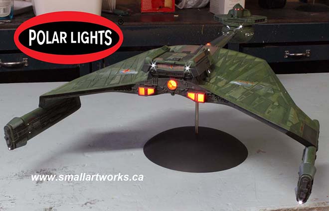
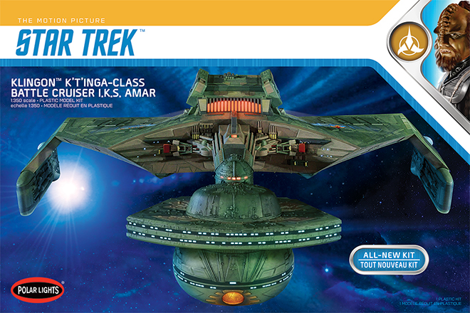
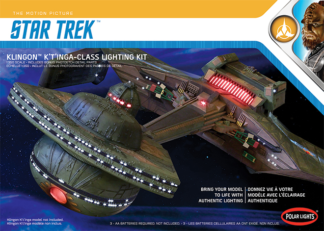
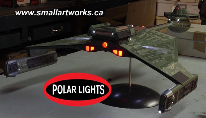
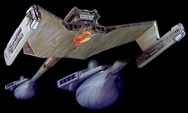
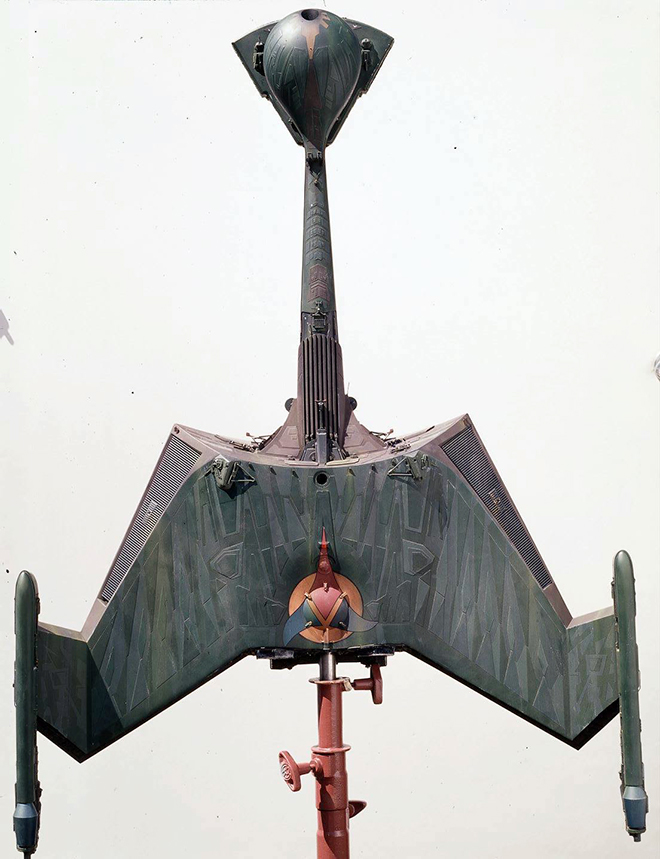
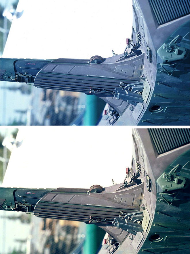
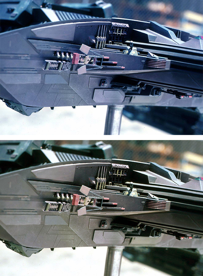
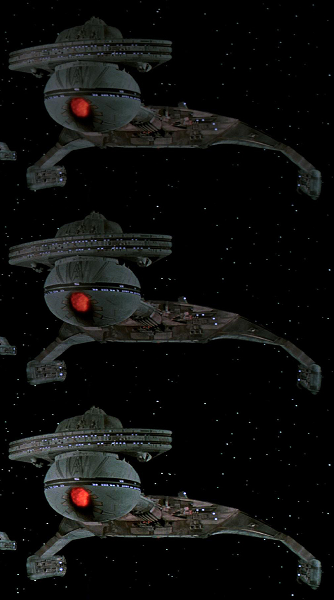
Polar Lights Model Kits: 1:350 scale Klingon K’t’inga update
UPDATE [11/8/2018] Klignon K’t’inga kits (and light sets) landed at our warehouse on Monday 11/5. It usually takes 1-2 weeks for kits to make it to retail once we receive them. So look for kits in just a matter of days!
Hi All. We just wanted to mention a few quick things about our all-new 1:350 scale Klingon K’t’inga model kit, and we won’t bury the lead. THE KIT IS ON THE WATER! That means it is currently on its way across the ocean to our warehouse. It should arrive there before the end of the month and reach retailers the first week of November. So, get your Halloween costume finished. By the time you finish your trick-or-treat candy, the kit will be here.
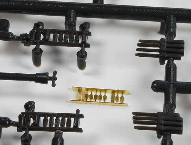
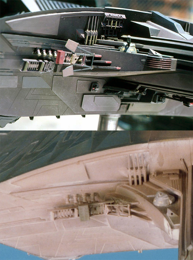
It has come to our attention that we haven’t really given much detail on one of the aspects of the K’t’inga’s Lighting Set. That is the photo-etch sheet that we have included in it. Many have asked what is included in that and why it would be needed. Well, there are several factors at play here.
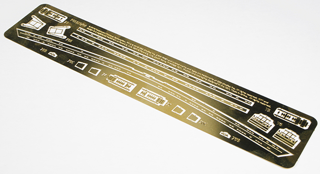
Some of the details on the studio model were too slight to properly replicate with injected styrene. We did the best we could with those parts in the kit, but the photoetch sheet allows us to offer parts closer to the original model. There were additional parts we wish we could have included, but they didn’t lend themselves to PE. In those cases, there is no better answer than to scratch build replacements. Modelers that are that particular will no doubt have the capacity to figure out how to do that.
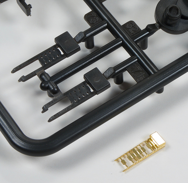
Two copies of this piece get stacked to create a more authentic replacement for part #76.
In a few cases, we didn’t have exact copies of kitbashed parts to copy when we started developing the kit. In those cases we worked form photographs and got as close as we could. Once copies of the real parts were found for reference, it was too late to change the part and stick to our release schedule. So the PE parts represent the real parts more closely.
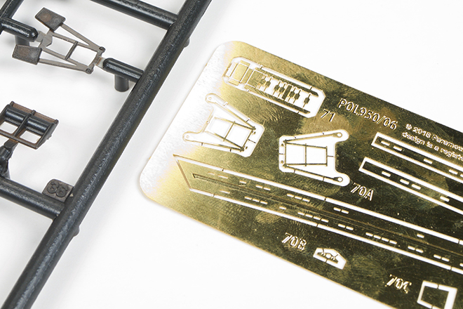
Another significant part of the sheet are window frames for the battle head. At 1:350 scale, (or 1/2 studio scale if you prefer) the windows on the cobra head and the bulb became very small. In fact, they are so small it is hard to inject them completely clean of flash. tool drafting also make them somewhat mis-formed in some places. We don’t mean to make it sound worse than they really are because the plastic parts aren’t terrible in this regard. They just aren’t as perfect as some will want. Now even the photoetch isn’t a perfect answer for the problem we wanted to address either because it WILL impact the accuracy of the model. The window frame strips are to be glued to the surface of the model which means they will protrude slightly unlike the studio model. So there isn’t a “perfect” answer, but we want to provide as many solutions as we can and let modelers decide which way they want to address it. Keep in mind that dealing with photoetch can be tricky for the uninitiated. It is intended to be used by experienced modelers.
lastly, we just want to mention that there is a an advance preview build going on that is hosted on the allscaletrek.com website.
You can find the threads for that here for the K’t’inga model kit.
and here for the Lighting Set.
They have also reviewed our recent release of the 1:1000 U.S.S. Grissom and Klingon Bird-of-Prey.
Coming off the Shelf – Cruising into Fall

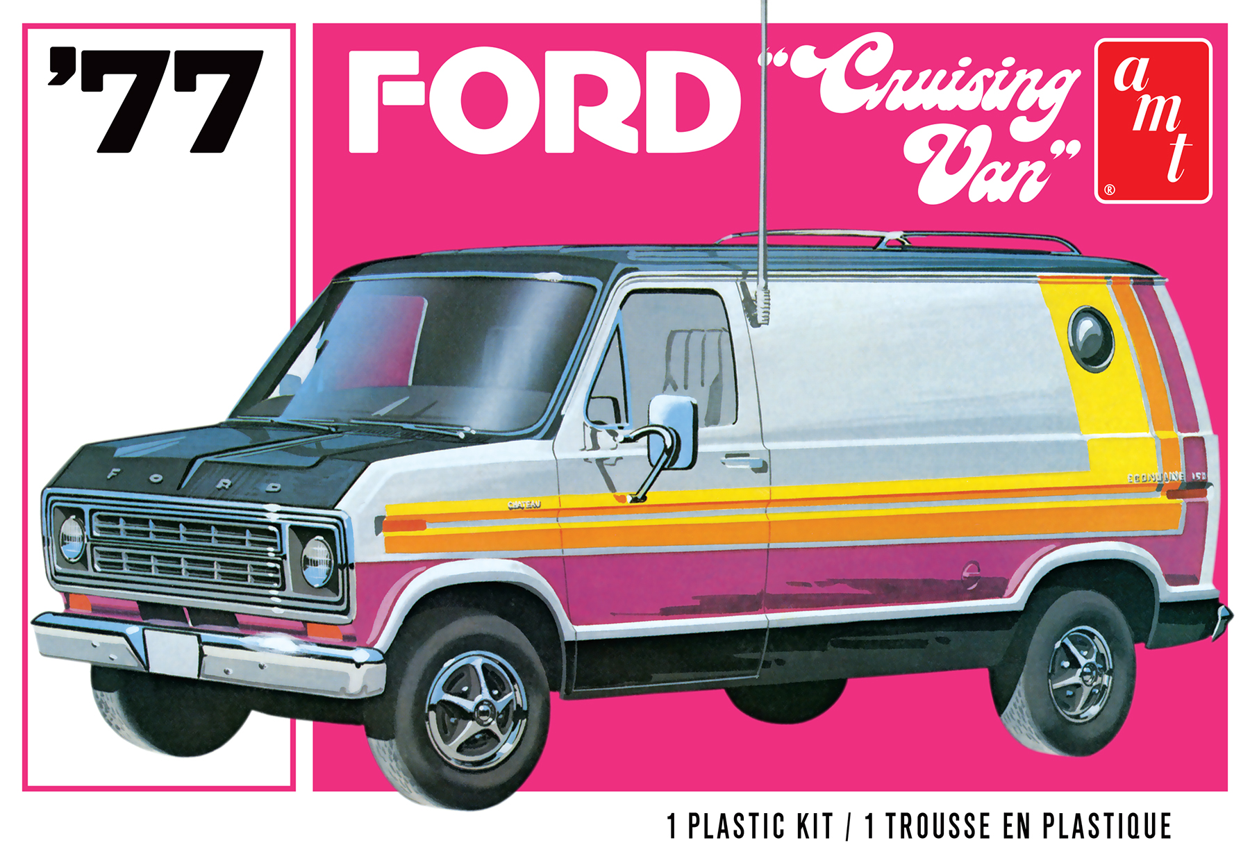
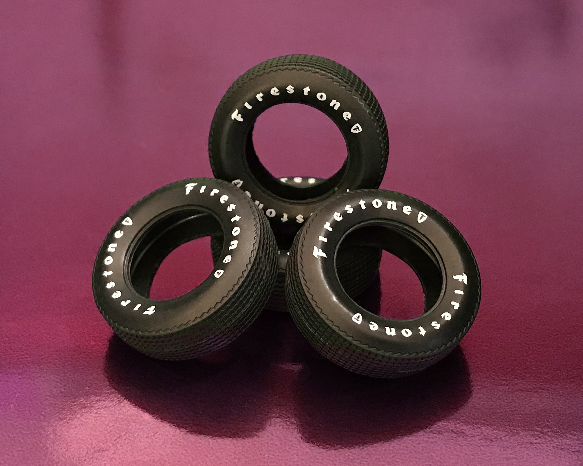
As the leaves begin to change and daylight grows shorter, the perfect time to line up your cold weather model kit projects begins now. Get things rolling with an AMT 70’s classic—one that screams for attention with it’s clean lines, vibrant decals and Firestone tires, the 1977 Ford Cruising Van. Shot in silver, the Cruising Van offers ALL NEW, pad printed Firestone tires and a large, expanded decal sheet—which now provides a second colorful option of in-your-face stripes, once offered for the real van, port hole window decals and additional detailed graphics which can only be found from the kats at AMT.
Fall is here, and so is the Cruising Van! Coming soon wherever kits are sold.
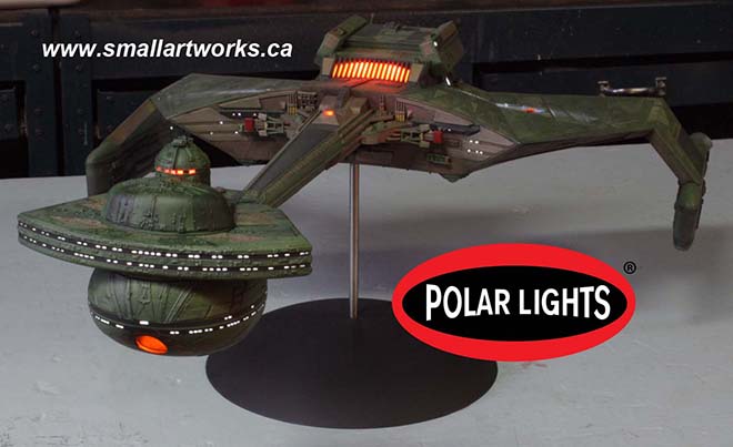
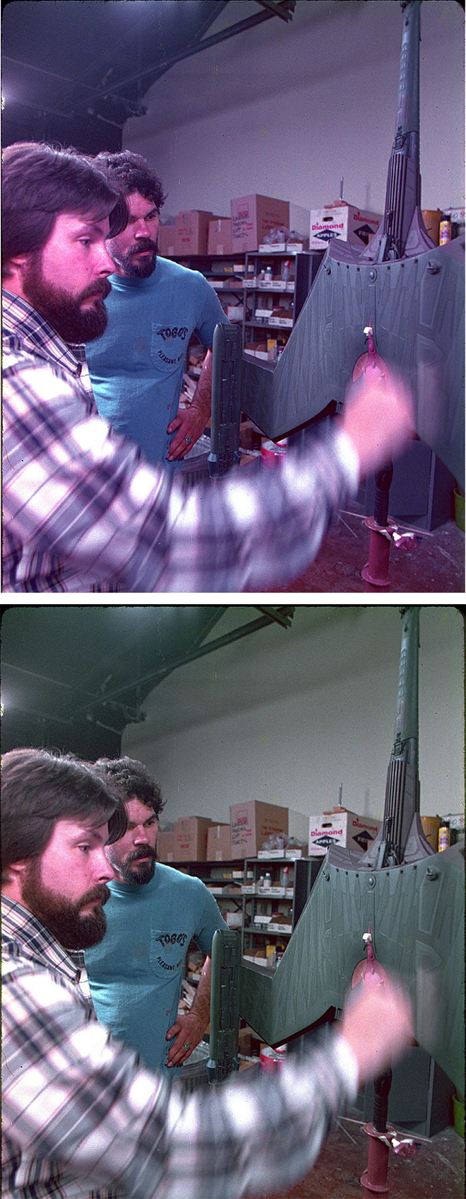
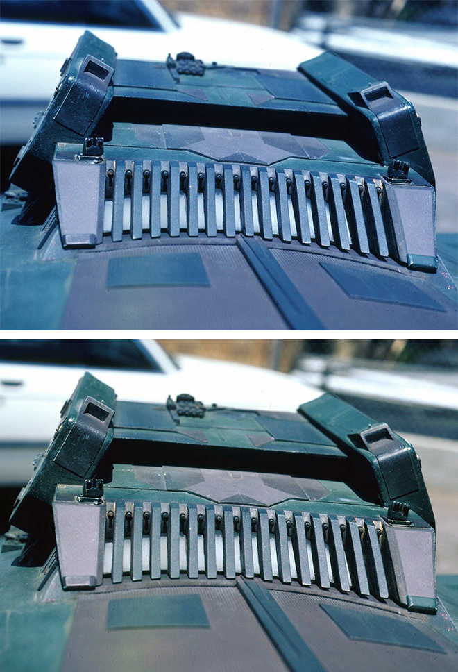
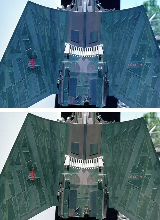
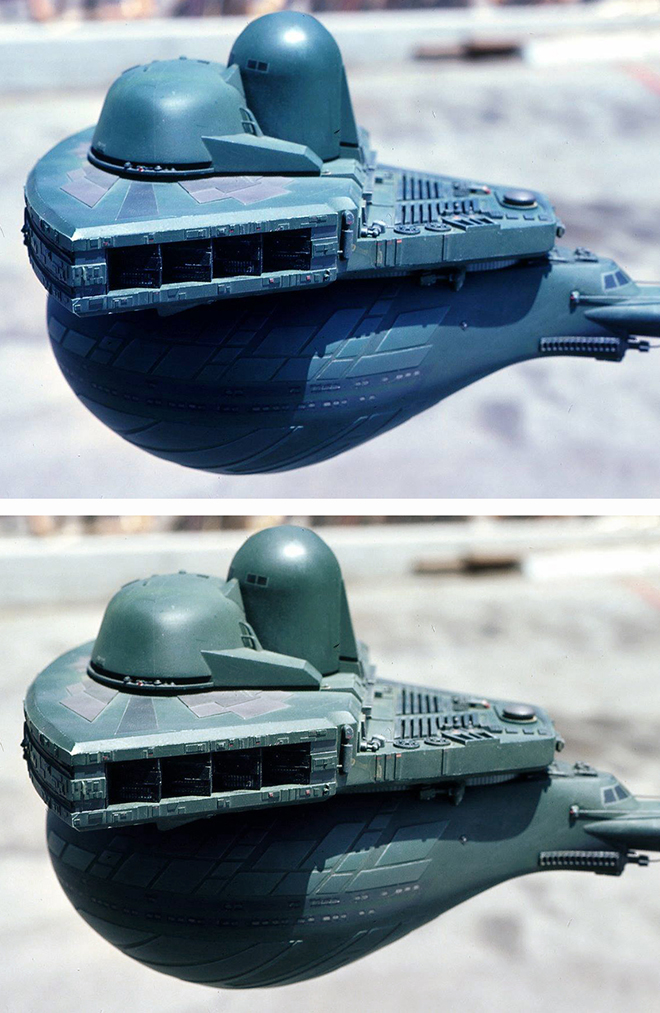
Polar Lights Models: Klingon K’t’inga buildup process Pt.7
Continuing our series of guest blogs covering our brand-new STAR TREK: The Motion Picture 1:350 Klingon K’t’inga model kit…
Finishing, The Final Frontier.
James Small, www.smallartworks.ca
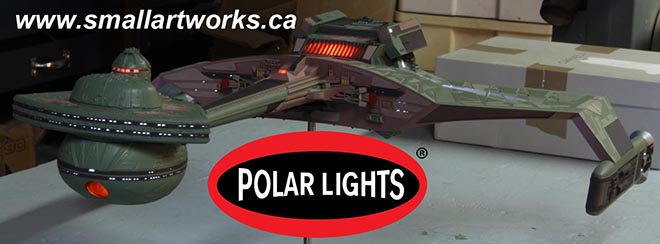
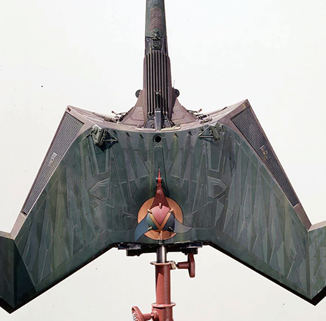
Not really much to tell on this post, the last of the series on building the K’Tinga from Polar Lights, Round 2. The pictures pretty much speak for themselves. After all the main colour coats were done, it was time to weather the model, doing so with a dark green wash to tie the colours together, some airbrushing with a tiny hint of black scorching and streaks of zinc chromate. Then the decals were applied. Normally one would say you should apply the decals BEFORE weathering but in this case the decals are small and I didn’t want them to be obscured, lest the low lighting conditions used for the photography would lose the markings altogether.

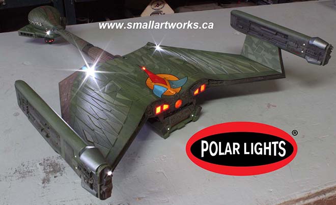
The decals were test prints sent to me by Jamie in slightly past the “nick of time” we would have liked, but they worked out really well. The only challenging decals to apply are the set of four that make up the big Klingon symbol on the bottom of the ship. When you do this as you finish your kit, make sure you take your time planning them out, and they will need a lot of coaxing and setting solution. The front “splash” surrounding the torpedo tube had not been printed at that time, so I had to spray that one on from scratch by first masking off the area, spraying on some gold and then following up with a touch of clear orange to match the colour seen on the Klingon symbols.
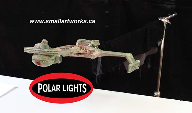
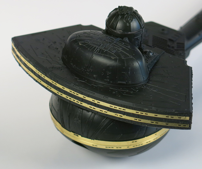
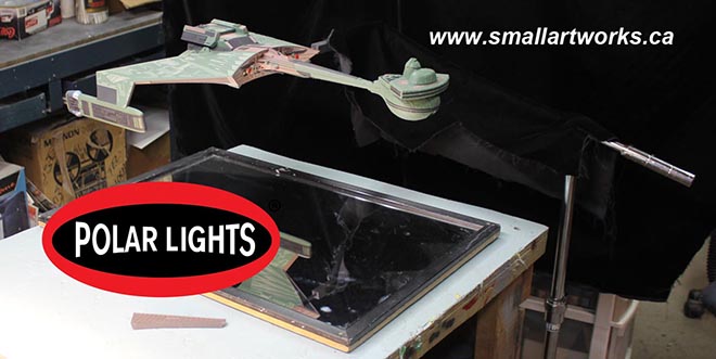
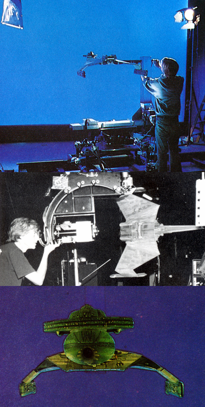
After all this was done, the model was finally finished and I began what would end up being one of the most challenging photo shoots I’d yet done for a model. It took me a full day to figure out the right balances of exposure, aperture for depth of field and lighting so it would all look wonderful on the box art. We also wanted to try to match the ominous look of the ship as seen in the film itself yet see all the details and retain proper colour balance. I had multiple light set-ups, bouncing light off the ceiling, walls, floor, some direct and some indirect, lights on stands, some attached to the ceiling, some on the floor across the room… it was a lot more complex than one might imagine for such a shoot and required a lot of time to figure out to get just the right look. Then I spent another day or two actually taking the shots. I took many dozens of shots testing it all before I could get it to look right. Because the model is so dark and required such long exposures at high resolution, microvibrations in the floor (even though concrete), in the air, whatever, maybe in the camera itself for all I know, made the camera move JUST enough to blur the image slightly. I also discovered that really long time exposures make a digital camera’s dead pixels (all digital cameras get them after even a short time of use, it’s a disease like tooth decay) really stand out like a klaxon! To account for the blurring, I had to do faster exposures with a wider aperture, and then stack shots so they could be stitched together by Jamie in Photoshop to cheat the depth of field. These challenges were exacerbated by the fact that I don’t really have professional photographic equipment, namely a more expensive camera (the Canon Rebel I have is a good camera but is after all, consumer grade) and a good solid tripod. Really good tripods that eliminate the slightest vibrations can cost a lot of money. Also, Jamie had very specific angles in mind for each shot, so it would follow his box art layout, and that took considerable time in some cases to set up and line up as well.
The build took far too long to do (I still have to paint the other two but I’m taking a short break from them to do something else for a while as I’m all K’Tinga’d out right now), the pix were done, the box art under way. I therefore present to you here and now the very first look (no, these are NOT the pictures used for the box art!) at the completed new 24” long K’Tinga kit which is right up there with the most comprehensive, most accurate sci-fi model kits on the market today!
We’ve tangled with solvents, paint and plastic. Now… it’s Chardonnay time. Cheers!
And as a special bonus, here is a look at the box faces for both the kit and the light kit!
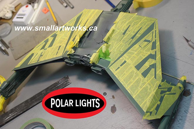
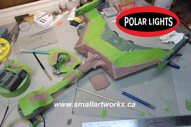
Polar Lights Models: Klingon K’t’inga buildup process Pt.6
Continuing our series of guest blogs covering our brand-new STAR TREK: The Motion Picture 1:350 Klingon K’t’inga model kit…
Painting in Klingonese. The Grueling (But Still Fun) Part.
James Small, www.smallartworks.ca
“The Making of Jaws” pocket book printed back in the mid 1970’s has a funny line placed as a caption beneath one of the photos of the crew preparing to shoot a scene. The line has always stuck with me. I quote it a lot because I think it’s clever and is true of many things besides just film making. It reads, “It’s not the time it takes to take the takes, it’s the time it takes between the takes that take the time to take.” I was trying to find a way to adapt that to how you paint a model like this and fell short by a wide margin. The closest I could come up with is “It’s not the time it takes to paint the model, it’s the time it takes to prepare and mask the model that takes the time to paint.” Yeah. Really lame, I know. I’m not much of a meme generator. Hopefully I’m a much better model builder than a writer or I’ll have to go get a job at Wal-Mart.
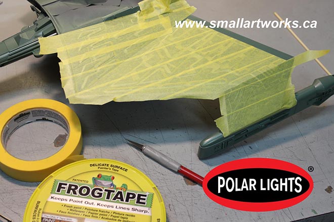
Anyway, the following shows what I consider by far to be the most grueling part of building this kit. It requires tremendous patience and even more masking tape. The tape itself is important. Make sure you don’t use some cheap-o no-name bargain tape. Use something that really works. I like to use “Frog Tape” which is readily available even here in the backwater town of Truro, Nova Scotia. It’s twice the price of standard painter’s tape but is better for preventing paint seepage under it than generic tape, but still a hell of a lot cheaper than the hobby tapes like Tamiya and so on, especially when you need to use a lot of it like on this model. It comes in two types. Regular (green) and the yellow stuff made for delicate surfaces. I used both as you will see. There are advantages and disadvantages to both. The green has a more aggressive adhesive, but the yellow type is semi-translucent and is less likely to peel off the paint you are masking over when you remove it. The hobby tapes are a lot thinner (meaning less wide) and people see that as a massive advantage. It’s easy to adapt the Frog Tape to do the same thing though. Simply lay a strip down onto a CLEAN, dry piece of glass and use a ruler and X-acto knife to cut strips to whatever width you like. Then just peel the tape off the glass when you’re ready to use it and put it in place.
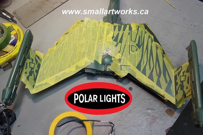
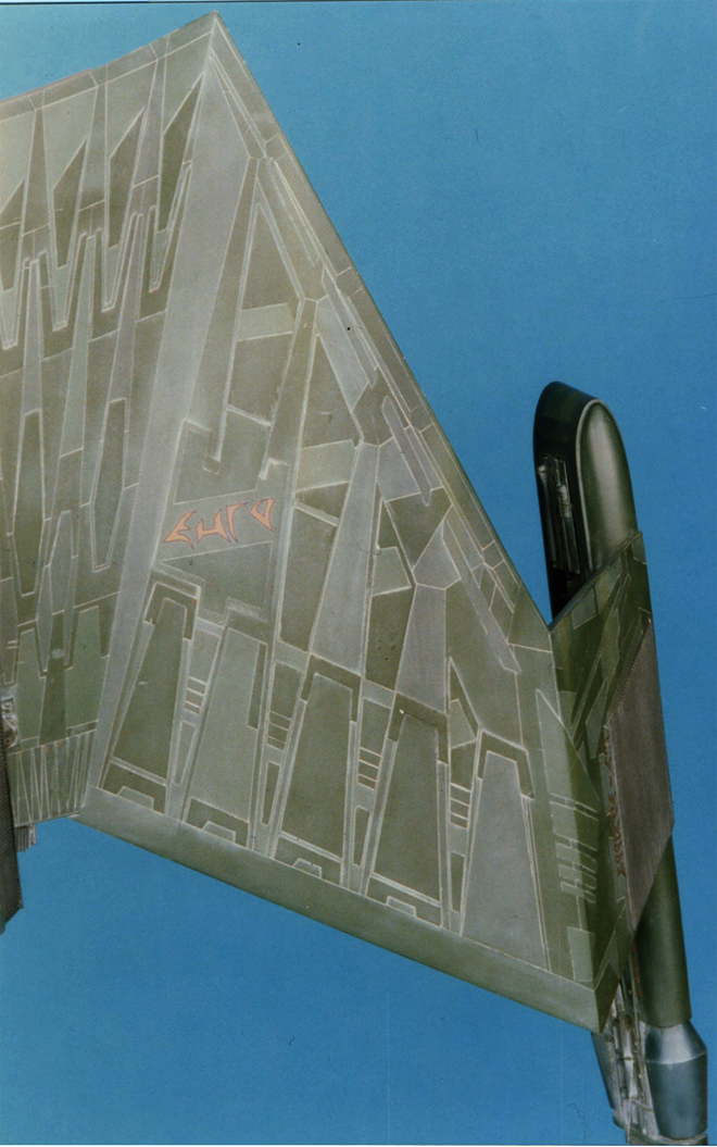
But with the green paneling that covers the bottom and top surfaces of the main body and “wings” of the K’Tinga, I opted to simply cover the whole thing in tape and then use a pointed bamboo Kebab skewer, (but toothpicks could work too) to push the tape down into the nooks and crannies and then cut out the sections that will be sprayed onto. Just make sure the edges are pressed firmly into place. Because there are three different green colours, it gets a little complicated and confusing, and is really hard to describe here so I’ll let the pictures do most of the talking.
The yellow Frog Tape is laid down onto the darkest green painted surface. Normally you’d want to paint the lighter colours first and then cover that with the darker colours, but in this case the darker green is the main colour so it was put down first over the primed and light-blocked hull (the production kit will be molded in black so light blocking will not be much of a problem!).
The long and tedious task of cutting out the panels to be sprayed first, the “medium” green colour, begins.
Same for the bottom.
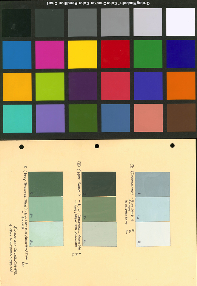
Spraying the medium colour with an airbrush is done and then the tape is cut out and removed for the next (lightest) colour of green to be applied. All the colours were mixed by decanting various rattle can paints into a mixing cup in previously determined proportions to match the colour chips that Jamie gave me to follow. How those colours were determined was covered extensively in Jamie’s previous blogs posted or linked to on this page.
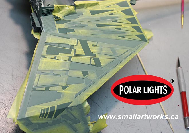
With the medium colour done and dry, it’s covered up again and then the panels that will receive the lightest green colour are cut out and sprayed.

The green colours all applied, all the masking is removed. This procedure took me several days as the alkyd paint needed to be fully dry for 24 hrs or more before the next colour could be applied, and the masking alone took many hours. All the paint was applied with an airbrush, done by decanting the paint from the rattle cans into cups, mixed to match the colour chips Jamie provided me with and sprayed onto the primed surfaces.
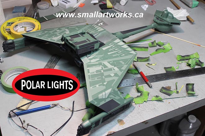
With the three layers of green out of the way, it was time to start laying down the other colours. This part was actually a lot more fun, as it was a lot easier, less time consuming and really started to flesh out the final look of the ship! This picture shows the model with the “light black” sprayed on. For this, I used 10 parts black Krylon primer (which is not true black to begin with but actually an extremely dark gray bordering on black.. difficult to describe!) mixed with 1 part white primer, and it seems to have the right effect. The nice thing about using primers is that it dries quickly, is less likely to react with the paints underneath and provides a nice silky matte finish.
The indescribable brown/tan/pink/oxide/mauve/taupe style colour… (I’m convinced that the VFX people said to themselves “Let’s see if someone forty years from now will be able to figure THAT one out when they try to build replicas of this ship!”) was painted on after the black, so all the green and black were masked off as one should expect and the pinkish stuff was sprayed on. Since there was also a lighter colour of pink to spray on, the same was done for it as was done for the green for various panels. I cheated in some areas and simply brush painted a few of them.
Starting to look the part, eh?
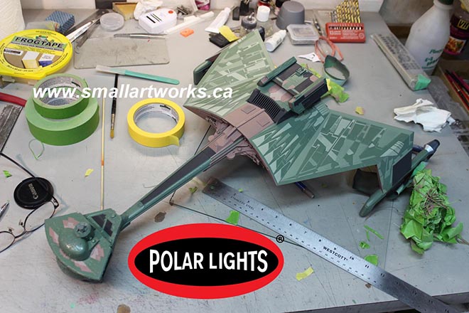
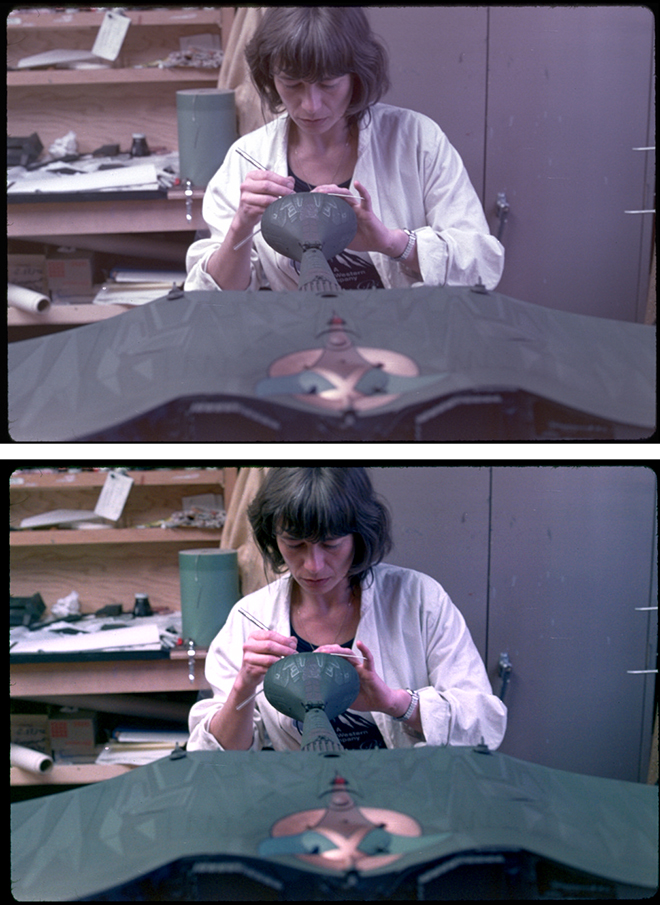
Now some of the smaller details are decorated using the old tried and true brush painting method using the small jars of easy to use hobby paints. There are some errors as seen here which will be touched up before proper photography.
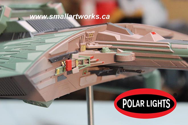
The model is nearing completion. Lighting is tested and paint work evaluated. At this point I did some photography of the model in this state for some of the painting instructions that will be included with the kit. Jamie will work his Photoshop magic as required to perfect the shots as needed to make sure the model is accurately depicted.
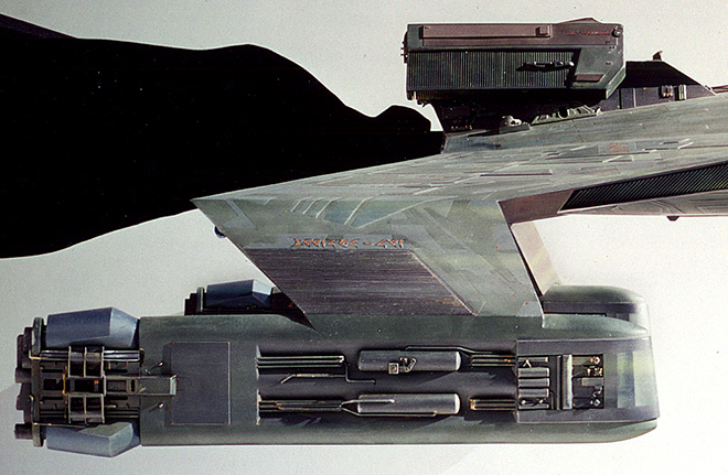
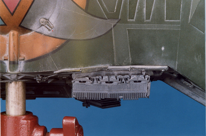
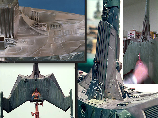
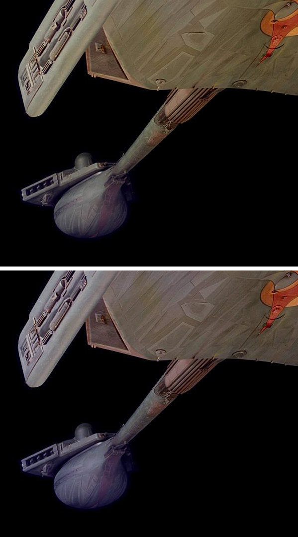
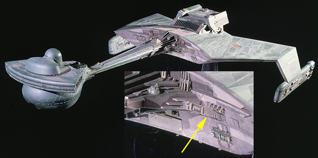
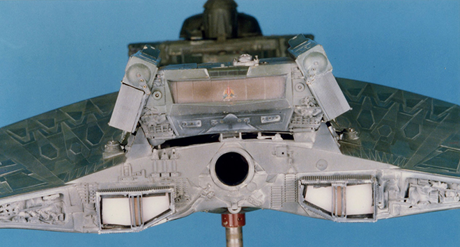
The mounting point modifications I made for this particular one can be seen here used as designed. In this case, the left grille, normally held in place with a magnet and seen here below the Polar Lights logo, is removed and the model mounted to a C-stand in front of a black velvet backdrop over a mirror to bounce light up onto the underside surface to give it a flat-lit appearance. It was shot using a 300mm lens from about 25 feet away, making the photos appear mostly orthographic so as to best show off the paint work in a blueprint-like format. The removable grille and other hatches designed into the modified kit as described previously allows the stand to be mounted into the model away from camera so as not to be in the way of any other parts of the it when photographed. This technique has become a staple for much of the photography I do for Round 2’s box art that Jamie uses to show how to decorate the kit for you, the builder. This makes finishing as clear as possible using actual photographs of the finished model in full colour instead of the usual crude grayscale diagrams that used to be done by kit makers in the past. Similar setups will be used after the model is completely finished with decals and weathering and dramatically lit for some VFX shots for the main box art photography.
Now you can see why I made all those modifications!
One more blog post to follow when the model is completely finished.
Jim did an excellent job matching the paint swatches I sent him, but everything turned out lighter in real life than I had guessed. I would never ask him to remask and repaint this ship. Luckily, we have the weathering stage to darken it up and the magic of Photoshop to get the look we want on the packaging. But did you see the light!?! Holy cow!!! -JH
Polar Lights Model Kits: K’t’inga… the colors, man… the colors… (Pt. 3)
Not to get confused with our buildup series from Jim Small, Jamie Hood has returned to share his research into the paint colors of the Klingon K’t’inga filming miniature featured in STAR TREK: The Motion Picture. Here is the third of three parts…
So getting back to the solid data we have in that scan of swatches. You’ll notice that the written notes suggest different color sets were used in different areas of the model.
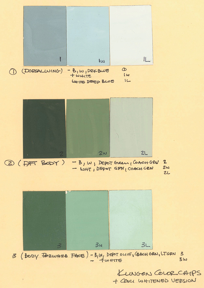
This may have truly been the case before the bridge details were added, and further evidence shows most of the head was probably repainted. So we have to ignore or at least downplay those colors. The lightest tones also seemed too light compared to all of the photos. Btw, we’ll rely on the Bill George photos for referencing the greens…
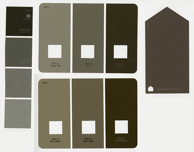
but we will rely more on the Apogee pics for the neutrals.
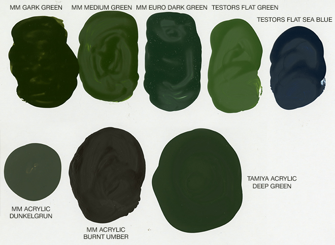
So we are rolling with the idea that we’ll use two dark greens on the swatch page as the base tones in the photos seem less different value-wise than they do temperature-wise, then use the swatch marked 2w as the lighter tone. I took a quality print out of this swatch page to our local Lowes and chose Sherwin Williams sheet #325A to communicate the colors to Jim for our buildup. It is a neutral (It leans neither “cool-blue” nor “warm-yellow”),soft (not too bright) green. It is very much a “leaf green”. (If you want a slightly yellower green, the SW #324A card will get you there.)

Here are a few model paints I picked up to see if anything happened to match. Some of these colors get us in the neighborhood, but may need to be combined or lightened. The Sea Blue goes on the rear end of the nacelles.
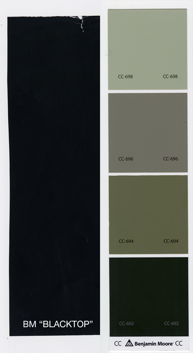
I mentioned that John Goodson had identified a couple colors through the Smithsonian data base. He described the results as such “the base color is Benjamin Moore, Topsoil- CC – 692, the darker accent color is Benjamin Moore Blacktop – 2135 – 10.” So after googling the colors, I was baffled… (I also attained swatches from the store. Ironically, one color was only available in Canada…) Neither looked like anything I was seeing in photos and neither was close to the main greens or neutrals. Based on all gathered reference, both seemed way too dark to have been used on the miniature.
When I asked if it was possible these were the neutral tones, he described the area he took the scan from as “the readings were taken from an engine piece so it’s only the greens not the brown.”
(Side note: I just re-discovered this shot of the nacelle which was likely part of the outdoor photo series. Note the small specs of red on the pylon and nacelle. There were A LOT of these scattered around. A few still remain on the face of the cobra head in the Bill George photos if you look for them. Go back to the images from Cinefex that I showed in part 1. You can see more of them there. They are even too small to include on the decal sheet, but a touch of paint from a fine brush might be needed by purists that pay that close of attention.)
I determined that the darkest neutral we see in the center of the nacelles may have been in the neighborhood. Also going back to the flyover view of the model supplied by Andy Probert…
we see that the entirety of the back of the ship was a dark neutral. Jim and I decided (yesterday) to settle on a “light black” for this color. The kit will be injected in this color and it is close to the Blacktop color match. Besides being a nice dark surface to start with from a painting standpoint, it might also help with light leaks. It has been determined that this dark neutral was used everywhere I had perceived as the dark blue in the Apogee pics. (reflected light from the clear blue sky…?) This color is also used for the bands around the windows on the head.
The green shades all show plenty of variation as if each shade was blended into the others, and in a few cases we pick up on darker green tones especially on the head and engineering area. Chromium oxide paint supplies a few distinguishing streaks of green/mustard yellow over everything. This is apparent in both of the photo surveys. There seems to more weathering streaks on the bottom that can be perceived on top.
Which leads us to that pesky neutral tone. We have to ignore the tan mess that we see in the Bill George pics, but can we rely on it for color temperature? (the “tan” is new, but how close was that to the underlying color?) We have to weigh the look of the color in some pics against how it looks in others. The early Apogee photos look close to that early pic of Andy Probert painting the weathering. It looks more like a gray, but possibly a warm gray.
However, the early overhead/rear shot makes it look reddish like a deep mauve. (shown here with a touch of color correction)
“Mauve” can have varying degrees of potency. Sometimes it can look like a very gray pink or a desaturated reddish or purplish brown. At a certain point, you just need to make a call… and then change your mind… then change it again… In the end, I decided to compare the amount of data (images) leaning each direction and followed the one we had more of which landed us on the mauve track. To achieve this in a practical way will be a matter of lightening Burnt Sienna model paint. Tone it down with gray to taste. Or if you like the less colorful option, start with Umber model paint and lighten it. At this moment, we haven’t nailed down the exact formulas, but we know what we are aiming for. Here are a selection of paint chips I picked up to send to Jim. I was first going to have him target the range shown on the left, but in the end we decided to use something closer lightened tones of the swatch on the right. (this scan comes across de-saturated compared to the real chips)
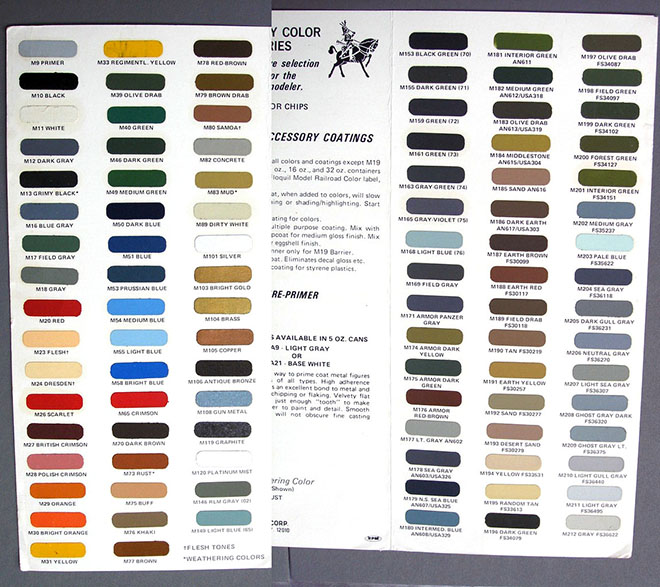
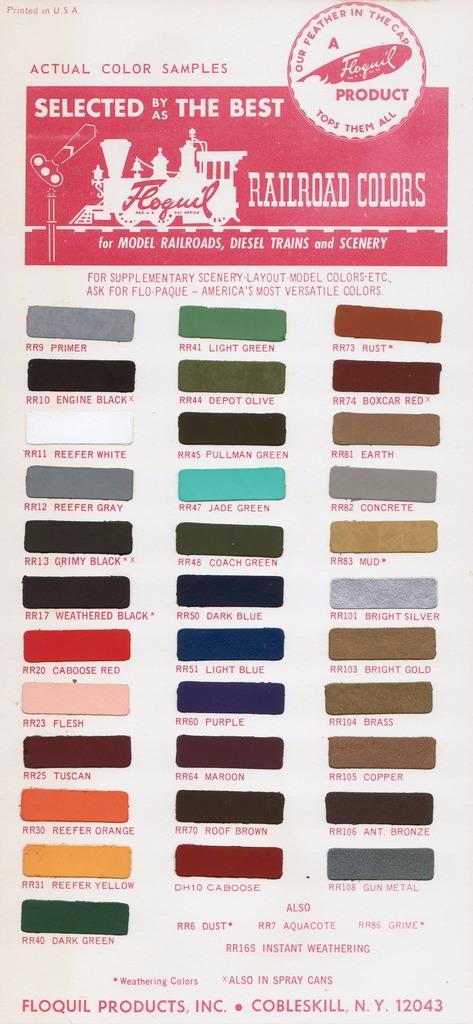
If someone wants to make some suggestions… If you have an extensive Floquil paint collection and you think you can decipher which colors were used, speak up fast. Maybe we can take your suggestion into account for the kit.
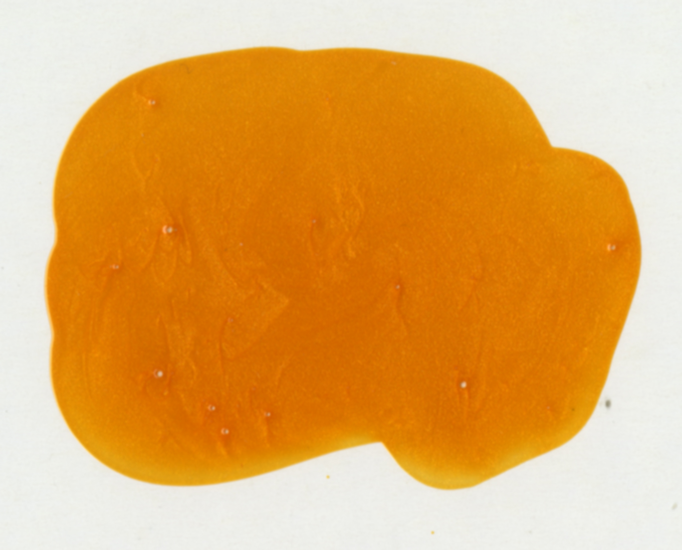
Oh! And that metallic orange… Model Master turn signal amber over white (because it is translucent). But you’ll only need that to touch up a couple details. We’ll be using that to match a metallic ink color on the decals…
So… yeah…whew… that’s it. Or at least everything I can articulate in any kind of organized way. I’m sure your mileage may vary. Do with this info as you will. At least use it as a reasoning for what we will specify in the kit.
Polar Lights Model Kits: K’t’inga… the colors, man… the colors… (Pt. 2)
Not to get confused with our buildup series from Jim Small, Jamie Hood has returned to share his research into the paint colors of the Klingon K’t’inga filming miniature featured in STAR TREK: The Motion Picture. Here is the second of three parts…
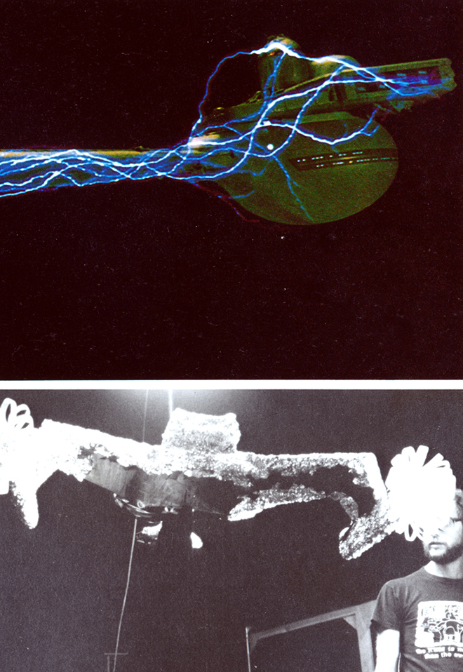
If you take screen caps of every appearance of the ship as it appears in ST:TMP (like I have…) and study/compare them, you will come to notice a few details change. These changes help us track the shooting order. The first shot of we see of the ship on screen was not the scene that was filmed first. I’m no special effects wizard, but as I understand it, a given appearance of a model on screen is actually filmed several times to create matte effects that when combined make us believe a space ship is flying through a remote galaxy. For part of this, the ship itself needs to be covered up. Consultant Charles Adams shared how the story he heard was that in some cases the ship had to be wrapped in aluminum foil for some of these passes. (One of the images from Cinefex #2 shows the ship in this very state.)
When the foil was peeled off, some of the fragile details came off the model. In some cases they were replaced… or misplaced… or lost along the way. What we have come to discover is that portions of the model were also repainted DURING filming. That is one of the reasons the Bill George photo survey looks different from the Michael Middleton survey.
We might have assumed the repainting came when the last minute details were added after the model was handed off to Apogee. I’ll present my case for the repaint during filming theory as we go. So the best way to walk us through this is by formulating a chronological history of the model and point out what changed along the way.
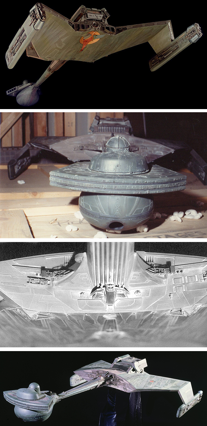
Images of the “Phase II” Klingon Battle Cruiser exist. I am not clear about whether that model eventually morphed into the K’t’inga filming miniature or not. It does seem to have some distinctive similatiries that lead us to believe they might be one in the same.
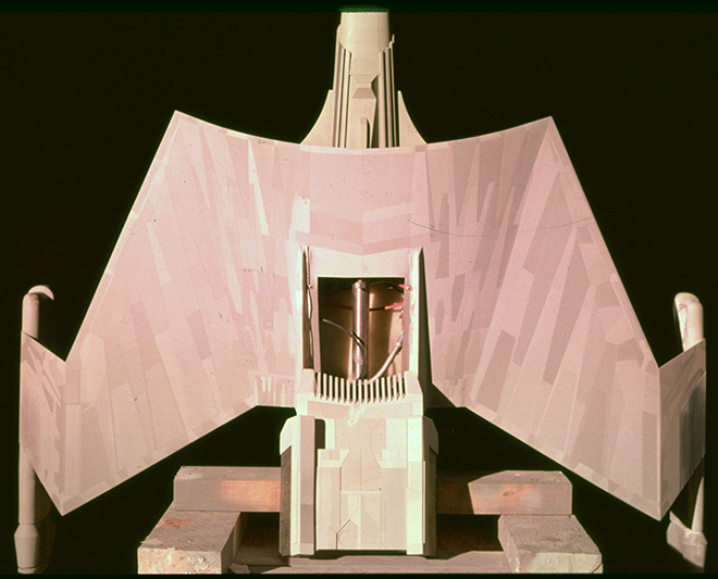
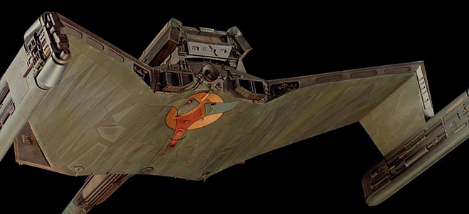
These are the earliest clear photos we have of the miniature as it was being painted. (I will be showing the original images as found next to color balanced versions. If you want to know what my system was for correcting color balance in Adobe Photoshop let me know in the comments. I can’t take the credit. Youtube is the best instructor I can find for the money.)
We see a deep Kelly green used for the primary color. It has a matte finish at this stage. Lighter colored panels might be mistaken for light playing against them leading you to believe it might all be one color, but after studying all of the reference I have determined that there were three primary shades of green. Some areas of the neck are a dark neutral. Determining exactly what color or family of colors this is becomes one of the biggest challenges. The scan of swatches we do have does not show the neutral tones. Are the smaller panels in these areas a lighter neutral or are they greens? And did this neutral tone survive to filming? The color doesn’t seem as highly pigmented as we will find in later photos. Note that the orange of the Klingon symbol is metallic. This isn’t the only spot this metallic orange was used.
I hinted that I thought the model might have been completely repainted at some point. I’ll pause here to say that I don’t think that is the case. I think all of the green tones we see here stayed in place. Were they weathered over? Sure. Were the neutral tones repainted before filming? I think it comes across poorly in the Probert photo, but I think what is there stayed there… for a while at least. Further to this theory, if the ship were repainted in whole I would have to ask “why?” Considering the time and expense that would incur, what would be the value to repaint all of the panels, but in just slightly different shades? These were people making a film on a budget and deadline. If the color differences were more substantial, I could get onboard with the idea.
Next we have a couple images of the ship in its delivered form… well, almost as one small detail did change on the neck between this and the photo set taken at Apogee.
However, this one confuses us as to the true color used for that pesky neutral tone. The lighting gives it a purplish tone, while the overhead shot makes it look like a reddish brown. We don’t know for a fact that these two images were taken at the same time, but given the quality, setting and nature of the shots, that is my assumption. Also note we can pick up on some color variation on the raised panels on the head bulb.
Next we have the survey taken outside by Michael Middleton. A few of the overall views were relatively balanced.
Adjusting the color balance on the rest significantly steps greens much closer to the Bill George photo set. The neutral tones become much warmer and look less like “steel” gray (even though I have constantly had to fight my personal bias that that would make a better looking model IMO). It could be described as a warm gray or “French” gray.
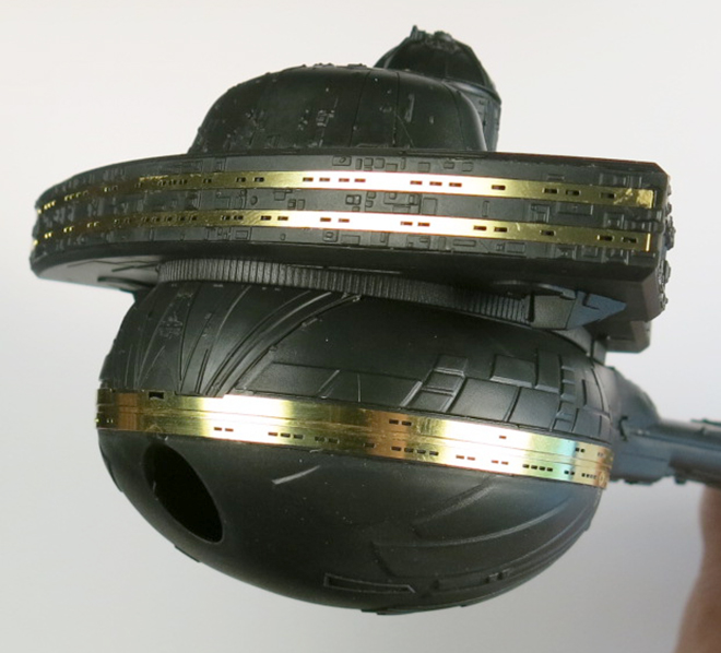
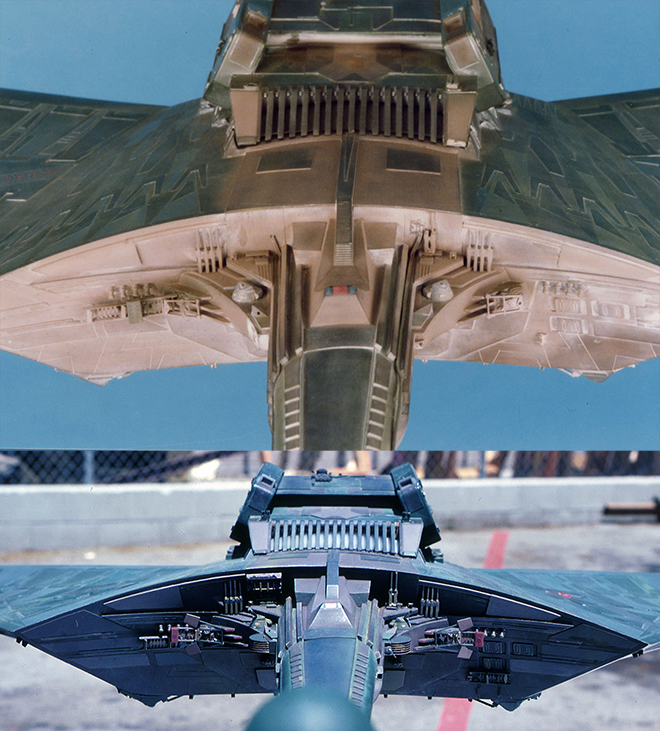
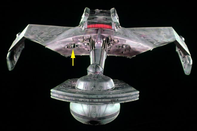
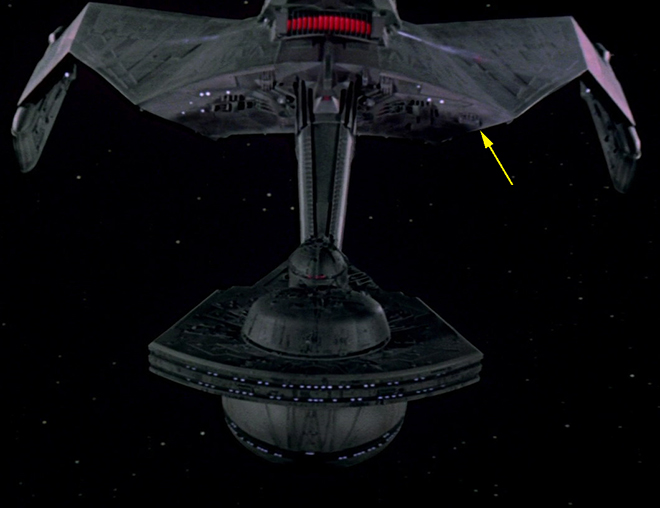
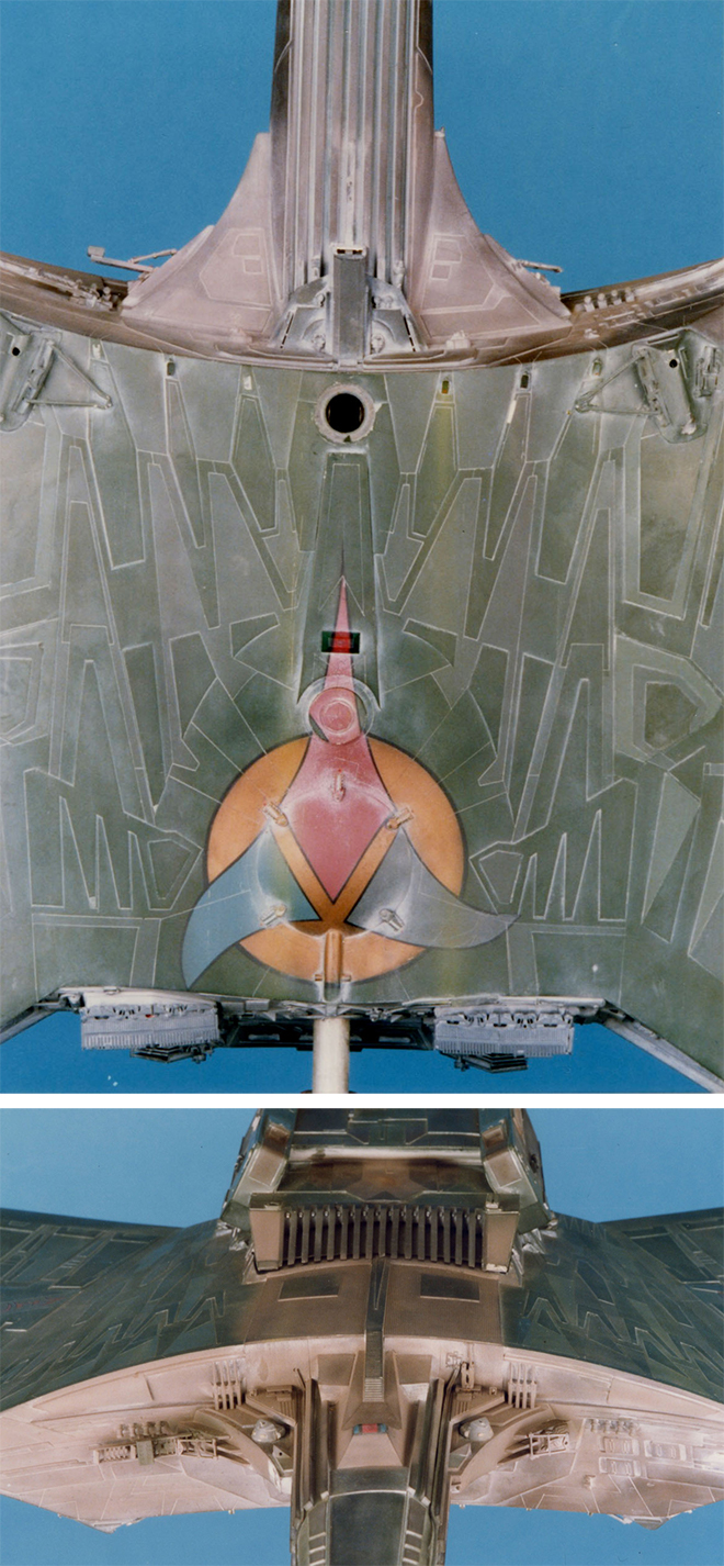
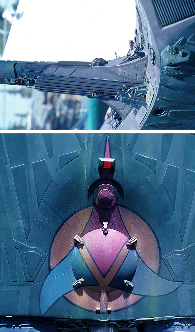
Be sure to note the details on the sides of the neck. There are two orange-ish “fan” shapes and a noticeable red box form there.
It seems that there are some spots of dark blue on the engineering housing and along the center of the neck.
Note both the Klingon symbol and the registry on top of the ship incorporate that same metallic orange used on the bottom.
We can also see that the raised panels on the head bulb were indeed a lighter shade of green.
I have not seen a “pure” photo of the ship as it appeared on the first day of filming. From the outdoor photo set, we go to the film and what we can see on screen. Ignoring how it looked chronologically on film, I will walk through the chronology of the photography instead.
In this flyby sequence, we should note those “flag” details I mentioned earlier. The lower flag was removed from both sides prior to filming. The color of the ship is a soft green and the neutrals look…mauve… is the best color description. Mauve is a pinkish neutral tone that is achieved when red, blue and yellow are mixed. It isn’t “gray” and it isn’t “brown”. It is a hard color to describe.
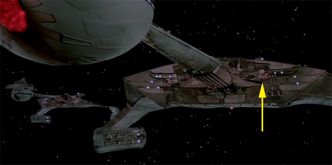
This shot was flopped in the film. (corrected here) The color looks significantly different. The bulkhead seems to be green now, but it was not repainted green. The fact it looks green is a camera trick, but it WAS in fact painted over.
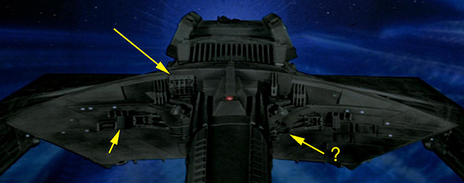
Note the presence of the detail to the upper starboard side of the neck on the bulkhead. This part can be seen very clearly in the outdoor photo survey and has been identified as a rail gun model kit part. It is tough to detect if one notable detail is missing on the port side of the neck, but more on that later. (Let’s assume it is missing though) The red boxes look just as green and the upper flags that had been present before have broken off. Don’t be fooled. The red boxes we saw in earlier pics were not repainted. They were replaced altogether, and the new ones were green. Proof of which can be found in the following images. (I’ve seen another angle of the ship at this stage that makes this fact more apparent.)
Oddly enough, this behind the scenes photo was not the same shot used on screen in this scene…
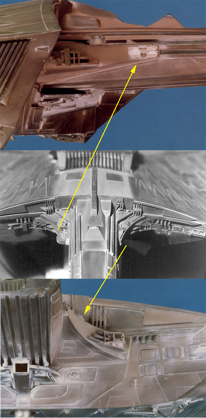
Because we can note the rail gun part has moved to the port side of the bulkhead. It had fallen off the model and was placed back in the incorrect spot. Note in the close-up neck comparison above that there is no trace of the part in the later photo.
Now we flash forward to the Bill George photos taken when the miniature was pulled out of mothballs for STVI.
Ignoring the “white stuff” we see that the overall color and panel color variations we saw on the bulkhead in the Apogee photo set has been “tan-washed” in that it has been given a “whitewash” of tan paint which can be seen in the comparison photo back at the top of this article. It seems to have been applied with little precision as we see over spray here and there where it was sprayed on other details on the engineering area.
I noted that a noticeable detail may have been missing a couple steps back. This would have been the half-moon detail on the port side of the neck. By the time this photo set was taken this detail was missing from both sides, but note the starboard one fell off after long after filming (maybe when it was uncrated?), leaving a white mark. The spot where it had gone missing on the other side was overpainted with the tan. This is what leads me to believe this area was (hastily) repainted during filming.
The dark blue I had mentioned on the neck in the Apogee pics looks more neutral now. Also note that the panels on the bulb are no longer lighter green. I am led to believe the lighter shades were done away with when the bridge details were added before filming. In the camera-scraping fly-by, we don’t perceive any lighter panels.
Also note that the entirety of the rear end has been overpainted for screen. This seems like it could just be a gray primer as it doesn’t appear “tan” in any of the photos.
Hopefully, you’ve stuck with me through the story thus far. With all this in mind, it was my task to determine what particular green shades to specify, what neutral tone is correct and how many shades were used and to what extent were “extra” colors used to weather the model. The toughest nut to crack in all of this is determining with some certainty what color was used on the neck and bulkhead. Did the color in the Andy Probert photo last to filming? Is the way we perceive the color in that photo the reality or do we need to ignore the few instances where it looks gray and call it a light brown or mauve? Do I have to decide…?
(to be concluded…)
Polar Lights Model Kits: K’t’inga… the colors, man… the colors… (Pt. 1)
Not to get confused with our buildup series from Jim Small, Jamie Hood has returned to share his research into the paint colors of the Klingon K’t’inga filming miniature featured in STAR TREK: The Motion Picture. Here is the first of three parts…
Who remembers this from a few years back…?
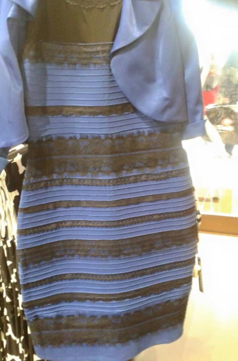
The world cracked in half trying to decipher the real color of this dress. Was it blue and black or white and gold…? (I guessed wrong, but who cares?) I have spent the better part of the last six months studying a similar conundrum in the paint guide for our upcoming 1:350 scale STAR TREK Klingon K’t’inga model kit. The goal is to supply a paint guide that would represent the look of the filming miniature on its first day on set. Why do we have to get that specific? Well, because changes were made to the miniature immediately before, during and after filming. Therefore, the way it looked the day it was first filmed is most likely the way it was intended to be. This story is a long and winding one, but I’ve learned too much not to share. Besides, I fear that without giving this complete explanation we will get letters about how we got it wrong. The truth is we can’t know exactly what it looked like that day AND no one says a modeler HAS to paint his model to match. You do you. Paint it however you want, but the decoration notes in the kit will be our best advice to this end. I’ve looked at this thing every which way, and though I am confident on the direction we will supply, I just changed my mind about some of these colors again yesterday. Besides determining the design of the small clump of detail that sits on top of the bridge dome, figuring out this color situation has been one of the biggest time sinks of this whole project for me. I’ve spent days (weeks) on both…
Let’s start with what we have to work with. Some of it you may be well aware of, some bits have just been revealed as our team has offered their best evidence for the paint colors that were actually used on the model. I’ll start with what we’ve been aware of for the longest time.
STAR TREK : The Motion Picture – The advent of HD makes it easier than ever to get a decent look at the ship in its appearances on screen although the color of the model was very washed out in some of its appearances. It isn’t the best we have, but it will become apparent how much it offers as I go. Photoshop helps too. It can punch up colors, adjust contrast and even sharpen images. It can actually pull hidden details out of shadows in some cases.
Cinefex 1 & 2 – These classic issues featured behind the scenes info on the effects process that shed a little light on how the model was handled.
Bill George Photo Survey – A few years back FX production artist, Bill George, posted the series of photos he took of the miniature when it was uncrated for the ST6 redressing. I have had a chance to get further info directly from Bill as I’ve been studying the model. He did a great job IMO of photographing the model, but he stated they weren’t taken under the most ideal of situations. Shooting in tight quarters made the color wash out in some images. He said the color temperature of the images matches his recollection of the real model and this statement stood up when I took the step of checking the color balance in Adobe Photoshop. One mystery remains about the model as we see it in his photos though. You will notice a white substance that clings to the panel lines and other details on the model. Some might think it is dust that settled in from storage, but dust wouldn’t have settled just as much into the bottom of the model as it would to the top. This white substance is evenly distributed over the model. Bill said that it wasn’t powdery, but would come off when touched. The best theory we have about this was that it probably had to do with some of the “lightning” effects shown when the ships were destroyed by V’Ger. We have all stared at these great photos for so long, we are used to it and we see it as weathering. It really ties the whole ship together. But if it was used for special effects, was it there the first day of shooting? My working conclusion is “no”.
Michael Middleton Photo Survey – This set of pics was taken outdoors and in one case has an Apogee logo on them. (As I understand it, Magicam built the model and Apogee filmed it.) It is immediately apparent that the model was modified by Apogee after this survey, because details were added to the bridge dome including lights. The greater mystery was what more was modified after this set of photos was taken? Some of these pics have been floating around for a while, but they were low res and the color temperature seemed significantly different than the Bill George series. Trek Production Designer, John Eaves, recently shared high res versions of these images and more. However, they all had the same color temperature problem as the low res versions. These higher res images were released pretty late in the game relative to developing the kit. I wish we had them earlier, but they helped check our work and they also helped determine our color research once the color balance was corrected.
Various other photos of the miniature – These range from a lower rear shot that had been shared online by one of the guys that helped design the ship, Andy Probert. We also found an uncredited photo of the ship literally sitting on its crate after being taken out of storage. There is also a survey of black and white photos. They are relatively low res and they hold little value in determining color. I have been shown a few images that couldn’t be shared (Hey, this is sci-fi modeling… These things happen), but I think I can work around them and still make my point.
“Real” paint swatches – This is the latest and greatest! This was shared by Gene Kozicki who was working with Virgil Moreno’s estate. This is a scan Gene took from the original swatch card. Although it does not show every color used on the ship, it provides notes on a few specific model paints that were used. This lined up with additional information from Paul Newitt that Russ Simpson had brought his own full rack of Floquil paints to use on the miniature. In addition to this, Bill George received a couple paint matches from John Goodson who had run paint scans through the Smithsonian Institution’s database like they did on the ST:TOS U.S.S. Enterprise restoration. Although those results were a bit head-scratching, I think I know how and where they were used. More on these as we go.
In the beginning of my study, I had to consider the possibility that the model may have been completely repainted at some point because the color in the oldest photos looked nothing like the color in the newest photos. But none of the reference photos we have were native digital files or even scans from slides or negatives, but scans of prints. In some cases, old-school photograph color integrity degrades. The original photos (or negatives even) could have color shifted significantly in some cases. So, was it repainted or was it just bad color balance in the reference? “Real” paint swatches helped, but they didn’t solve all the mysteries…
More to come…