Recommended Sites


Polar Lights Model Kits: K’t’inga… the colors, man… the colors… (Pt. 3)
Not to get confused with our buildup series from Jim Small, Jamie Hood has returned to share his research into the paint colors of the Klingon K’t’inga filming miniature featured in STAR TREK: The Motion Picture. Here is the third of three parts…
So getting back to the solid data we have in that scan of swatches. You’ll notice that the written notes suggest different color sets were used in different areas of the model.
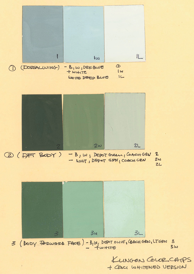
This may have truly been the case before the bridge details were added, and further evidence shows most of the head was probably repainted. So we have to ignore or at least downplay those colors. The lightest tones also seemed too light compared to all of the photos. Btw, we’ll rely on the Bill George photos for referencing the greens…
but we will rely more on the Apogee pics for the neutrals.
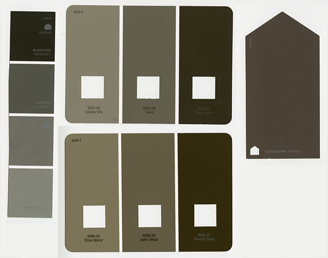
So we are rolling with the idea that we’ll use two dark greens on the swatch page as the base tones in the photos seem less different value-wise than they do temperature-wise, then use the swatch marked 2w as the lighter tone. I took a quality print out of this swatch page to our local Lowes and chose Sherwin Williams sheet #325A to communicate the colors to Jim for our buildup. It is a neutral (It leans neither “cool-blue” nor “warm-yellow”),soft (not too bright) green. It is very much a “leaf green”. (If you want a slightly yellower green, the SW #324A card will get you there.)

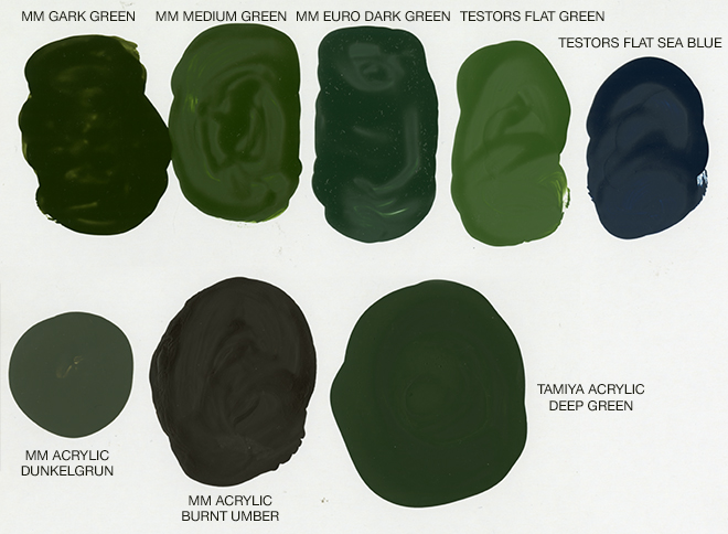
Here are a few model paints I picked up to see if anything happened to match. Some of these colors get us in the neighborhood, but may need to be combined or lightened. The Sea Blue goes on the rear end of the nacelles.
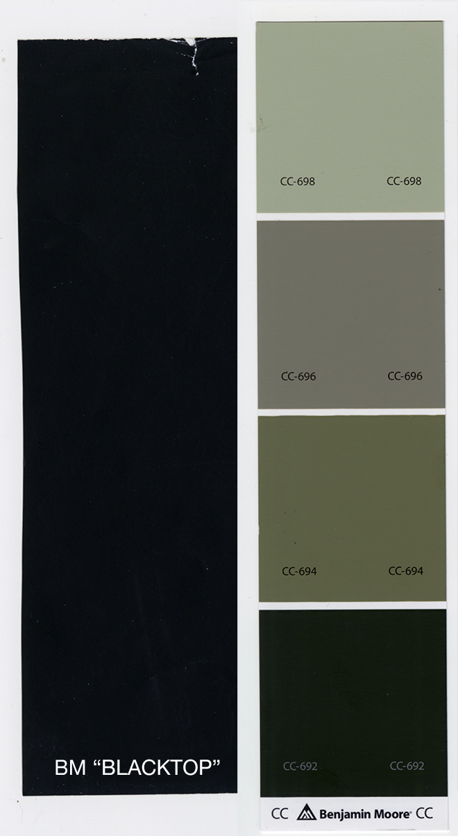
I mentioned that John Goodson had identified a couple colors through the Smithsonian data base. He described the results as such “the base color is Benjamin Moore, Topsoil- CC – 692, the darker accent color is Benjamin Moore Blacktop – 2135 – 10.” So after googling the colors, I was baffled… (I also attained swatches from the store. Ironically, one color was only available in Canada…) Neither looked like anything I was seeing in photos and neither was close to the main greens or neutrals. Based on all gathered reference, both seemed way too dark to have been used on the miniature.
When I asked if it was possible these were the neutral tones, he described the area he took the scan from as “the readings were taken from an engine piece so it’s only the greens not the brown.”
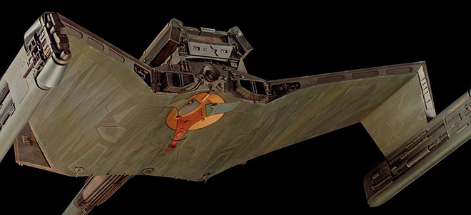
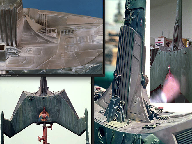
(Side note: I just re-discovered this shot of the nacelle which was likely part of the outdoor photo series. Note the small specs of red on the pylon and nacelle. There were A LOT of these scattered around. A few still remain on the face of the cobra head in the Bill George photos if you look for them. Go back to the images from Cinefex that I showed in part 1. You can see more of them there. They are even too small to include on the decal sheet, but a touch of paint from a fine brush might be needed by purists that pay that close of attention.)
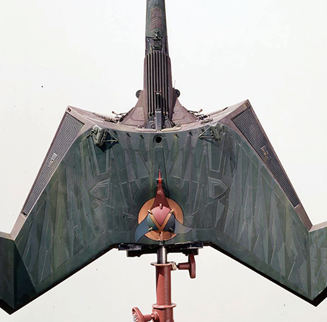
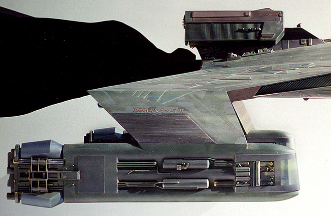
I determined that the darkest neutral we see in the center of the nacelles may have been in the neighborhood. Also going back to the flyover view of the model supplied by Andy Probert…
we see that the entirety of the back of the ship was a dark neutral. Jim and I decided (yesterday) to settle on a “light black” for this color. The kit will be injected in this color and it is close to the Blacktop color match. Besides being a nice dark surface to start with from a painting standpoint, it might also help with light leaks. It has been determined that this dark neutral was used everywhere I had perceived as the dark blue in the Apogee pics. (reflected light from the clear blue sky…?) This color is also used for the bands around the windows on the head.
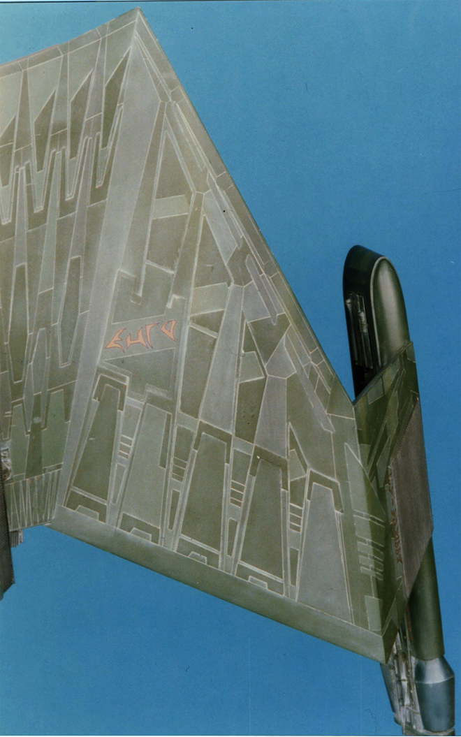
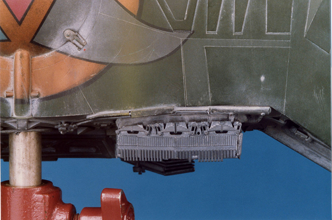
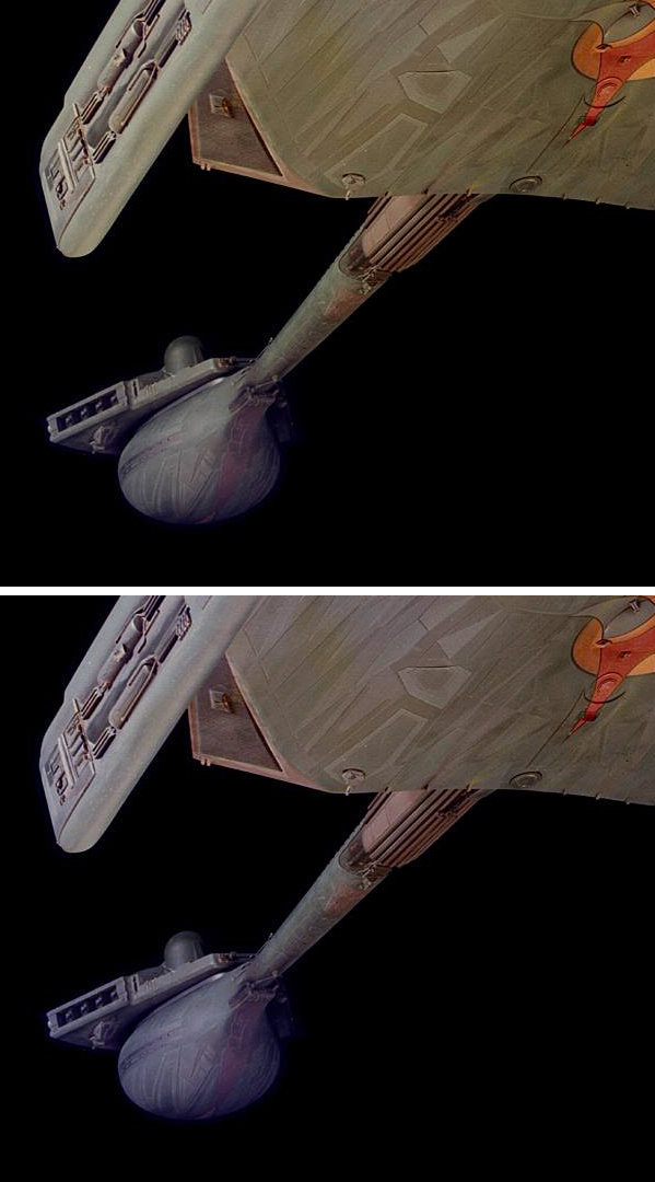
The green shades all show plenty of variation as if each shade was blended into the others, and in a few cases we pick up on darker green tones especially on the head and engineering area. Chromium oxide paint supplies a few distinguishing streaks of green/mustard yellow over everything. This is apparent in both of the photo surveys. There seems to more weathering streaks on the bottom that can be perceived on top.
Which leads us to that pesky neutral tone. We have to ignore the tan mess that we see in the Bill George pics, but can we rely on it for color temperature? (the “tan” is new, but how close was that to the underlying color?) We have to weigh the look of the color in some pics against how it looks in others. The early Apogee photos look close to that early pic of Andy Probert painting the weathering. It looks more like a gray, but possibly a warm gray.
However, the early overhead/rear shot makes it look reddish like a deep mauve. (shown here with a touch of color correction)
“Mauve” can have varying degrees of potency. Sometimes it can look like a very gray pink or a desaturated reddish or purplish brown. At a certain point, you just need to make a call… and then change your mind… then change it again… In the end, I decided to compare the amount of data (images) leaning each direction and followed the one we had more of which landed us on the mauve track. To achieve this in a practical way will be a matter of lightening Burnt Sienna model paint. Tone it down with gray to taste. Or if you like the less colorful option, start with Umber model paint and lighten it. At this moment, we haven’t nailed down the exact formulas, but we know what we are aiming for. Here are a selection of paint chips I picked up to send to Jim. I was first going to have him target the range shown on the left, but in the end we decided to use something closer lightened tones of the swatch on the right. (this scan comes across de-saturated compared to the real chips)
If someone wants to make some suggestions… If you have an extensive Floquil paint collection and you think you can decipher which colors were used, speak up fast. Maybe we can take your suggestion into account for the kit.
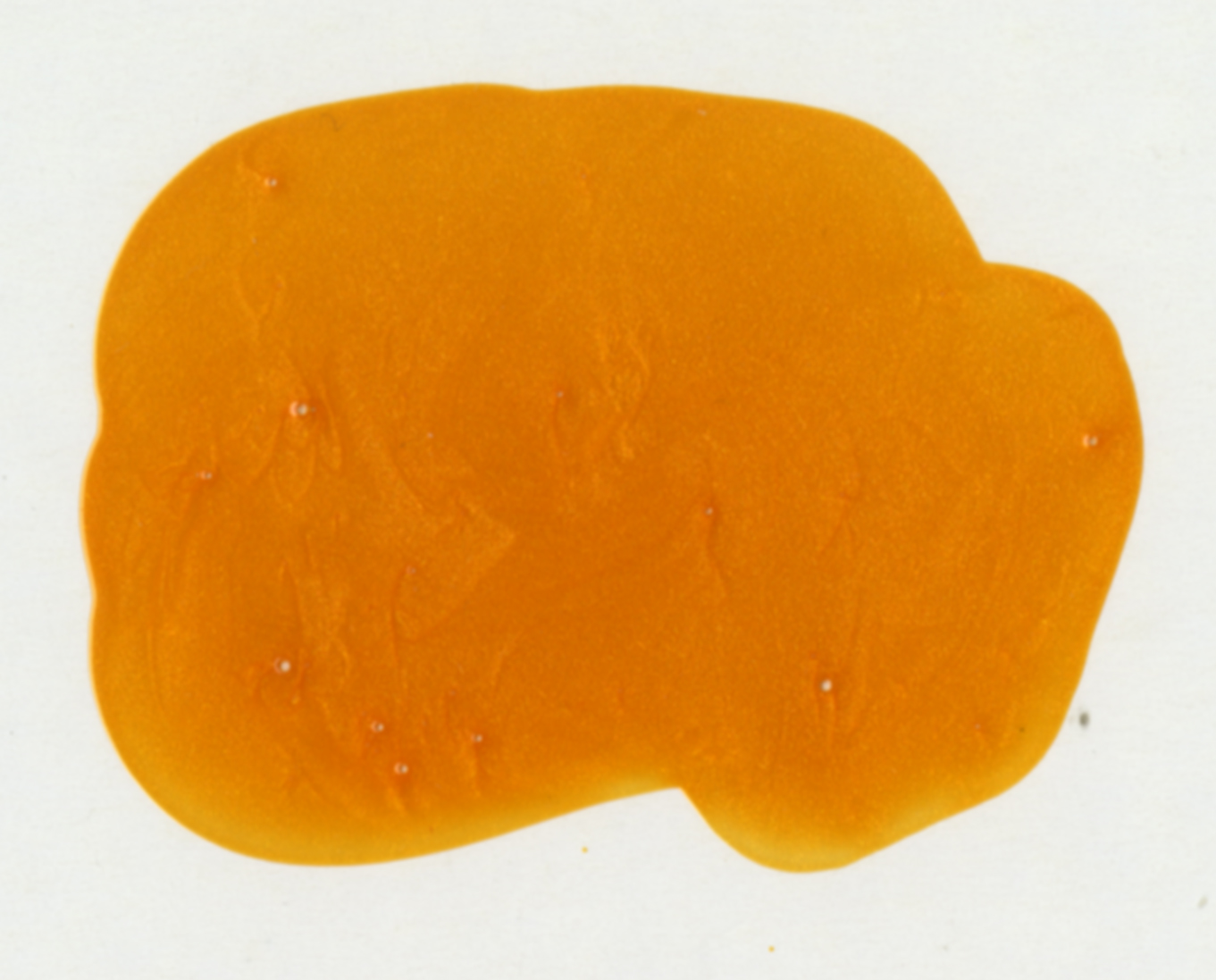
Oh! And that metallic orange… Model Master turn signal amber over white (because it is translucent). But you’ll only need that to touch up a couple details. We’ll be using that to match a metallic ink color on the decals…
So… yeah…whew… that’s it. Or at least everything I can articulate in any kind of organized way. I’m sure your mileage may vary. Do with this info as you will. At least use it as a reasoning for what we will specify in the kit.
Excellent research Jaime on the studio miniature paint scheme. It’s important to note that large scale studio models are painted quite differently than smaller model kits. There is apparently alot of “layering” and “misting” on studio model paint. Alot. My observations of the rear and forward secondary hull strong-backs: is that the base color is a medium neutral grey, followed by various shadings of lighter and darker grey panels, then for “weathering” lightly misted blacks, and beige/rust color giving that brownish / mauve hue in some photos. Then finally the white wash over the surface.
The best Klingon K’tinga green colour I found was Floquil Military Color’s Medium Green 303033 . Nasty stuff made with Xylol and petroleum distillates . Floquil never replaced this exact colour with a friendlier acrylic paint AFAIK .
Fantastic research going into this and great idea about the black plastic to minimize light leaks.
The work and time you invest into this is amazing special for a ship were it is very hard to find anything useable.
Cheers to everyone involved
I will for sure buy at least one 🙂
Okay – With all of the information contained in the recent posts, my head is swimming.
Great work! I can’t wait to see the kit when it hits the store shelves!
Not to rain on your parade, but I’m sure you’re aware by now that Testors has discontinued most of the Military Model colors.