Recommended Sites


Polar Lights Model Kits: K’t’inga… the colors, man… the colors… (Pt. 2)
Not to get confused with our buildup series from Jim Small, Jamie Hood has returned to share his research into the paint colors of the Klingon K’t’inga filming miniature featured in STAR TREK: The Motion Picture. Here is the second of three parts…
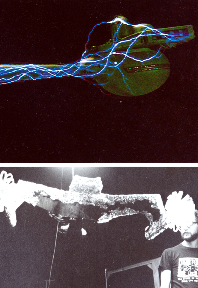
If you take screen caps of every appearance of the ship as it appears in ST:TMP (like I have…) and study/compare them, you will come to notice a few details change. These changes help us track the shooting order. The first shot of we see of the ship on screen was not the scene that was filmed first. I’m no special effects wizard, but as I understand it, a given appearance of a model on screen is actually filmed several times to create matte effects that when combined make us believe a space ship is flying through a remote galaxy. For part of this, the ship itself needs to be covered up. Consultant Charles Adams shared how the story he heard was that in some cases the ship had to be wrapped in aluminum foil for some of these passes. (One of the images from Cinefex #2 shows the ship in this very state.)
When the foil was peeled off, some of the fragile details came off the model. In some cases they were replaced… or misplaced… or lost along the way. What we have come to discover is that portions of the model were also repainted DURING filming. That is one of the reasons the Bill George photo survey looks different from the Michael Middleton survey.
We might have assumed the repainting came when the last minute details were added after the model was handed off to Apogee. I’ll present my case for the repaint during filming theory as we go. So the best way to walk us through this is by formulating a chronological history of the model and point out what changed along the way.
Images of the “Phase II” Klingon Battle Cruiser exist. I am not clear about whether that model eventually morphed into the K’t’inga filming miniature or not. It does seem to have some distinctive similatiries that lead us to believe they might be one in the same.
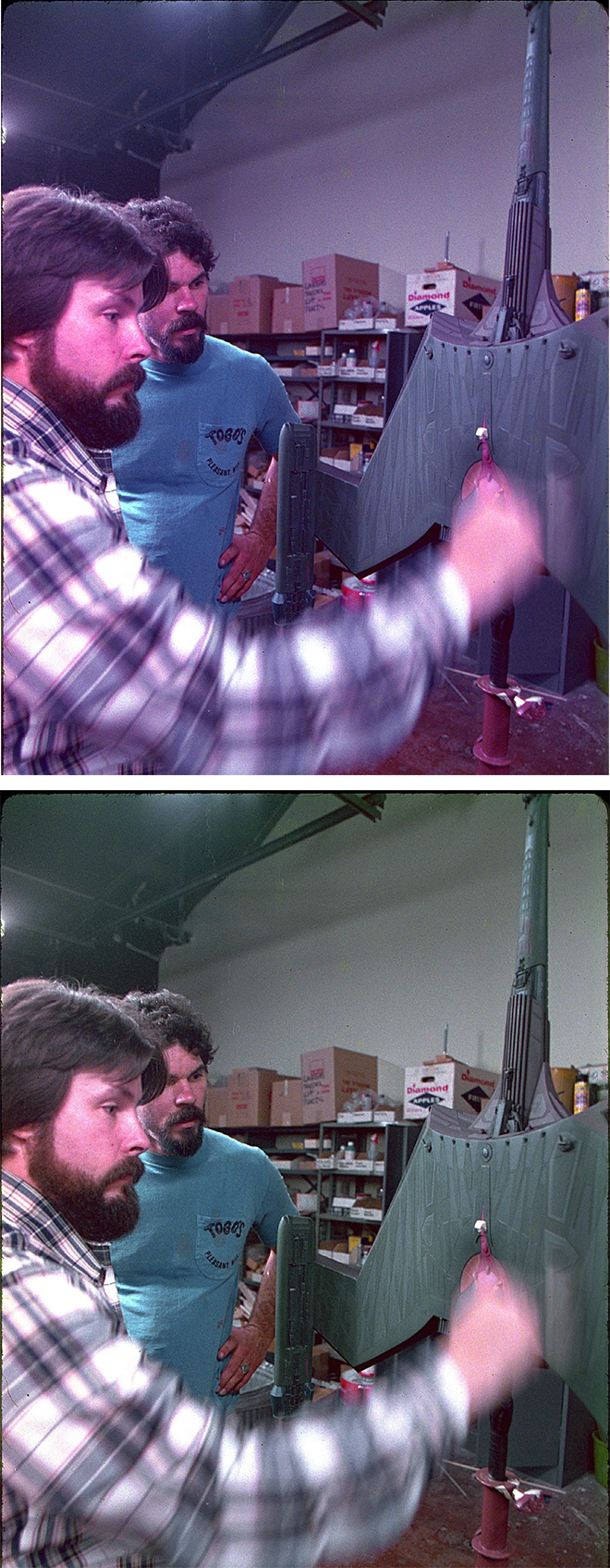
These are the earliest clear photos we have of the miniature as it was being painted. (I will be showing the original images as found next to color balanced versions. If you want to know what my system was for correcting color balance in Adobe Photoshop let me know in the comments. I can’t take the credit. Youtube is the best instructor I can find for the money.)
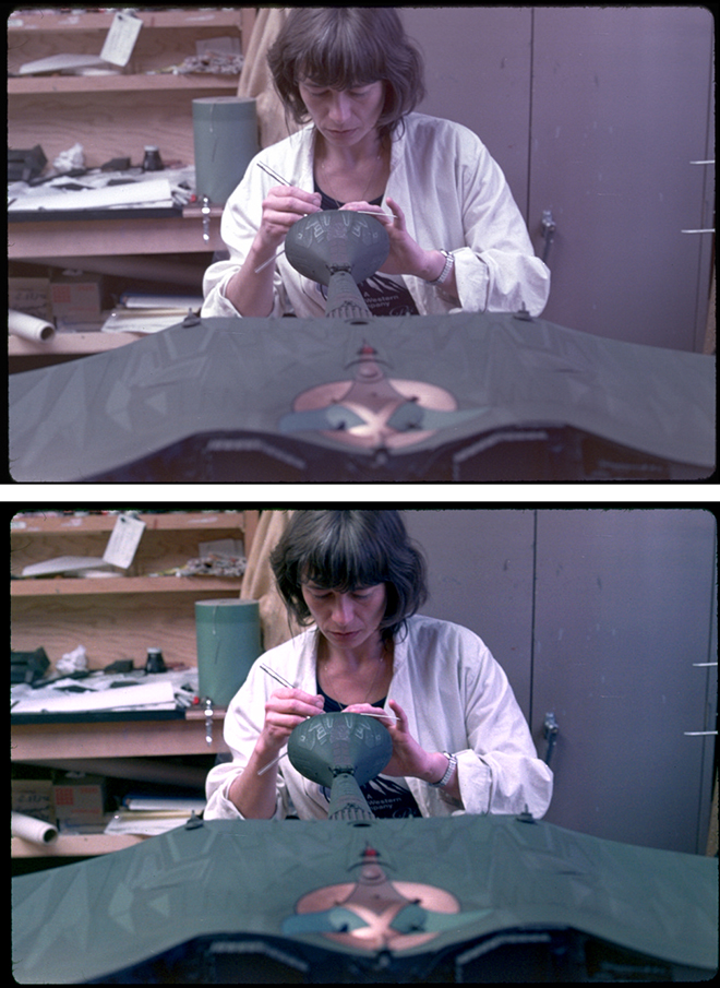
We see a deep Kelly green used for the primary color. It has a matte finish at this stage. Lighter colored panels might be mistaken for light playing against them leading you to believe it might all be one color, but after studying all of the reference I have determined that there were three primary shades of green. Some areas of the neck are a dark neutral. Determining exactly what color or family of colors this is becomes one of the biggest challenges. The scan of swatches we do have does not show the neutral tones. Are the smaller panels in these areas a lighter neutral or are they greens? And did this neutral tone survive to filming? The color doesn’t seem as highly pigmented as we will find in later photos. Note that the orange of the Klingon symbol is metallic. This isn’t the only spot this metallic orange was used.
I hinted that I thought the model might have been completely repainted at some point. I’ll pause here to say that I don’t think that is the case. I think all of the green tones we see here stayed in place. Were they weathered over? Sure. Were the neutral tones repainted before filming? I think it comes across poorly in the Probert photo, but I think what is there stayed there… for a while at least. Further to this theory, if the ship were repainted in whole I would have to ask “why?” Considering the time and expense that would incur, what would be the value to repaint all of the panels, but in just slightly different shades? These were people making a film on a budget and deadline. If the color differences were more substantial, I could get onboard with the idea.
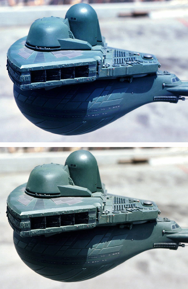
Next we have a couple images of the ship in its delivered form… well, almost as one small detail did change on the neck between this and the photo set taken at Apogee.
However, this one confuses us as to the true color used for that pesky neutral tone. The lighting gives it a purplish tone, while the overhead shot makes it look like a reddish brown. We don’t know for a fact that these two images were taken at the same time, but given the quality, setting and nature of the shots, that is my assumption. Also note we can pick up on some color variation on the raised panels on the head bulb.
Next we have the survey taken outside by Michael Middleton. A few of the overall views were relatively balanced.
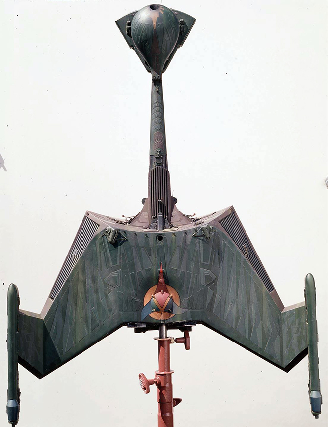
Adjusting the color balance on the rest significantly steps greens much closer to the Bill George photo set. The neutral tones become much warmer and look less like “steel” gray (even though I have constantly had to fight my personal bias that that would make a better looking model IMO). It could be described as a warm gray or “French” gray.
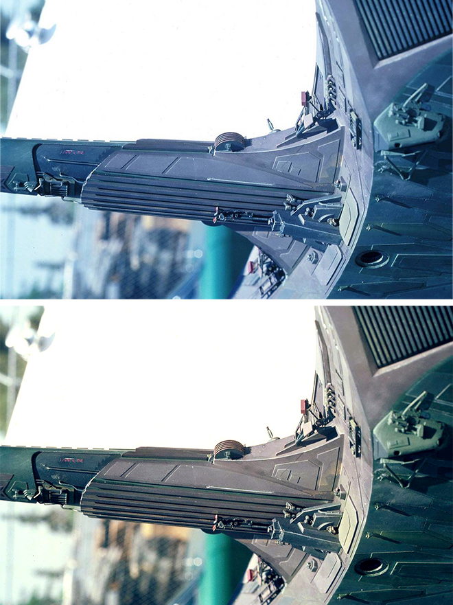
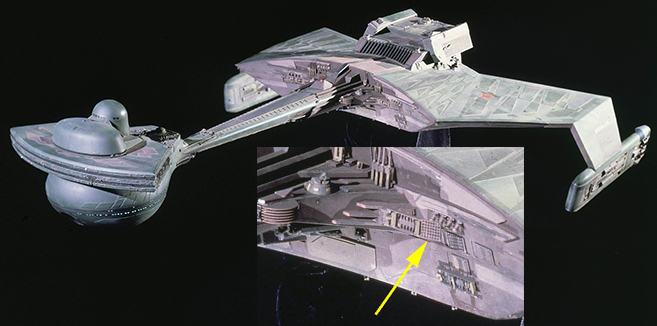
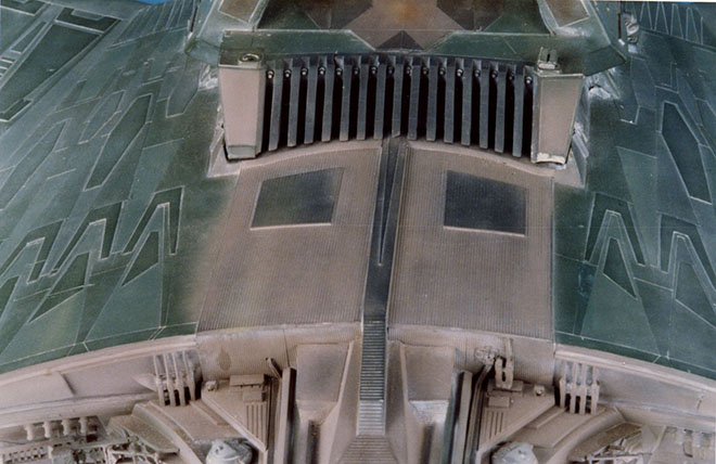
Be sure to note the details on the sides of the neck. There are two orange-ish “fan” shapes and a noticeable red box form there.
It seems that there are some spots of dark blue on the engineering housing and along the center of the neck.
Note both the Klingon symbol and the registry on top of the ship incorporate that same metallic orange used on the bottom.
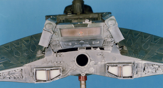
We can also see that the raised panels on the head bulb were indeed a lighter shade of green.
I have not seen a “pure” photo of the ship as it appeared on the first day of filming. From the outdoor photo set, we go to the film and what we can see on screen. Ignoring how it looked chronologically on film, I will walk through the chronology of the photography instead.
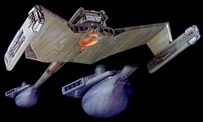
In this flyby sequence, we should note those “flag” details I mentioned earlier. The lower flag was removed from both sides prior to filming. The color of the ship is a soft green and the neutrals look…mauve… is the best color description. Mauve is a pinkish neutral tone that is achieved when red, blue and yellow are mixed. It isn’t “gray” and it isn’t “brown”. It is a hard color to describe.
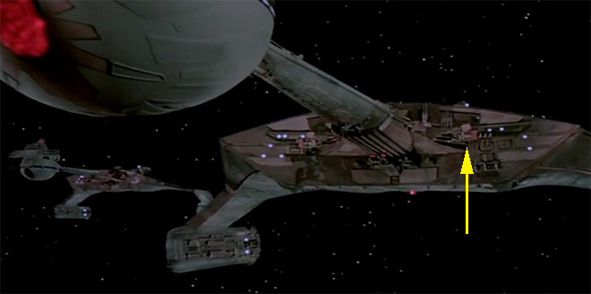
This shot was flopped in the film. (corrected here) The color looks significantly different. The bulkhead seems to be green now, but it was not repainted green. The fact it looks green is a camera trick, but it WAS in fact painted over.
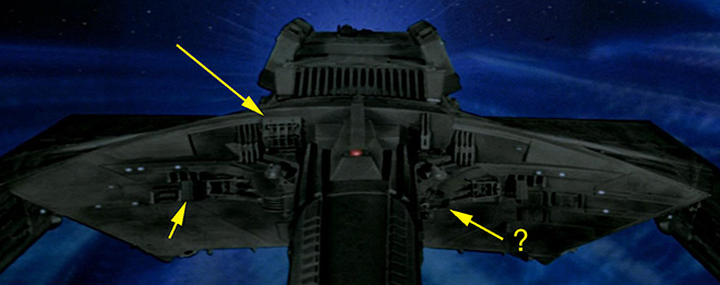
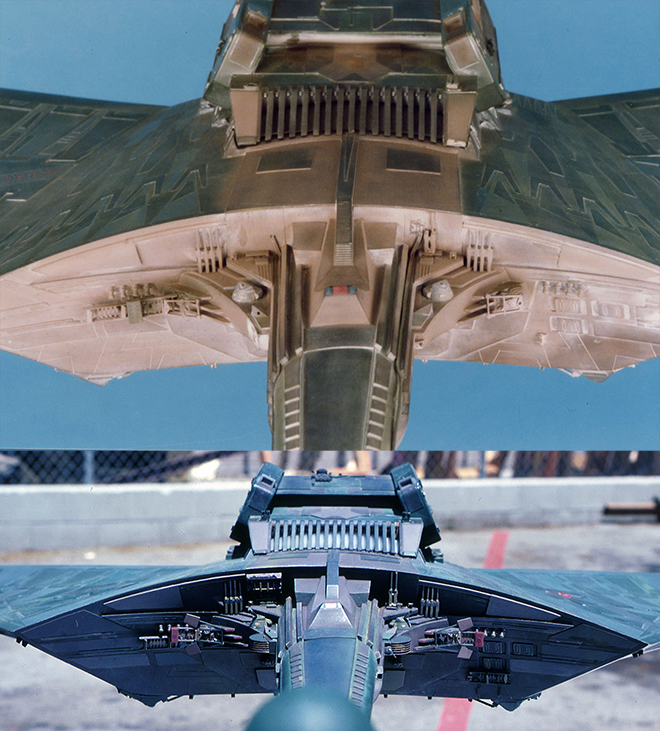
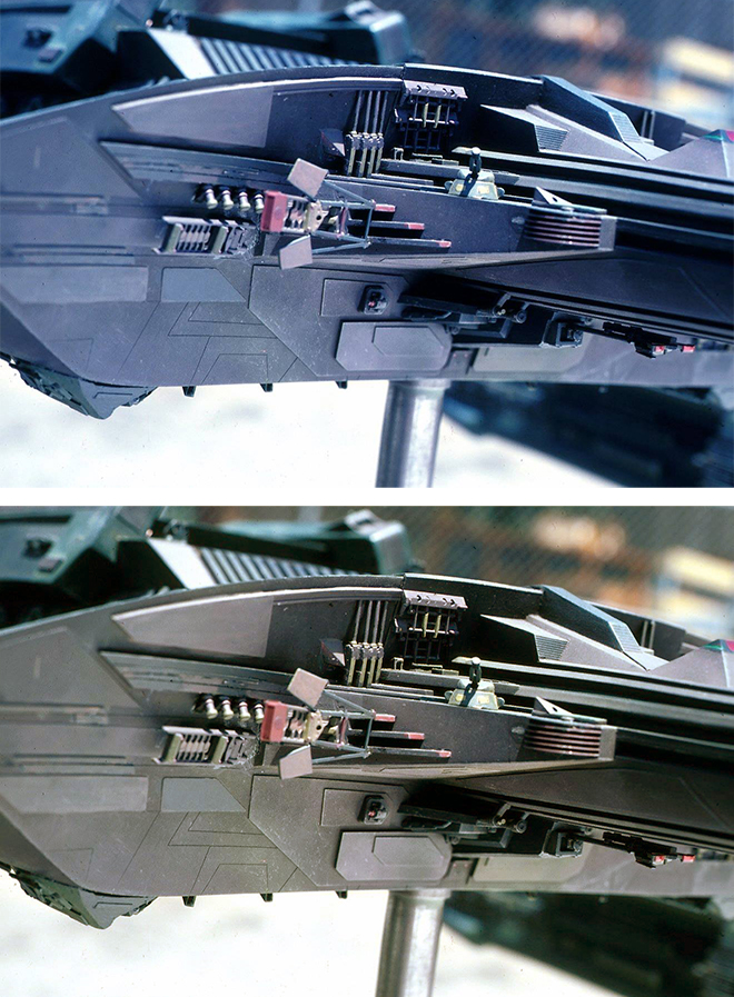
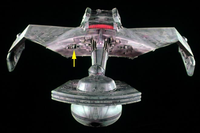
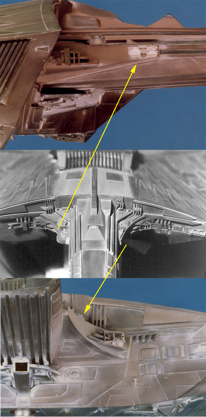
Note the presence of the detail to the upper starboard side of the neck on the bulkhead. This part can be seen very clearly in the outdoor photo survey and has been identified as a rail gun model kit part. It is tough to detect if one notable detail is missing on the port side of the neck, but more on that later. (Let’s assume it is missing though) The red boxes look just as green and the upper flags that had been present before have broken off. Don’t be fooled. The red boxes we saw in earlier pics were not repainted. They were replaced altogether, and the new ones were green. Proof of which can be found in the following images. (I’ve seen another angle of the ship at this stage that makes this fact more apparent.)
Oddly enough, this behind the scenes photo was not the same shot used on screen in this scene…
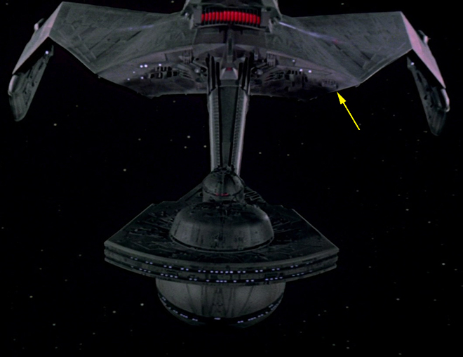
Because we can note the rail gun part has moved to the port side of the bulkhead. It had fallen off the model and was placed back in the incorrect spot. Note in the close-up neck comparison above that there is no trace of the part in the later photo.
Now we flash forward to the Bill George photos taken when the miniature was pulled out of mothballs for STVI.
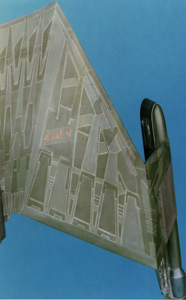
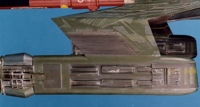
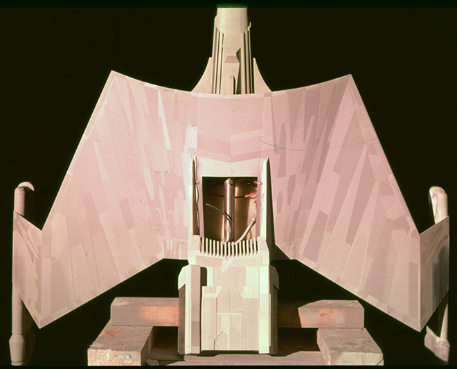
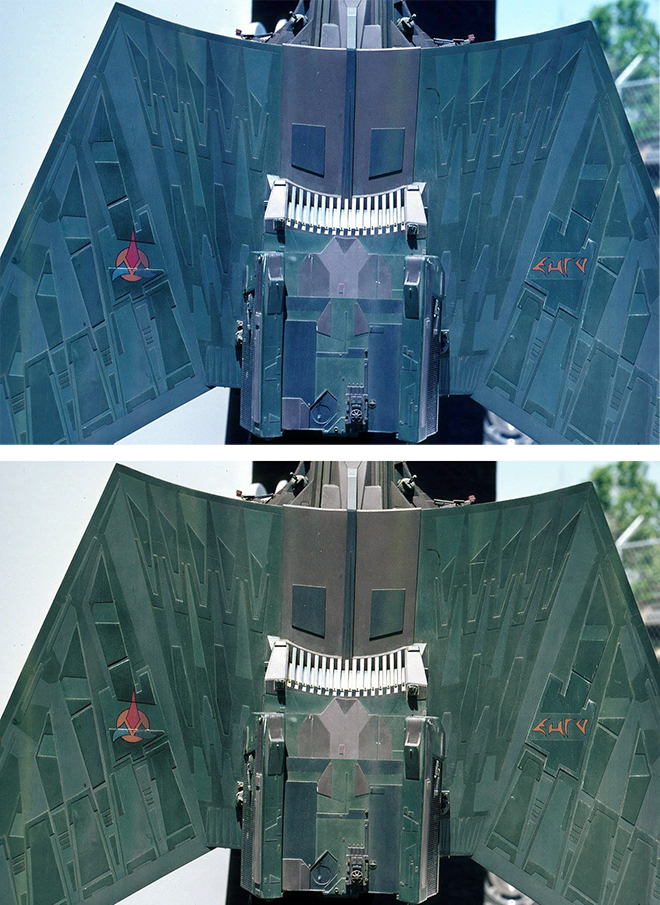
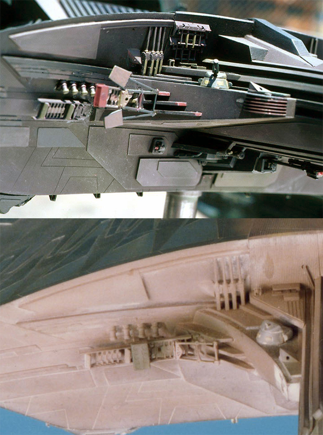
Ignoring the “white stuff” we see that the overall color and panel color variations we saw on the bulkhead in the Apogee photo set has been “tan-washed” in that it has been given a “whitewash” of tan paint which can be seen in the comparison photo back at the top of this article. It seems to have been applied with little precision as we see over spray here and there where it was sprayed on other details on the engineering area.
I noted that a noticeable detail may have been missing a couple steps back. This would have been the half-moon detail on the port side of the neck. By the time this photo set was taken this detail was missing from both sides, but note the starboard one fell off after long after filming (maybe when it was uncrated?), leaving a white mark. The spot where it had gone missing on the other side was overpainted with the tan. This is what leads me to believe this area was (hastily) repainted during filming.
The dark blue I had mentioned on the neck in the Apogee pics looks more neutral now. Also note that the panels on the bulb are no longer lighter green. I am led to believe the lighter shades were done away with when the bridge details were added before filming. In the camera-scraping fly-by, we don’t perceive any lighter panels.
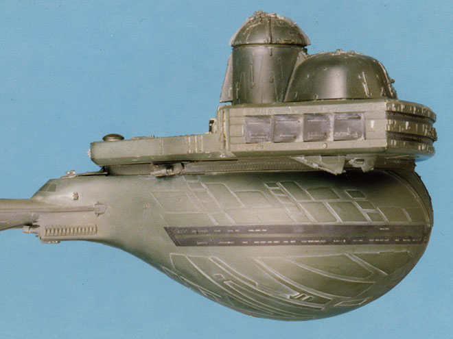
Also note that the entirety of the rear end has been overpainted for screen. This seems like it could just be a gray primer as it doesn’t appear “tan” in any of the photos.
Hopefully, you’ve stuck with me through the story thus far. With all this in mind, it was my task to determine what particular green shades to specify, what neutral tone is correct and how many shades were used and to what extent were “extra” colors used to weather the model. The toughest nut to crack in all of this is determining with some certainty what color was used on the neck and bulkhead. Did the color in the Andy Probert photo last to filming? Is the way we perceive the color in that photo the reality or do we need to ignore the few instances where it looks gray and call it a light brown or mauve? Do I have to decide…?
(to be concluded…)
All I can say is that along with my money, you guys deserve an Acadamy Award for the painstaking efforts you are doing to get the colors right. I can’t wait!
Did you consult with Andy Probert for any memories he has on the Ktinga colours?
Yes, but he offered a little bit of info, but didn’t have much to say.
Love the detail and effort that you guys are putting into this.
This is all REALLY fantastic research you’ve done, can’t wait to see the next installment! Thank you for making it so public and accessible.
This is a fascinating article going over the color and changes of this model. I do not envy your task as no matter what you come up with you’ll be wrong… The techniques used by these painters involved many passes of color washes, sprays of translucent (severely thinned” color and straight thinner to base colors to get that “oxidized” look… If you get the color in the right ballpark, similar painting techniques will need to be used to get the right “effects” to the color tones. No single set of base colors will be likely a match… but I APPLAUD your effort to ID them :D.
Thank you for this wonderful article and pictorial history lesson. I’m struck by how the model received its last minute parts detailing once delivered to Apogee for filming. These photos document the cleaner, smoother lines of the ship that frankly makes the original 1/537 AMT kit seem more accurate at the time. It is plausible to me the AMT kit engineers were working from the photos of the less detailed filming miniature (especially see the smooth bridge tower in the pix above, decrease in detail on the forward bulkhead near the boom attachment, etc). The last minute “bolt on” nature of the greeblies added to the filming miniature truly gave greater depth and detail on screen but ensured our scale model would never come close to an accurate replica.