Recommended Sites


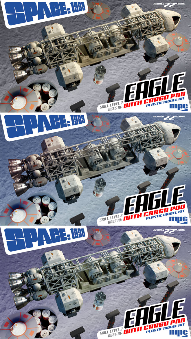
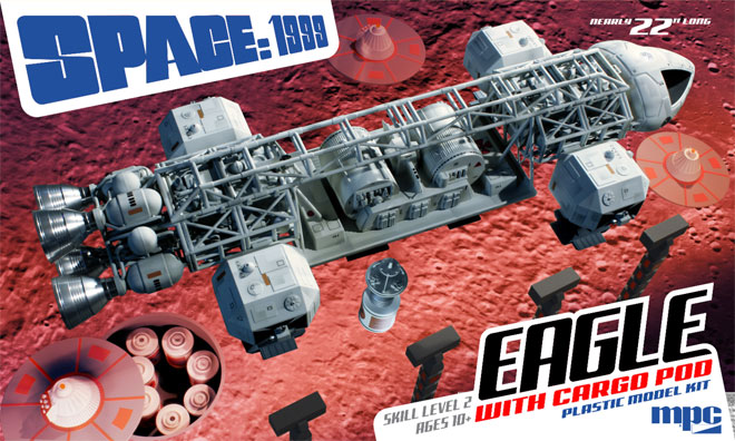
Space 1999 Model kits: MPC Eagle with Cargo Pod packaging part 3
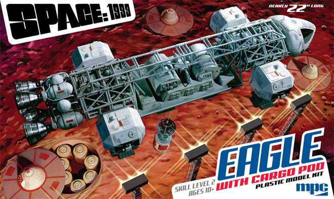
As described in previous posts, I enlisted Jim Small to assist with the new Space:1999 Eagle with Cargo Pod box illustration by having him build some environmental props shown in the nuclear waste storage fields in Space:1999. So with all that work done, it was time to start photographing everything in context which could then be used as reference for the illustration.
Our method of working through this is kind of like a director working with his director of photography in a film, but we work long distance and transfer images and direction via chat messaging. Jim has everything set up in his workspace and sends over a photo. I usually plug that into my box layout that already holds all of the other design elements. Then I send direction back to him. Is the angle alright? Is the lighting correct? Etc. is worked through. In this instance, Jim sent me one quick photo just to generally set stuff up and see how the angle works, and this was the initial shot.
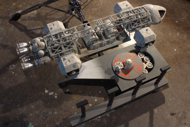
The angle was fine, but I had him play around a little bit with the location of the storage silo, but ultimately landed on the decision to position it below the rear of the Eagle. Once that was settled, we moved on to the other elements. I had him adjust the lighting and position the nuke cone platforms to the space I had built into my design.
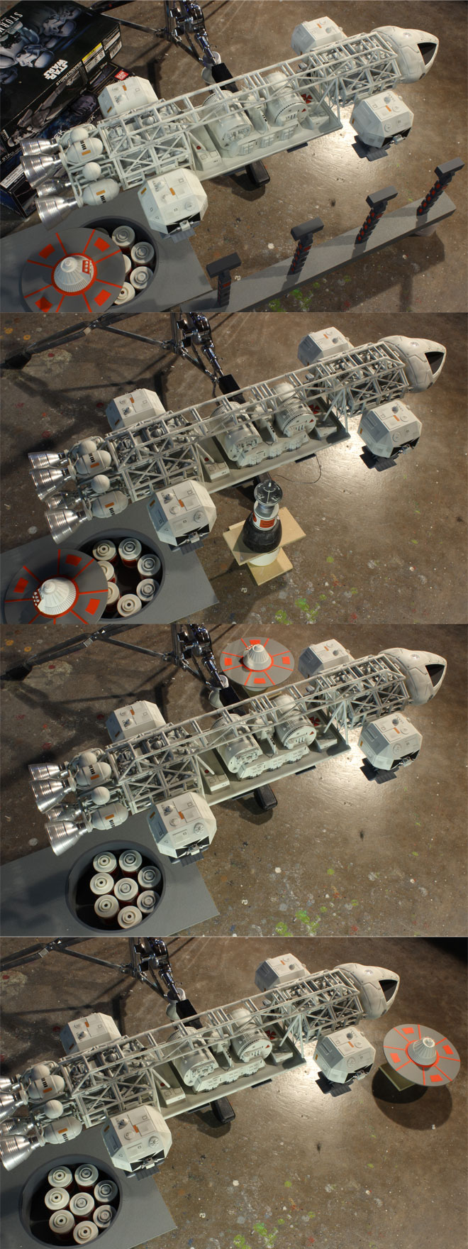
My initial vision was to have a row of lamp stands in the foreground, but I thought we would be missing out on seeing the signature light flares coming off of them in that position. So I had him re-position them to the far side of the scene to judge later.
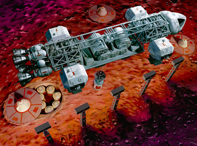
With all of the elements now available to me, I dropped them roughly into photoshop and tweaked positioning where needed and added a photo of the moon surface. This gave me the opportunity to play around with color and to judge where to position the lamps.
I ultimately decided to go with my first instinct (because they always tell you to when you can’t decide) and leave the lamps in the foreground. I wanted to use red to pop the box off the shelf, but I am not a “red guy”, and I wasn’t sure to what degree I wanted to push the “red alert” theme I mentioned in my previous post.
I continued to play around with color and asked for Jim’s input again. As a purist, he thought it might be better to make the moon surface gray and leave the ship white. The only way to separate them in a painting then would be to make one element “warm” and the other “cool”. I went through the exercise of proving one or the other of us wrong.
This is the image I used to base my painting on.
The painting itself was painted at 100% print size because the total box area is pretty big to begin with. I learned a lot when doing the first Eagle painting. If you recall, I actually did two paintings the first time around, the large main image and then I painted the smaller background Eagle separately and actually did that one first to get back into practice. I and many other people liked that smaller painting better than the larger main one. I liked it because I thought the end result was a better interpretation of the ship. (I think others liked it more because it was a longer-distance shot with less distortion in the ship) I think the fact that it was smaller made the paint on the board look more satisfying so I didn’t want the ship to get really big again on the new painting. Besides, working larger (which most illustrators do to allow details to sharpen when printed) would have required a large unruly board to paint on. So it was essentially one half a piece of illustration board measuring in the neighborhood of 20” x 30”.
I used acrylic paint again and ended up limiting the number of paint colors with maybe 10 different tubes in the mix. I used cooler reds for the shadow areas of the moon surface and warmed them up under the light of the lamp stands. I started by masking off the ship to preserve it’s pure whites. I then started roughing in the lunar surface before tightening up a few details like the craters, etc. I then moved on to the lamp stands and nuke cone platforms. I tend to paint secondary objects first in order to “keep my juice up” to paint the really exciting stuff like the ship at the end. I only transfer lines for what I intend to paint next. So that means details don’t get drawn in until the overall forms are painted.
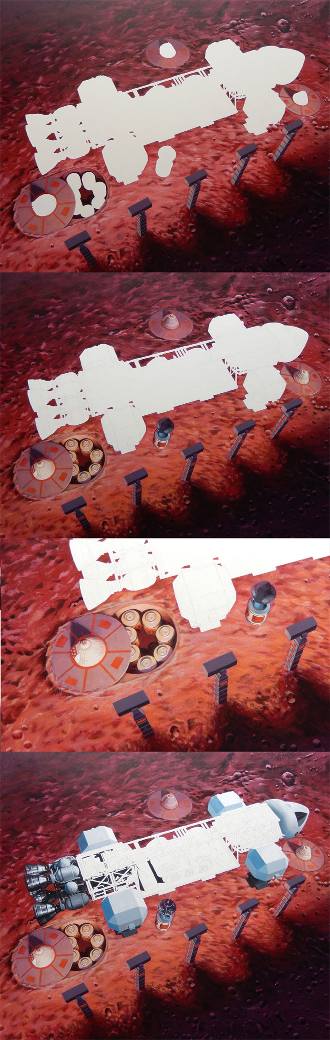
One of the things I got hung up on with the first big painting was mixing the colors for the facets of the shoulder pods, and ended up painting over them several times. So I started there on this one, and only ended up painting over them a couple times before being satisfied. That helped set the value key for the rest of the ship. I laid in pure blacks just to get me rolling in detail areas. I tinted the whites a little bit where I wanted subtle color tones. In my digital color study, I purposely put a touch of purple in the outlying areas and shifted to a slightly greenish tone in the central area of the cargo pod. This was in hopes of attracting the eye to that area with it clashing against its complimentary background. For no other reason than not knowing where else to go, I started in on painting the details of the ship at the rear and moved my way forward, leaving the spine for last.
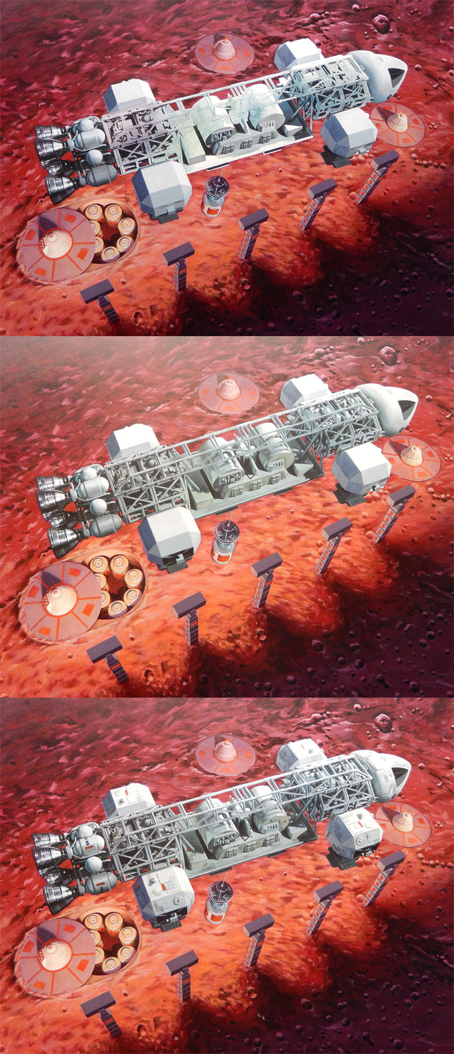
I was pinched for time by the time I got the painting finished, but it didn’t require the stress of staying up through the night and bringing in a slightly unfinished piece in the end. I had to touch up a few details and add logos and weathering patches digitally to the first painting. This time around I was able to paint everything in, and realize the fortuitous angle negated the need to paint Moonbase Alpha crests.
Scanning and digitally “stitching” a large painting like this is a tedious process even with a ledger-sized scanner. It took a total of 12 scans to capture the entire piece. One set of scans was taken from one direction then, turned and rescanned. This step helped eliminate the texture of the board and paint that is inherent in the scans. I tweaked the values to nicely match the original painting. We’ll see how it looks when printed.
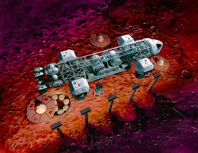
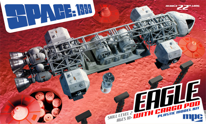
A cause for concern arose when I showed the painting to Tom Lowe. His first question was “what, is it landed?” Um… Not in my head, and the colors should be tipping off everyone that knows the show that the Eagle is taking away one of the nuke canisters, right? Well, I couldn’t get the comment out of my head, and I had always wondered if I shouldn’t “cheat” and show the lamp light flares even though we never see such flares from behind a light source in reality. I thought adding them was worth giving closer consideration, and this IS an illustration. It should show the ideal, not necessarily reality. the light flares were created in photoshop and I think they really do help to show what is happening as well as stressing that the warm red under the ship is coming from a light source.
So, with all that ado out of the way, here is a sneak preview of the entire package layout with the painting and Jim’s buildup photos in place.
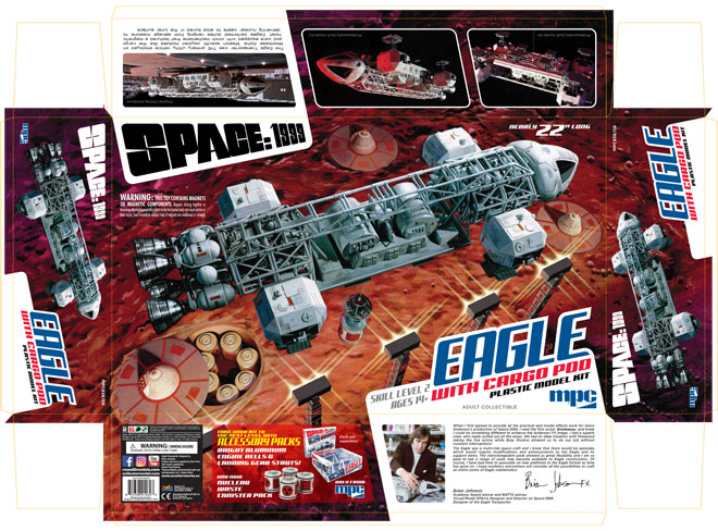
I didn’t want to spoil this post by putting this at the top. We had announced at every opportunity that the winch boom included in the Cargo Eagle kit would be magnetic, meaning that we would include the magnets in the kit needed to make one of the nuke waste canisters cling to the boom without requiring glue. Well, it would have been nice… We have been advised that in order to prevent the possibility of child endangerment, we should not include the magnets in the kit under any circumstances. The kit is engineered with locators for the magnets in case anyone wants to procure their own. In lieu of the magnets, we added a peg to the boom that can be easily removed for the sake of accuracy. Was this an over reaction? Probably, but we couldn’t risk the liability.
Awesomesauce, Jamie.
And I’ve got magnets. Boy, oh boy, do I have magnets.
Jamie, thanks for a fascinating insight into the process of making the box art! Both you and Jim did a great job.
Another Fantastic work of Art Jamie ! I look forward to the possibility of a Poster of this box art too. Keep up the good work, I can’t wait to see the box art you create for the Lab Eagle. I love the Jim Small accessories in the photos, are these possible prototypes for a Diorama set ?
Beautiful job Jamie! I really like the ‘white’ against the ‘red’ lunar surface.
BTW good call on not including the magnets. Better to be safe. Magnets are very easy and cheap to get so that’s not a problem that they aren’t in the kit.
Again, Excellent job on the box art!
That looks great and really interesting to see the work gone into it.
Really excited about this release, excellent work! Wondering if it will include a Cartograph decal sheet, like the one that was featured in the “special edition” Eagle? Am hoping to build this one out of the box, rather than painting. Thanks!
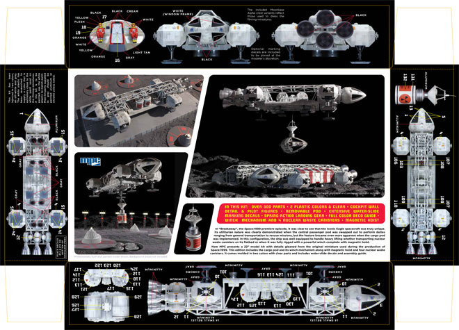
No. It includes additional decals as needed to decorate the pod and canisters. We’ll offer the weathering decals later at some point.
Thanks Jamie!
Michael
What is the release date for this jewel anyways.
It looks like we are track for a July street date.