Recommended Sites


MPC Model kits: 22” Space:1999 Eagle update #4
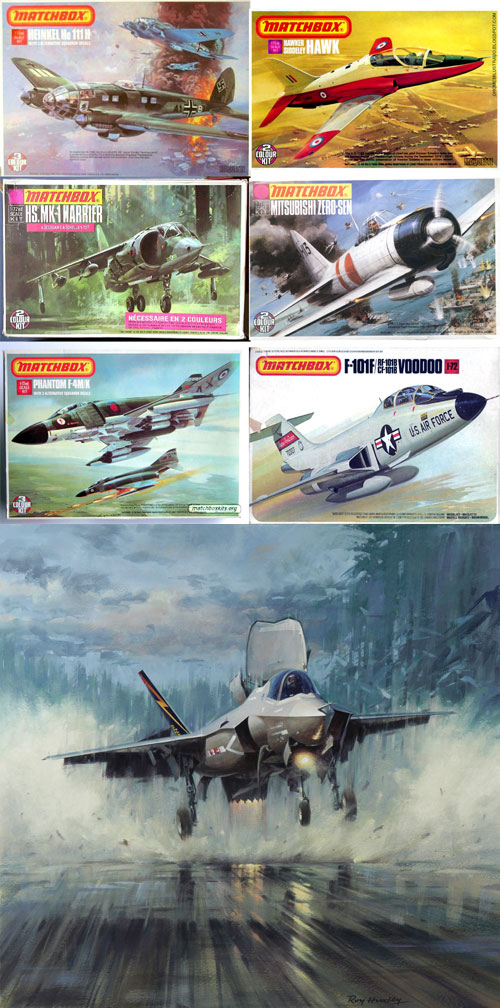
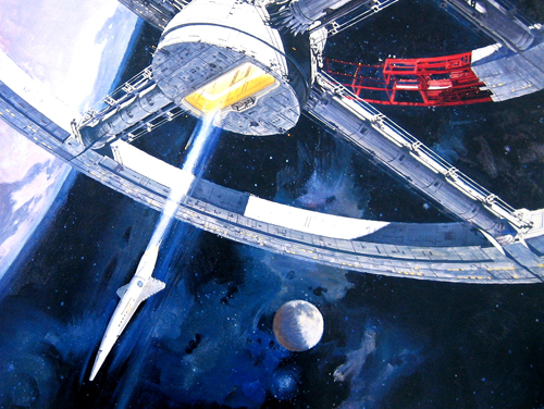
With the development of the new 22” Eagle model kit currently in the tooling stage I have started design work on the packaging. I’ll be illustrating the box lid personally on my own time. Jim Small pointed out the stunning illustrations done for the Matchbox line of kits by Roy Huxley. I’m taking them into account as well as Robert McCall’s work and focusing on his 2001: A Space Odyssey poster. Their art is very inspirational. I can only hope that my skills can pay them due homage.
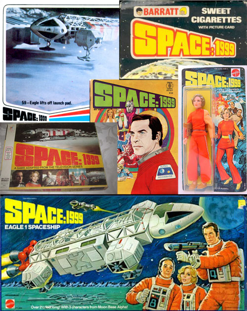
While digging into my illustration inspiration, I’ve been playing around with fonts and design motif’s that span the range from throwbacks to vintage Space:1999 products and collectibles like the old Eagle toy to contemporary takes that still keep a toe in the 70’s. Despite wanting to capture the look of the vintage products, I’m at a slight disadvantage because nearly every product uses the main three characters in a significant way. I can “cheat” by plugging in some of the other characters or putting everyone in helmets. Surprisingly after examining the size of the sprue frames and estimating a box size to hold them all it looks like we may have landed at the fortuitous box width of 22” wide.
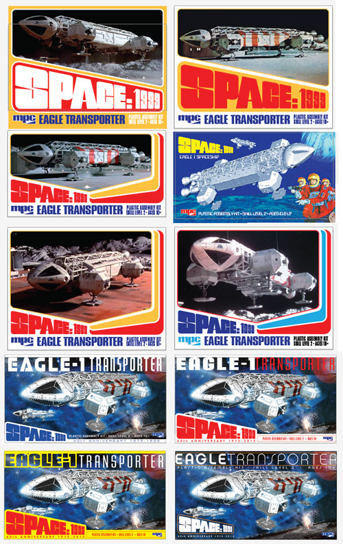
These are quick study layouts using screencaps of the Eagle just for positioning while exploring the rest of the layout and various motifs.
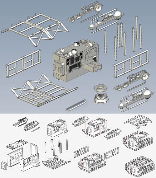
I’ve contracted a skilled digital artist named Ken Netzel to help with instruction sheet diagrams. I’ve been playing around with how to best lay out the instructions. Though not what I would consider a knock-off by any stretch. I’m taking another cue from Matchbox instruction sheets, which had a very clean, nicely gridded look to them.
I quite like the last picture box art myself,very similar to the old art MPC kit.
Jamie, excellent blog entry, I also like the last bottom right photo! You definitely know how to keep my interest spiked! Keep up the good work!
In the last set of pictures(Eagle-blog-31.jpg), I really like the first 6 pictures. The first 2 pictures with the large Space 1999 really stand out as something different yet still have a vintage look.
Mike.
Really enjoying these updates, thank you! I concur — the final, bottom right design is my favourite as well. I wouldn’t be interested in seeing characters from the show depicted on the box — nor in a “retro” 70s treatment e.g., orange and yellow graphics. A classy, 40th anniversary design should in my opinion focus on depicting the ship itself in a realistic space setting, utilizing a more subdued palette, reminiscent of the first season of the show itself. Again, thank you for the opportunity to hear about your progress and to share our thoughts.
Did Jim Small put you guys up to this…? He liked the bottom right one too and really championed it. I didn’t mind that one, but I held out for the ones just above it. But, in the end another idea came to mind that was a departure from everything you see here. I’m waiting on the approval from the licensor to bless the design, but I’ve already started working on the illustration.
The bottom right is just what steps up as a new generation of eagle model box art. It’s unique but classic all in one. I’m sure your new idea is going to be outstanding. Jim just has good taste! Lol.
We will have to wait and see what you came up with but I’m with everyone else: lower right jumped out to me as well.
I like the last 2.
As an aside, I also really like the one above it to the right which shows the Eagle suspended by wires.
I rather like the homage to the Mattel Eagle 1 playset myself. I like the color palette and the angle of the model. You could use the trio of astronauts… just close the visors and bingo! Likeness issues eliminated.
Whatever you do on the box art make sure it is distinguishable from the old Eagle kit. The last thing you want is some guy browsing the hobby shop and doesn’t know it’s an all new kit!
Good stuff Jamie.
Hate to say it, but I also like the bottom right one.
What I like about this one, is that it seems to offer more of the illustration.
Its also a good angle for the Eagle.
The ‘Space 1999’ logo is overlaid onto the illustration without being distracting from it.
An alteration I might suggest though, is to take the ‘Eagle -1’ from the left column (4th one down) as it is in moon base font as depicted in the show.
I like the current type face for ‘Transporter’ at the top. Though, may I suggest reducing the point size of ‘Transporter’ by maybe half. Simply because it has so many letters, it can easily overtake the word ‘Eagle’. I think using the ‘Eagle -1’ concept would allow you to reduce the point size on ‘Transporter’ and allow you to still carry the two words all the way across the top as currently depicted.
My second fave is also on the right column. The third one down.
I like the symmetry of the ‘Space 1999’ logo flowing into a reverse angle on the other side.
Looking forward to seeing your illustration.
Yep, lower right is the nicest
I like the middle left one, but all look good to me except the 2nd on the right.
Thanks for all the input. I love seeing all the behind the scene details.
Mark
The strongest angles I see in your comps, numbered Left to Right, top to bottom:
#1 (top left)
#3 (left column, second down)
#6 (right column, middle)
The four on the bottom (both columns) are too squished in perspective (aggressive perspective pinching). Could just be my personal preference for more realistic views of such a classic ship, but it just looks off – or worse, makes it look far less tangible. You’re trying to sell the idea that this is a big, solid model.
The graphic treatment on the far lower right is very cool. #2 (top left) looks too much like the board game I kept for years because the cover was so cool. Unfortunately because of this it looks more like a board game to me than a model (highly personal).
Good luck on the box art! That would be a fun project.
I would love to hand-paint this scene in a Berkey / McCall style. So jealous!
Have fun Jamie, and thanks for sharing the process!
Chris, how did the fact that you are a painter slip by me? If my results end up lacking on this one, I might get in touch next time.
That’s quite alright, Jamie, it’s a big community of fans here and even I struggle to recall everyone’s contributions. I would be thrilled to have a go at one of your kits’ box art. Cheers!
Christopher Doll
I wanted the ship to really look like it was engaging the viewer. Too many times I’ve seen illustrations of the ship that look like it is staying still in space and not in motion. That’s how I landed on a bit of a fish-eyed angle. I did try a few less distorted angles within the context of my end-design before committing to the one I chose and it lost some energy/drama.
I’m a bit late on both replies, my apologies.
I agree on your more dynamic angle approach (even if it conflicts with what I previous stated as a favorite). From my own attempts at drawing Eagles, it can be a tricky bit of geometry to nail down without it looking either too static or too “pinched” in perspective. I will trust your instincts on this one, and look forward to seeing the final artwork in my to-build pile.
Cheers!
Chris
I get to cheat on figuring out the geometry by using our 3D model that the factory sends for our review. Actually, I’ve found myself doing all of my planning work digitally including color studies, etc. I told Jim Small that feels almost like I’m doing a CG animatic for the purposes of filming miniatures in a practical effects shot…
I won’t tell if any “whoosh” noises occurred while posing the 3D model for the compositions.
And might I just add that I’m ecstatic over the apparent complexity of this kit — the hundreds of parts where all we’ve had for 40 years was a very simplified, rather inaccurate version. Kudos to all involved. Can’t wait!
I like the third one down on the left for box art. Very much looking forward to this kit!
Wow! I just found and read all four of these updates and comments. Quite enthralling. The graphics, photos and descriptions give cool insights into what is otherwise a mysterious process.
Sp1999 was about a future twenty five years down the road from viewers of the day using then what was far-out future-graphics. I like the last set of four designs, the others being a little too 70’s retro specifically. The last four are a little too Trek though with the blue space BG specifically. Whenever the eagle is otherwise seen, it’s on the moon or at the pad. Eagles were about action, as demonstrated by the amount of times they were blown up, crashed or otherwise trooped into and through tough situations. I started a list of destruction once… Once!
How about an Eagle akin to that Harrier storm painting, planet-side? The vague face of a pilot looking out the window while two (or more) space-suited (or normally dressed) Alphans run to the opening side door with their backs to the artist?
There are plenty of episodes with exactly such events, the 2nd ep. with Brian Blessed in the ice caves and Last Sunset off the top of my head. Admittedly, it would take days to get through the entire show for thorough story-line inspiration, even on fast forward. Dramatic-up angle during lighting storm, coming in on impact? 😉
Thanks for bringing this great series, Jamie!
For the setting, I considered whether to put the ship out in space or on a pad. I’m saving other settings for other releases further down the road.
I agree the last 4 are definitely too Trek looking. I guess after seeing different illustrations and such over the years it’s OK to see Trek ships in a dark blue sky like that. However I don’t see the Eagle ‘whooshing’ through space like that, it’s usually seen on the moon or an a pad.
I can’t wait to see what the final artwork turns out to be for the box cover.
One of the main struggles I had was how much to cling to the era and how much to make this as contemporary as the kit itself. Should we try to portray an iconic scene or show the ship in a way that we never saw it on screen.
My very initial thought that I was talked out of was to portray the ship as realistically as possible floating in space above the moon ala common NASA photography.
One of the elements that really grabbed me in Huxley’s work was his impressionistic approach to the land under the aircraft. I thought Moonbase Alpha would supply just that kind of background detail.
I’m anxious to show where it ended up. Everyone that has seen it has responded really well to it. It all comes down to executing the painting which I have begun. Once that is finished, I’ll unveil the results and some of the looks I really liked but ended up abandoning in the end.
Btw, I’m waiting on something to come in before writing my next blog about the Eagle. I have one more in this series that is chock full of a lot of late breaking news about the kit. If you like what you’ve seen of the kit so far, just wait… there’s more…
Hi
Were will I be able to purchase these?
Im in Australia- will I have to order direct from MPC or will my local hobby shop be able to get them in?
cheers
I am not honestly sure what our territory is. I believe it is worldwide.
There are two in-line stores here in the UK that sell a wide selection of Round 2 kits, and will ship world-wide. http://www.modelhobbies.co.uk, and http://www.wonderlandmodels.com. Both should ship kits to Australia for you
Sorry, thats ‘on-line’, not ‘in-line’!!!
Man, as I’ve stated before, never was a huge fan of the Eagle, but these updates are making me want to get the kit.
Awesome job Jamie…I guess you can now count me in for one.
Just don’t tell the wife.
Andy
FYI Culttvman will ship to Australia.
Ace