
Archive for July 30th, 2010
Polar Lights Model Kits: I Might Have Lost My Head…
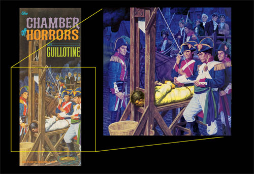
Not a meeting would go by without a certain someone mentioning bringing back the Polar Lights model kit of the Guillotine. We in the product development department had a difficult time wrapping our minds around how to “freshen up” the kit. What more could be said or done with a kit of a wooden death machine?
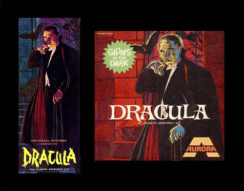
As we discussed other subjects like bringing back the Hunchback and Munsters Living Room kits, we decided to follow our formula used on the Witch kit last year. All of these kits had been brought back under Playing Mantis and packaged in the standard long box format so why not make the packaging part of the point of difference? Including additional glow-in-the-dark parts added an additional fun twist that stayed true to the Aurora tradition. In the end we threw the Guillotine into the mix for a “glow box” treatment.
Besides the packaging and glow parts, we figured we’d throw in another fun bit that took a baby step away from the vintage kit. Instead of using a peg to attach the head to the “victim’s” body, we eliminated in lieu of a couple magnets placed in the head and body. Now the kit really works reminiscent of the miniature toys the children of the time played with. (How I long for the days when decapitating pigeons was considered child’s play)
Anyway, back to the packaging. Most of you reading this are familiar with how un-named artists “re-worked” James Bama’s classic box illustrations which some would say were the strongest selling points of the original kits. A documentary shown at Wonderfest this year gave a great account of this happening. I felt outrage and heartbreak viewing that part of the film. Artwork was added to the sides of the illustrations to account for the space needed to make a square box out of a tall, narrow box. In addition, each illustration was painted over to key each one to a certain color scheme and indicate a yellow glow effect over certain elements.
Skip ahead a couple of months. We got a message from the factory that the packaging artwork would be due within the next week. We hadn’t forgotten the project but more or less put it off for other urgent projects. We hadn’t been in a hurry to do it because we knew we’d have some work to do to make the idea work and really had no great idea of how to accomplish it. So push came to shove and I sat down to figure it out.
We needed enough interest on the sides to fill out the scene but also be able to see the all-important guillotine (at least the important parts of it) and be able to put the title of the kit in the center of the box just like all others. I found that by enlarging some of the background elements, I could fill space with what was already there. The most difficult matter was finding something to fill space in the lower right quarter of the box. Painting in two halves of two soldiers had been no easy feet but I found enough empty room in a space where nothing but another soldier made sense. I knew I had a certain amount of skill with photoshop but how could I come up with a guy that wasn’t present in the illustration to begin with and have it look like he had been hiding off screen the whole time. I ended up picking up one of the guys I had and adjusting it from there; borrowing a cheek bone from one, changing his hairline including adding sideburns, altering the uniform slightly and changing his hand position. If you didn’t already know the difference, you’d probably never know. As with the other glow boxes, I knew I had to give it a color scheme shift. That was difficult for me to wrap my head around. I had spent almost a week straight being sure I got everything to match especially the color and had it nice and brilliant enough to look like a fresh piece of art. I copped out a little and used the original background to guide my color choice, going with a neutral blue.
It wasn’t until I was half way through this that it dawned on me… What I was doing and what I had become. A lot of time and work had come and gone since seeing the Aurora documentary back at Wonderfest. I became regretful that I was one of those nameless artists who painted over a great piece of artwork done by one of Illustration’s masters. This wasn’t what I had ever been about. I love classic illustration. I can trace my art training pedigree back to Howard Pyle and here I was bastardizing another person’s artwork. It took me a while to realize I was stuck in the middle and had no choice than to forge ahead. The only way I found to somewhat justify myself was to say, “Well, at least you’ll do it better than those hacks did back then”. That rings pretty hollow just to right it. What can I say? I’m a hypocrite just like 90% of everyone else on the planet. No one (well, hopefully not many) tries to be but every now and again we find ourselves doing something we know we shouldn’t, something we’d tell other people not to do. I’ll live with it and move on and try not to do it again.
So, my apologies go out to James Bama. I’ve got nothing but respect for you and your body of work. I hope to never do it again.
I was about 90% done with reworking the artwork when it dawned on me. “You know what have really made this kit special? Getting James Bama to adjust his own artwork to make the illustration square.” Maybe next time…


